Earlier this year, after about two years of using fountain pens and surrounded by a growing ink collection, I wanted to refresh my Col-o-ring and explore other ideas for swatching inks—this time with a more deliberate and personalized style.
Finding My Style
The first step for finding my style was looking back through notebooks and photos. Back in December 2021 I received a gift of four Birmingham Pen Co inks, and their signature naming style inspired me to include little sketches (using a glass dip nib pen) representing those names when I swatched them in my notebook.
That December I also got the 2021 Diamine Inkvent Calendar and used a paint brush to test each ink with a little painting on a page of that same notebook. December got busy and I didn't swatch all 25 inks that month, but I enjoyed creating pages like these for all those inks over a couple months, along with other small sketches and paintings throughout the year.
Fast forward to March 2023 when I attended my first pen show in Atlanta. I drove down by myself to spend all weekend around pens, inks, and fellow "pen people." One of the people I had the pleasure of meeting at the show was Ana Reinert from The Well-Appointed Desk, who created and produces the Col-o-ring and related swatching products with her husband (who runs Skylab Letterpress). When I mentioned my desire to refresh and expand my ink swatching, one idea she suggested was to look for inspiration via Instagram hashtags such as #coloringinktestingbook, which ended up being very helpful.
Ultimately I realized that doing those monochrome ink sketches was one of the ink-related activities I had enjoyed most, and it was an artistic avenue I wanted to explore further and improve. A sketch could also add value to the swatch card by demonstrating variety in line widths and volume of ink. With my goal to use inks more regularly, even when time and energy are scarce, it made sense for sketches to feature in my ink swatching plans.
The First Cards
After all the excitement and inspiration of the Atlanta Pen Show at the end of March and finally establishing a plan, I sat down in mid-April with a handful of inks and tools to get started.
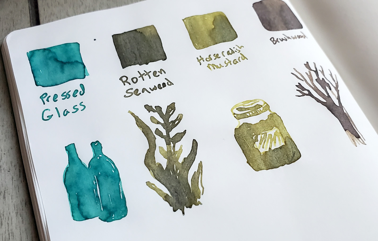
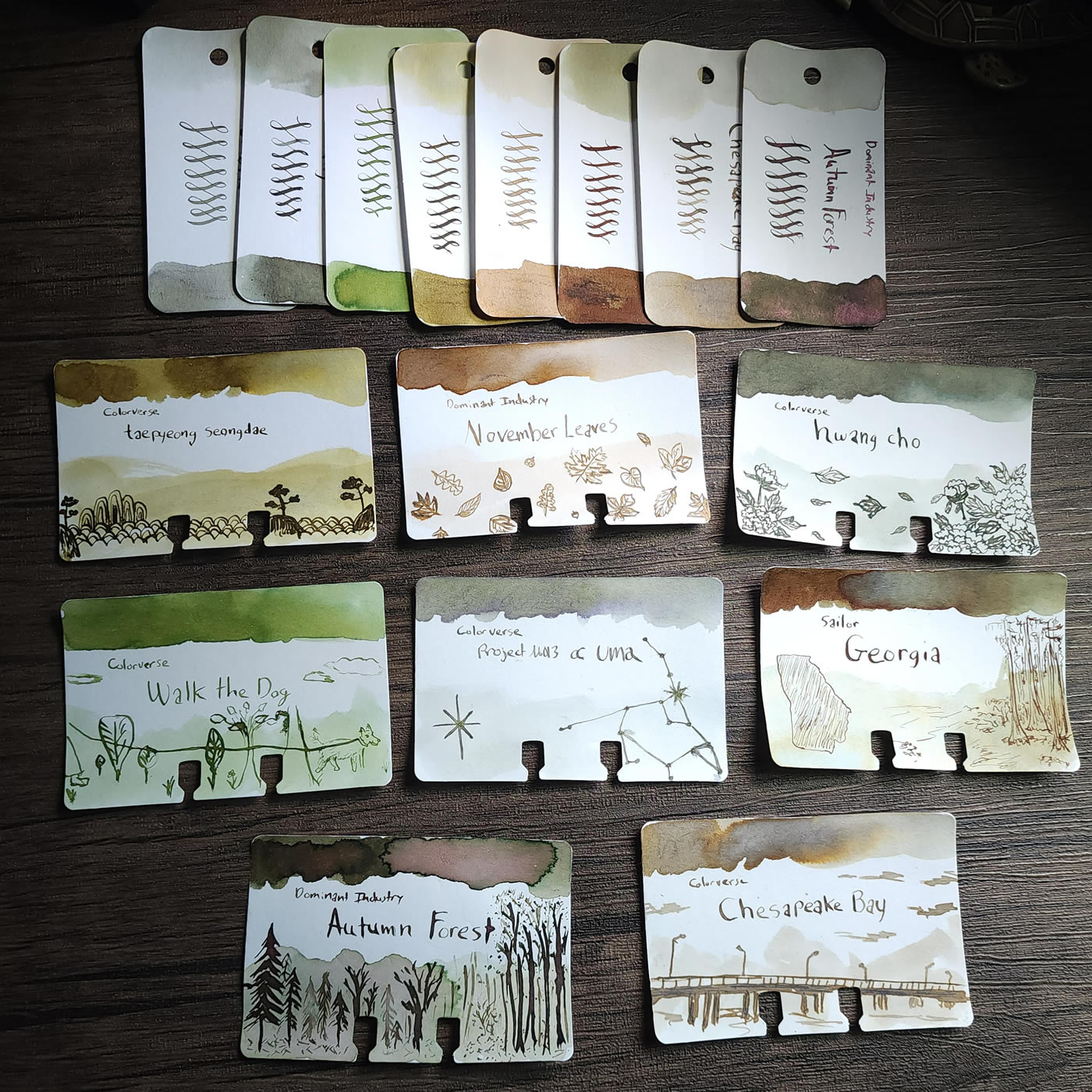
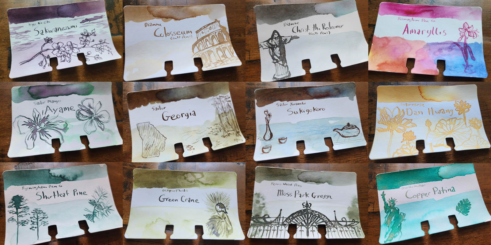
On the new Col-o-ring cards I kept the horizontal orientation, using a metal tool to spread ink along the right edge. On the left side, I diluted the ink with water to do a paler ink wash. In the middle I used a flex metal dip nib, mostly the vintage disposable Warren "penny pens" I picked up in Atlanta, to write the ink brand, name, and loops.
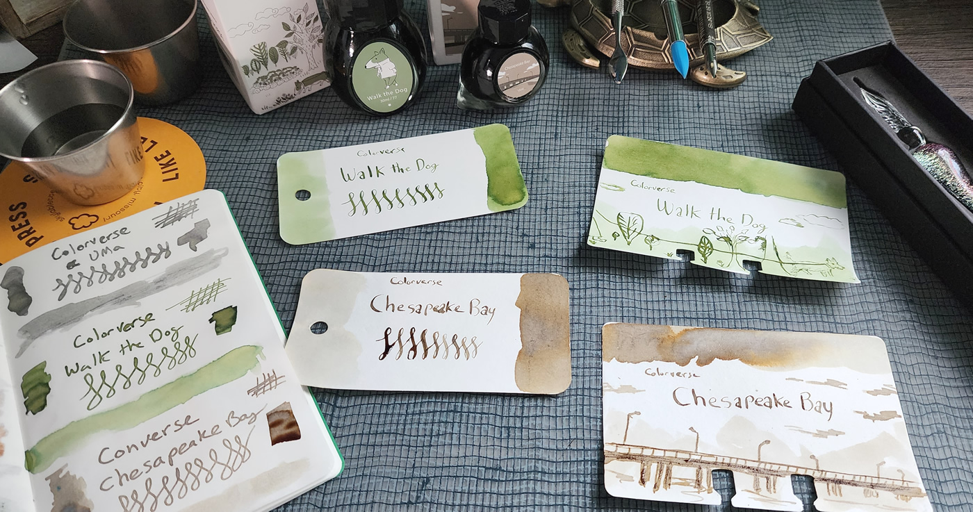
In parallel, I also spread ink two-thirds of the way across the top of a Col-o-dex card, diluting the ink slightly to bring it to the right edge. I added a pale ink wash to the lower half of the card, and used the same flex nib dip pen to write the ink brand and name in the space between.
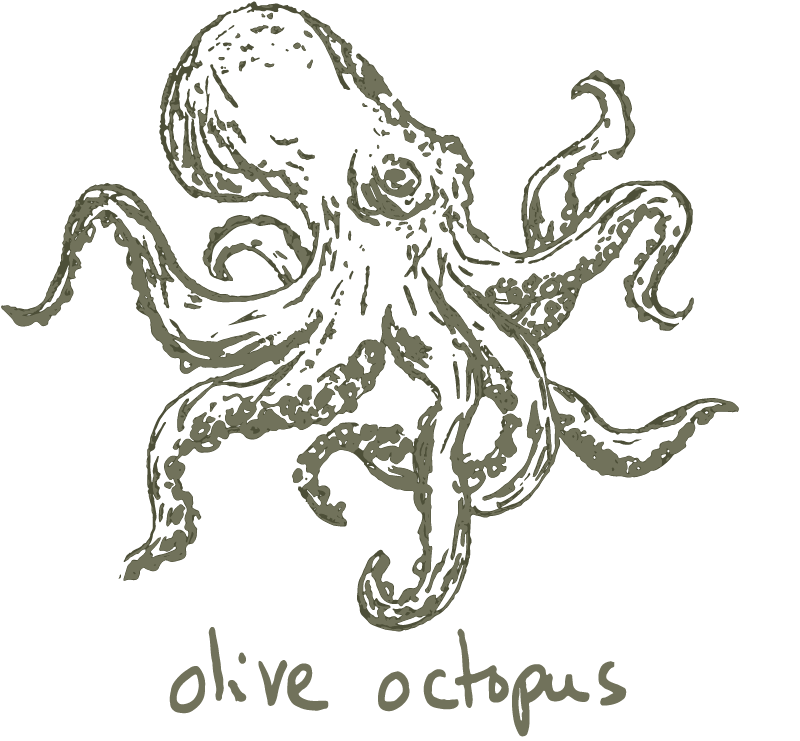
At this point both cards are set aside to dry. To decide on the sketch to add to the Col-o-dex card, I reviewed the ink name, bottle label and packaging, and color—doing additional research or translation as needed. Here is the first batch of cards I made, and almost all of these sketches are representations of the box/label graphics. The Dominant Industry inks did not feature designs on the packaging so I used the ink names, "November Leaves" and "Autumn Forest," to sketch a variety of falling leaves and a forest of trees, respectively.
A Global Community
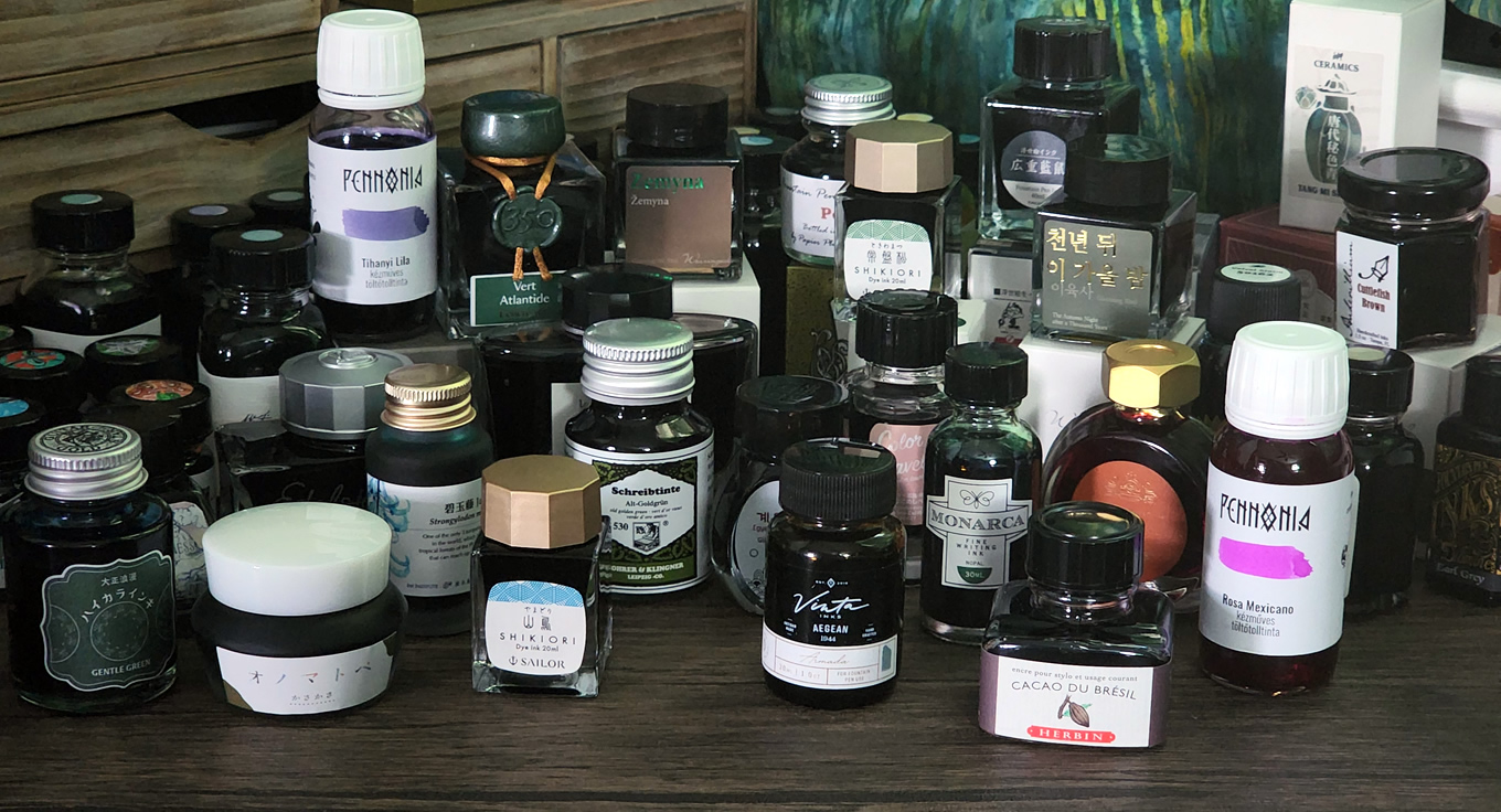
I've collected inks made by companies from all over the world, with many ink names not in my native language of English. Before beginning a sketch I might need to do a little research/translation to learn more about what an ink name means and why it was chosen. An ink series may have a greater shared theme or story encompassing that group of inks. Several brands take a particular pride in representing the region they are from, with colors and names reflecting specific places, landscapes, art, people, food, culture, and more. While there's certainly nothing wrong with straightforward ink names like "Emerald Green," which are much more accessible (especially to newer users), I appreciate the added layer of richness these little glimpses into other people, places, and interests adds to the experience of those inks.
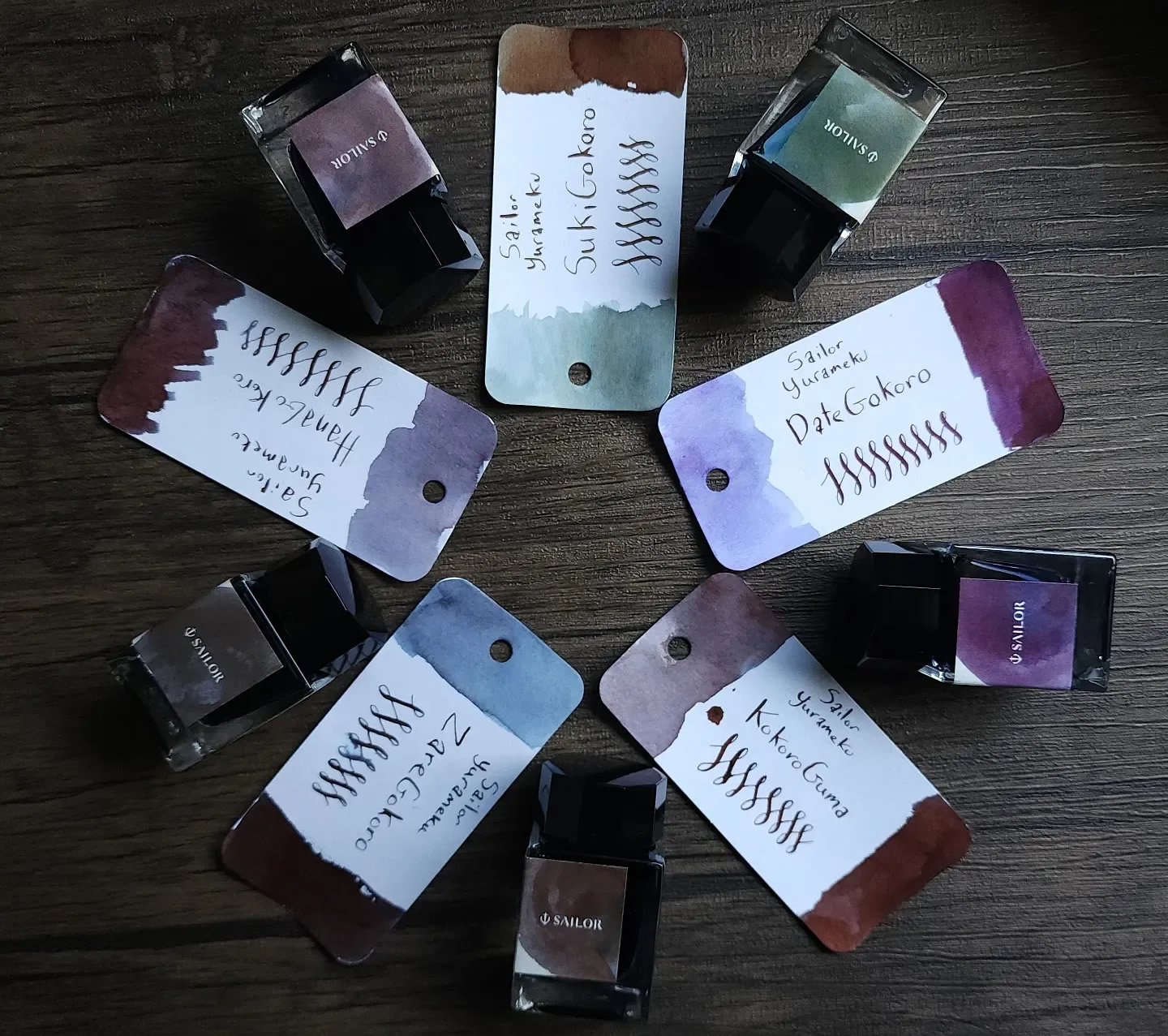
One interesting research journey was looking into the second series of Sailor Yurameku inks. The intriguing phrase "colors inspired by fluctuating heart" was used to describe the five ink set, with additional short English descriptions for each ink like "A mind like a flower, fragile and shifting," "Graceful, quiet mind," and "A mind with stylish and playful thought"—I wanted to learn more. With the assistance of translation tools, marketing videos and text on Sailor's website, and a helpful post on Reddit, I was able to better understand the story being told by these mysterious inks.
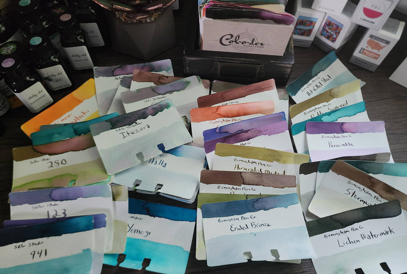
120 Col-o-dex cards
After four months, as of mid-August, I've finished 120 cards! I've learned more about each of these ink brands, and taken time to appreciate the care that goes into choosing a name and designing labels/packaging for many of these lovely inks. It's satisfying to see all of these quiet, creative moments I spent together in a gallery that is also a practical reference tool.
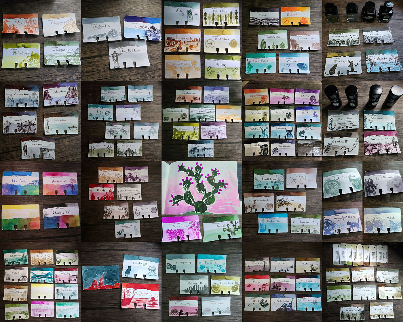
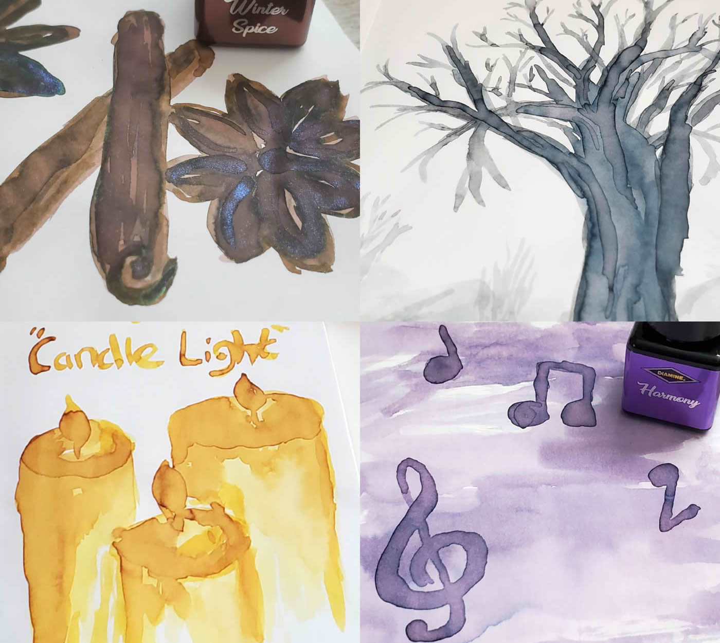
There were a few cards I had to re-do along the way due to accidental ink splatters or smeared text that impacted the readability/usefulness of the card, but I avoided redoing a card simply because I was disappointed in the sketch. Some cards turned out better than others, it's all part of the journey. These are some of my favorite cards so far.
What's Next? More Cards!
I have nearly 50 more Col-o-dex cards that have been swatched and await sketches, with several more bottles and samples to swatch after that. I may spend a whole year establishing this Col-o-dex—I'm not setting any deadlines and will proceed at an enjoyable pace. I intend to continue including sketches with swatching on other kinds of paper as well, in addition to more journaling (art & writing) and painting with inks.
To close out this pause for reflection I asked myself: What do I expect to gain from collecting a large volume and variety of ink? My answer: to learn, to share, and to be able to use ink generously for the non-digital creative expression and skill development that I recognize is important to my happiness and well-being.