I am fortunate to have a relatively large amount of control over my living environment, and I have chosen to surround myself with color. One of the very first things I did here was paint bold colors on the walls and hang colorful curtains, and I've added more "layers of color" over the years.
Walls
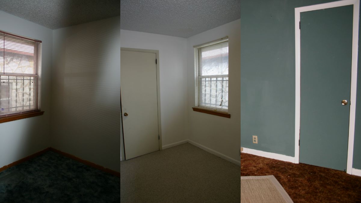
Rooms started out looking like this, with mostly white walls and inconsistently painted trim.
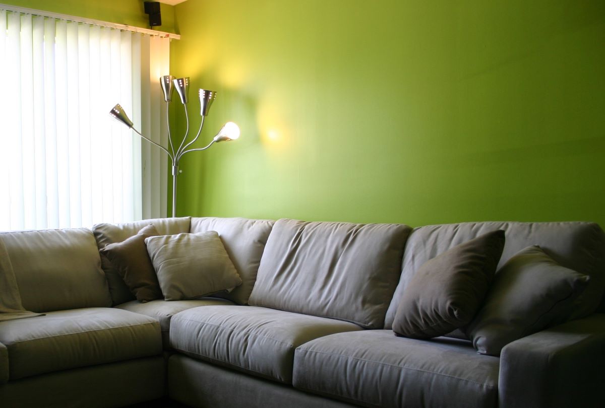
The first paint I used was a bright chartreuse green in the living room, and a lighter yellow-green in the kitchen.
Other rooms were painted shades of blue, blue-green, orange, and gray. All the trim and interior doors have been painted white. Over time I've re-painted a few rooms in more refined shades, and still chose off-white neutrals for the hallway, closet interiors, and utility room, but overall there is a lot of color.
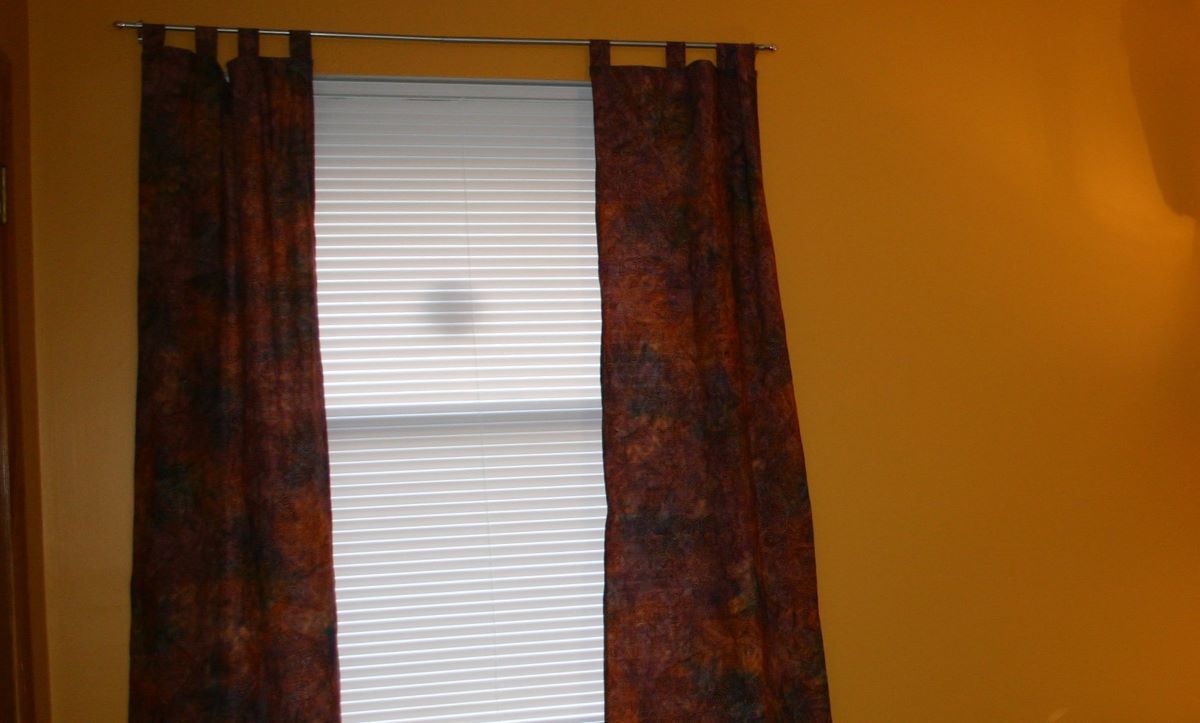
This orange room has become my office and the walls take on a warm glow when the late afternoon sun floods in through the west-facing window.
Curtains
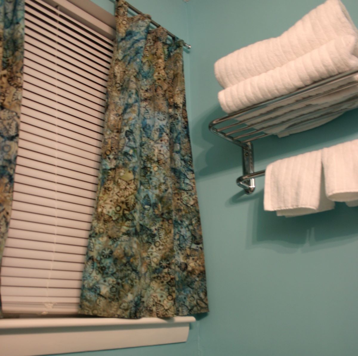
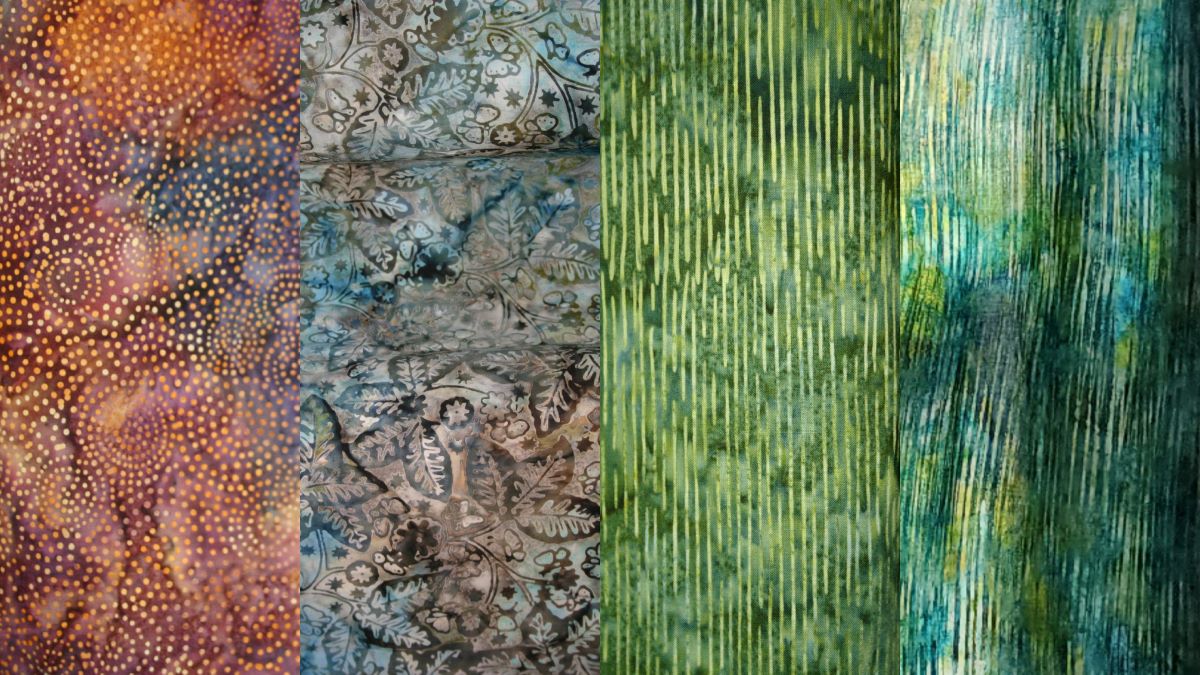
Budgets were tight in that first year, but I splurged to buy vibrant batik fabrics to make simple curtains that would coordinate with the various shades of wall paint. These dyed fabrics glow in the light like stained glass.
RGBs
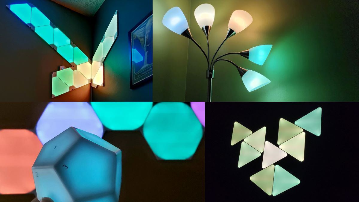
After several years I started slowly replacing regular light bulbs with Philips Hue smart bulbs, adding LED light strips behind shelves and under cabinets, and putting various "gamer" light designs on the walls. I find overly-bright indoor light to be unpleasant, so being able to use dimmer lights or colorful accent lights to customize an environment for various situations is more comfortable.
When I built my computer, I wasn't originally planning on adding a bunch of lights. But, I found this case with both a layout and design I love—it's more square and tucks the less visually interesting components like the power supply and most cables behind a panel to the side, and happens to feature several glass panels showing off the inside, so who was I kidding?
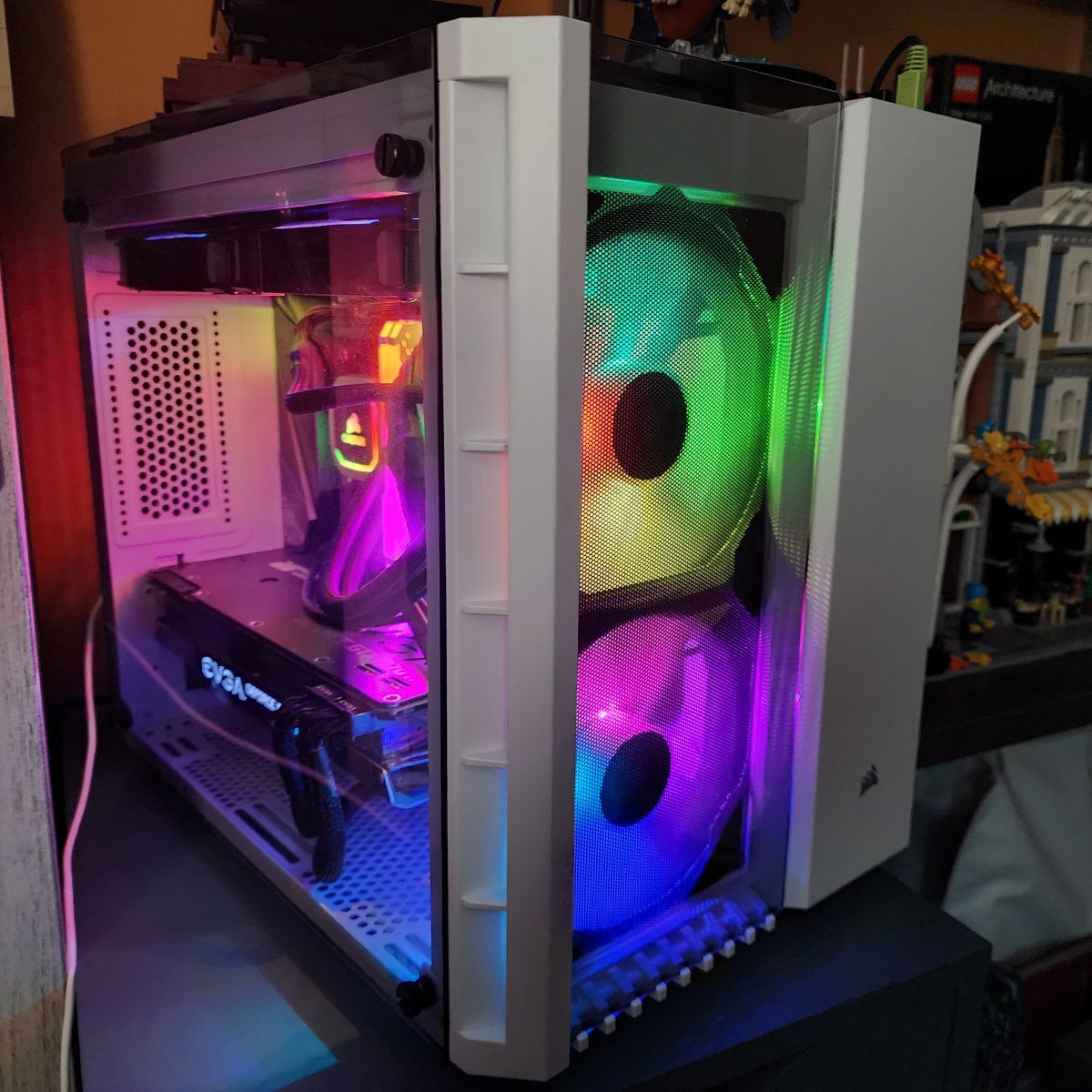
Of course I ended up adding an obnoxious level of gamer lights that still make me happy more than five years later.
Windows
In the past year I've added a new layer of color by using window films that look like frosted and/or colorful stained glass to let in more natural light while maintaining privacy, and the result has been very pleasing.
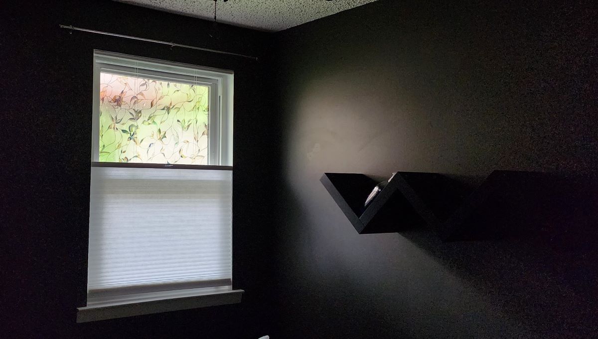
Also, replacing most of the blinds with a kind that lets in more light and can be lowered from the top as well as raised from the bottom is a game changer. Some of the window film designs obscure more than others, allowing variance in the balance of privacy versus seeing outside.
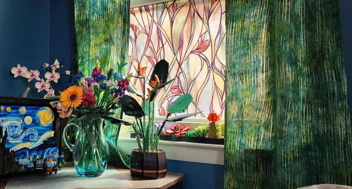
This corner in particular has become one of my favorite spots, especially during the brief periods in the spring and fall when the weather is amenable to opening the window. The Lego sets on the desk were collected there for the picture and are now part of the decor around the house, but the succulents stay on that windowsill.
Choosing a New Color
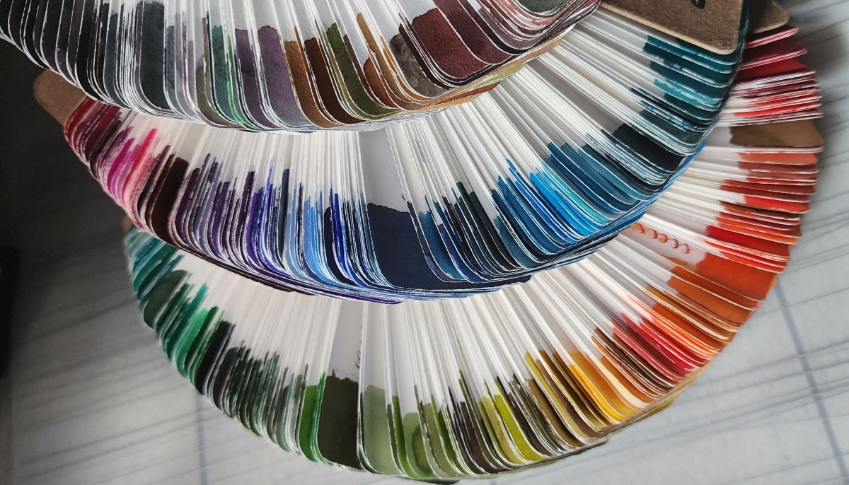
So, why are all these uses of color on my mind at the moment? This summer a window of opportunity presented itself to clear out the living room, take everything off the walls, and turn it into a construction zone for several weeks to catch up on some long-overdue maintenance, including sanding and cleaning up the paint job. I've enjoyed the original bright green, but I didn't have any rooms with a shade I would consider "my green", so off to the hardware store I went to get swatches and samples.
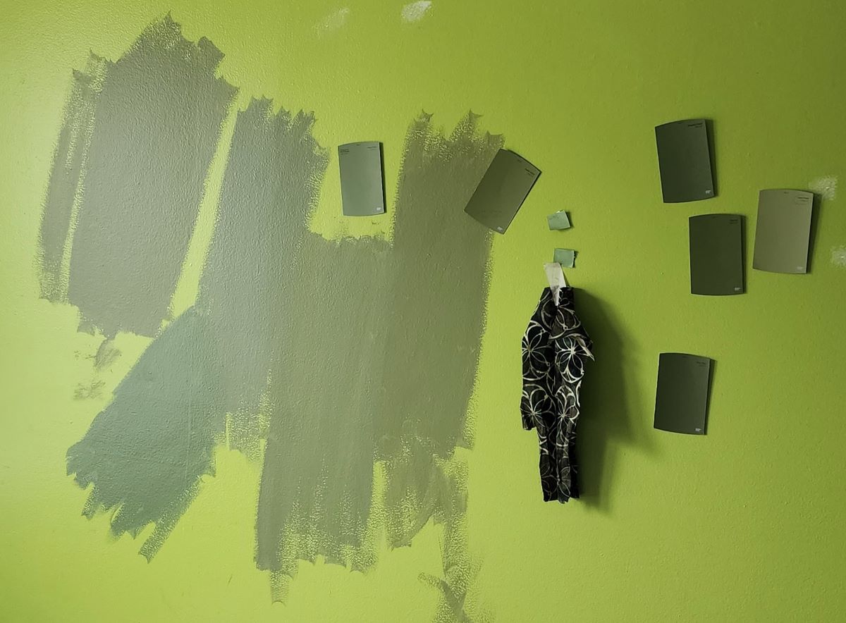
The vibrant green of the current paint really affected my perception of the potential new paint colors, even when I got samples to paint on the walls. The colors vary a lot with the light anyway, but that strong color made it even more difficult to see what the new colors might look like.
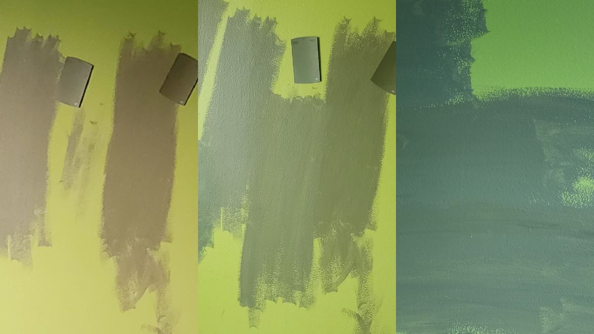
I ended up painting a couple coats of white primer after sanding/patching the walls before I felt like I could actually see what the final color would look like and make the decision.
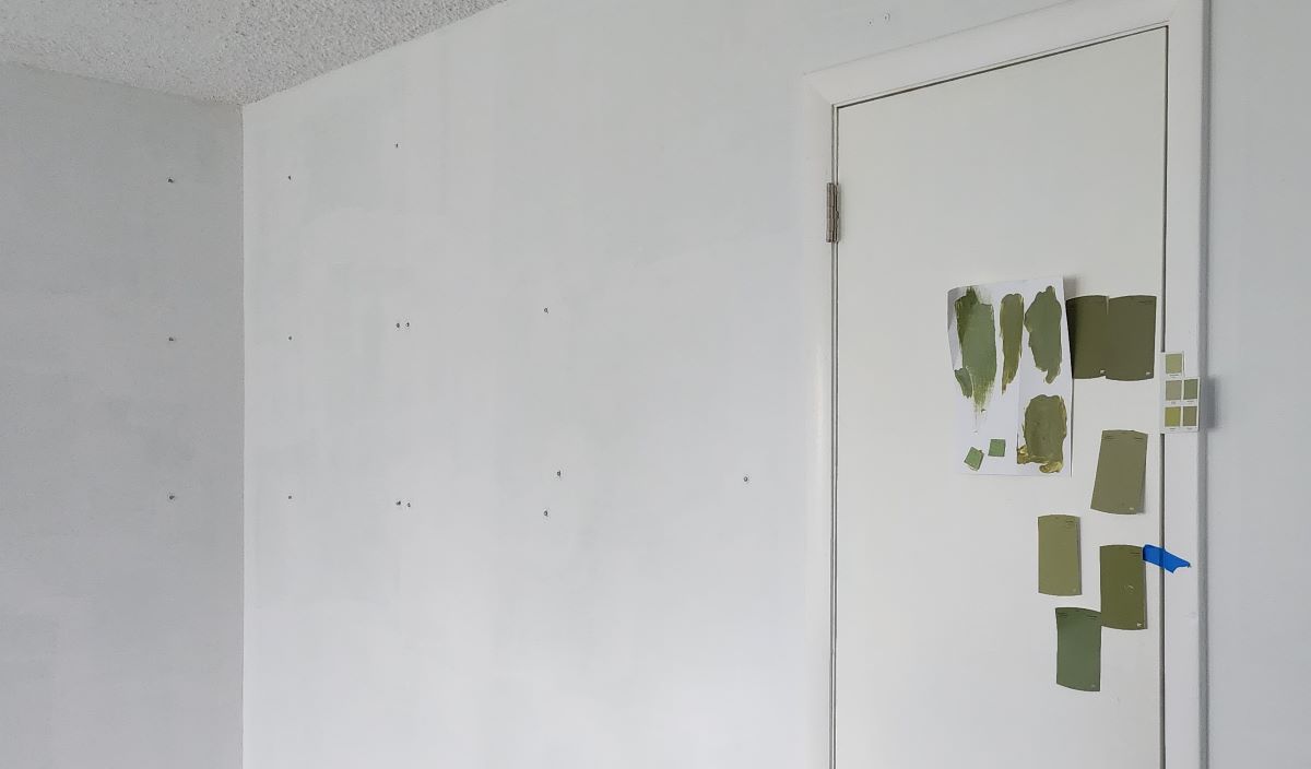
I'm glad I went through the process of creating a neutral base and getting actual paint samples. The color I ended up choosing looked good on the swatch, but appeared like a weak blue gray against the old paint which was not what I was looking for. Once I painted the samples over the white primer and observed the color throughout the varying light of the day, I was finally able to make a choice.
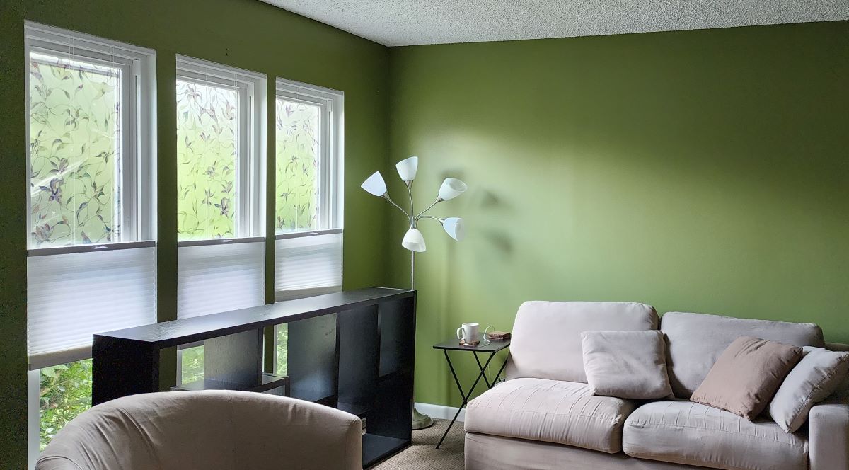
Now the final paint is a rich, soft green. It feels good to exist in this space.
The Road to Ink
So what's the takeaway? Why am I writing about house paint and RGB lights? Well, when I started paying attention to my perhaps outsized relationship to color throughout my life, and how I'd been using it to make my living environment comfortable and engaging, it seemed obvious that colorful fountain pens and ink would be a natural fit. Is there really any surprise that a spread of Col-o-ring ink swatches would draw me in and make me want to create my own?
For me, fountain pens and inks have become an extension of making color an intentional part of my daily environment, something that can travel with me when away from home. These interesting colors and variety in pens make me want to write out the schedules and to-do lists that help keep my life on track, and prioritize the time to explore and create on a regular basis.