To close out a year filled with exploring and collecting inks like Pokémon, I reflected back on 23 inks that stood out most in 2023. This list is roughly in the order of when I first encountered or spent time with an ink and isn't limited to inks released in 2023—any inks that crossed my path and made an impression during 2023 were considered.
Inks #1 & #2 Sailor Yurameku Dategokoro & Sukigokoro
Early in 2023 the second set of Sailor Yurameku inks became available, five dark shades that could develop a coppery-red effect on certain papers that is like sheen but a bit different from anything I'd seen before. The purple Dategokoro and green Sukigokoro inks stood out as the two with the most vibrant base colors so I've picked those two for this list.
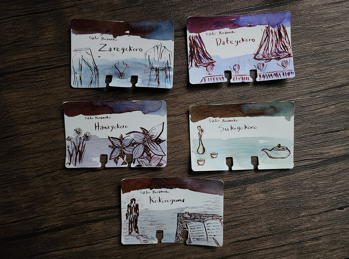
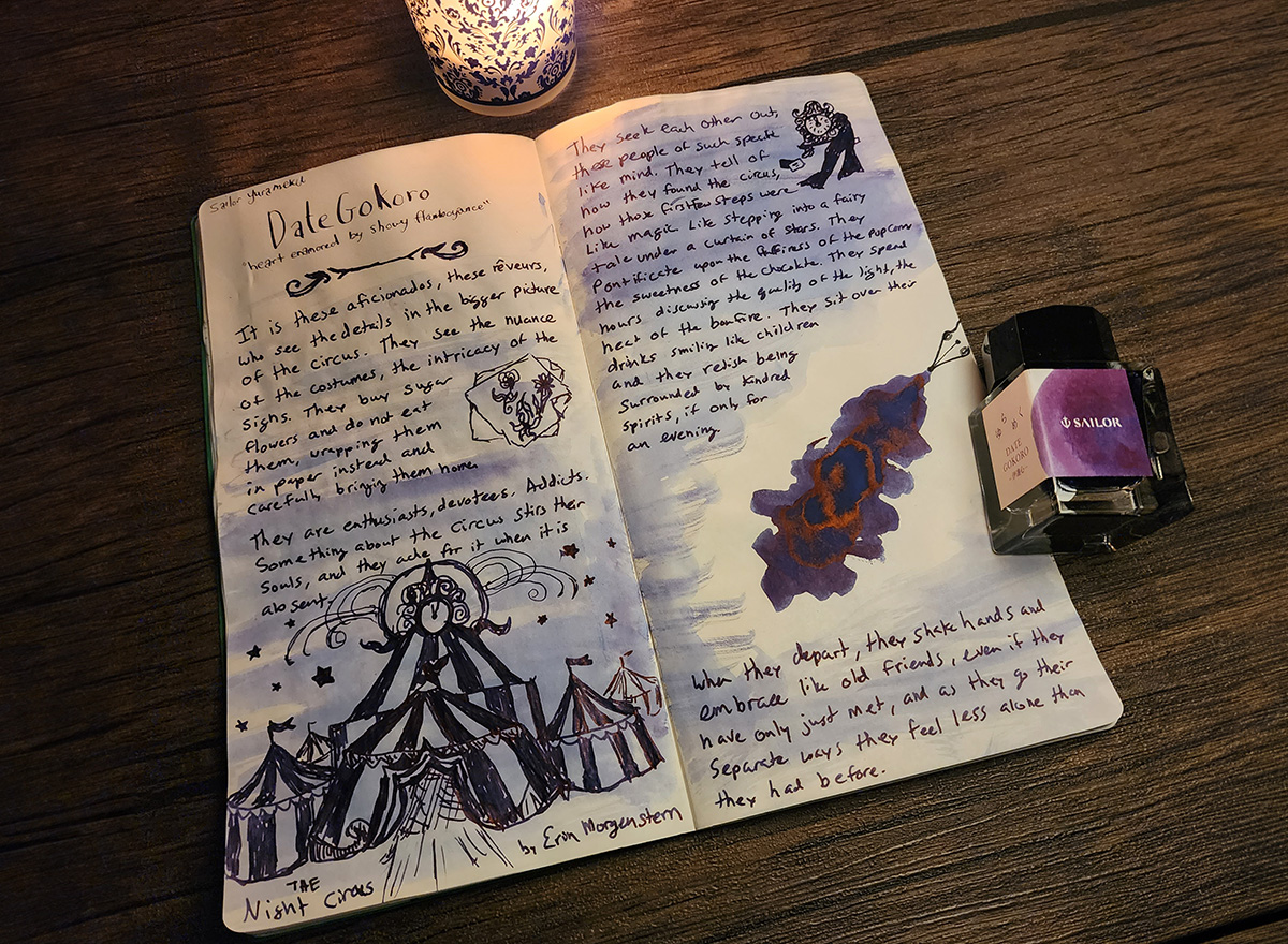
The Sailor Yurameku series inks are meant to vary in color based on the paper and change over time, and the 2nd Edition inks feature colors inspired by the fluctuating moods or aspects of the heart / mind. On Sailor's website Dategokoro is described as "Glitz, glamor mind" and Sukigokoro is "Graceful, quaint mind." I found other information through translation and a thread on Reddit about the inspirations for these ink names that contributed greatly to how much I've enjoyed exploring these inks. Those descriptions inspired elaborate sketches in my Col-o-dex and matching themes in my book journal. Dategokoro was also described as "showy flamboyance," referencing flamboyance in kabuki and other entertainments, a nice match for The Night Circus by Erin Morgenstern.
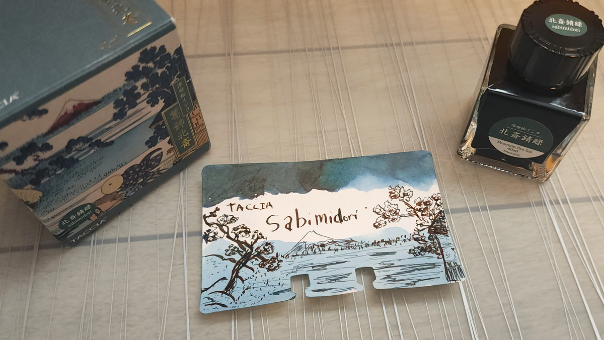
Ink #3 Taccia Sabimidori
In the spring of 2023 I attended my first pen show in Atlanta, and one of the first things I did was visit the Carolina Pen Company table. There were a few inks available to choose from for a test fill, and I chose Taccia Sabimidori. I enjoyed the ink so much in my new pen it wasn't long before I made my way over to the Vanness table to pick up a full bottle. By evening it was clear that this was a much-discussed ink at the show.
A rich teal with red sheen, this ink has a lot of character so I'm not surprised it's received so much attention this year. The gorgeous artwork and gold foil on the box makes this a very giftable ink.
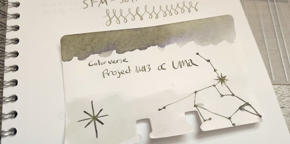
Ink #4 Colorverse α UMa
I wasn't intending to pick up much ink at the pen show, but while flipping through the ink swatch book at the Dromgoole's table there was one swatch that caught my eye. They didn't have a bottle there, so I went on a quest to see if anyone else had it and eventually spotted it for sale at another table.
Colorverse α UMa is a gray ink that can develop bright yellow-green and dusky purple hues that really set it apart. It reminds me of Sailor 123 but I haven't come across any other chromashading ink with this combination of hues.
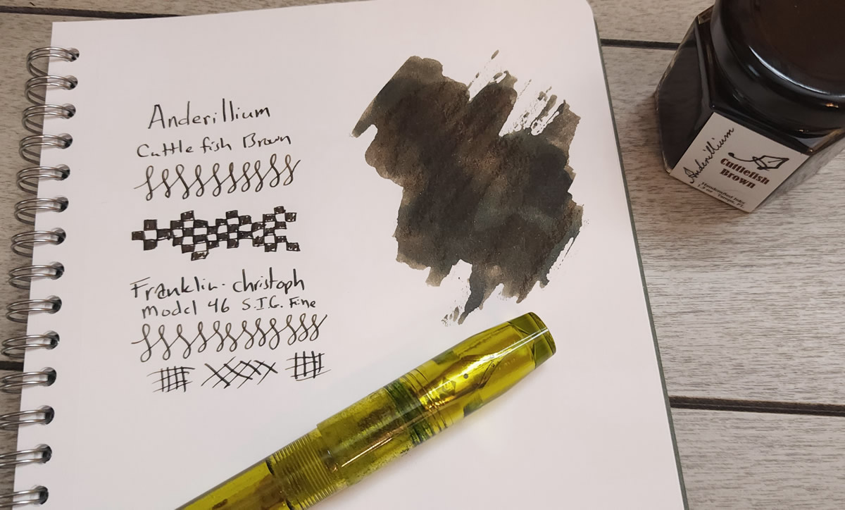
Ink #5 Anderillium Cuttlefish Brown
The first Anderillium ink I tried was this Cuttlefish Brown which I got as a free sample of with an order from The Gentleman Stationer, and it surprised me by being a very interesting pairing with my Franklin-Christoph Model 46 Olivae pen that has a fine S.I.G. nib. This dark brown ink can have quite a bit of black sheen, but with the S.I.G. nib (which is similar to a cursive italic or stub with thin horizontal lines and thick vertical lines) the sheen doesn't dominate and instead there's some nice variation between brown and black.
I enjoy a series of inks with a fun theme, so I've continued to collect bottles or samples of the rest of the "Cephalopod" series (naturally) and I've enjoyed many of the inks in the subsequent "Lepidopteran" series as well.
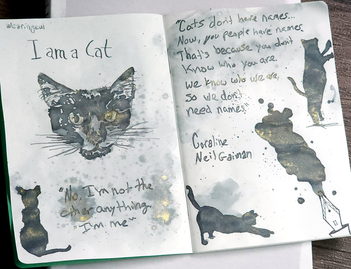
Ink #6 Wearingeul I am a Cat
The Wearingeul I am a Cat ink is a cool medium gray with striking gold shimmer, like the bright eyes of a cat, that I used to add the book Coraline by Neil Gaiman to my book journal.
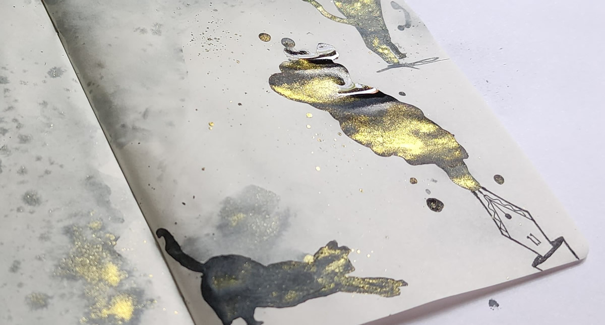
The journal page included a couple of quotes from the cat in the book and some cat silhouettes, but I also lightly traced a picture of my beloved void cat to create the sketch which became my favorite piece from all of 2023. A Wearingeul Instagram account even re-posted the image, so hundreds of people had the opportunity to see my sweet Boo's face captured in the glistening ink.
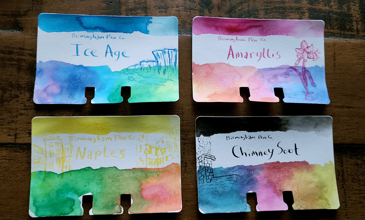
Inks #7, #8, #9, & #10 Birmingham Pen Co. Everlasting Atomink: Ice Age, Amaryllis, Naples, and Chimney Soot
These four water-resistant pigmented inks were sold as a set of essentially "CMYK" colors (cyan, magenta, yellow, and black) that can be mixed to create a whole rainbow of colors. I had a lot of fun exploring the range of colors that could be produced.
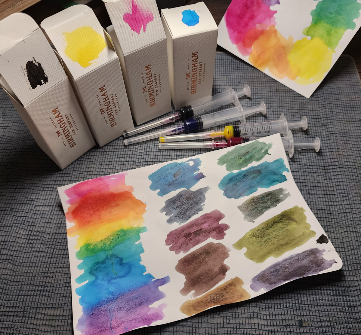
Since my primary use cases for wanting a water-resistant ink are for artsy things or correspondence (like on a postcard or envelope that might be exposed to water during transit), being able to mix the color I'm looking for or just use them like paints is very useful.
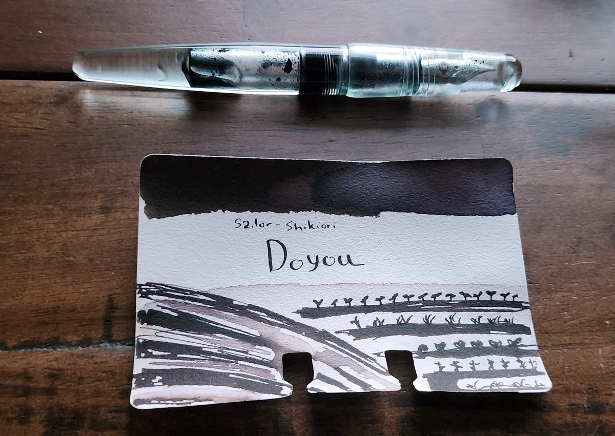
Ink #11 Sailor Shikiori Doyou
I haven't used black ink much in fountain pens—with all the rainbow available it hasn't been a priority. But, I had some pink staining from another Sailor ink in a Franklin-Christoph P66 Antique Glass pen, and while the staining didn't bother me too much I had heard Sailor Doyou described as a "cleaner ink" that could help remove stains. Curious, I picked up a bottle of Doyou and was pleased to discover that it has seemed to remove most (if not all) of the pink staining and been a delightful, low-sheen black I've actually enjoyed using while it's been in that pen.
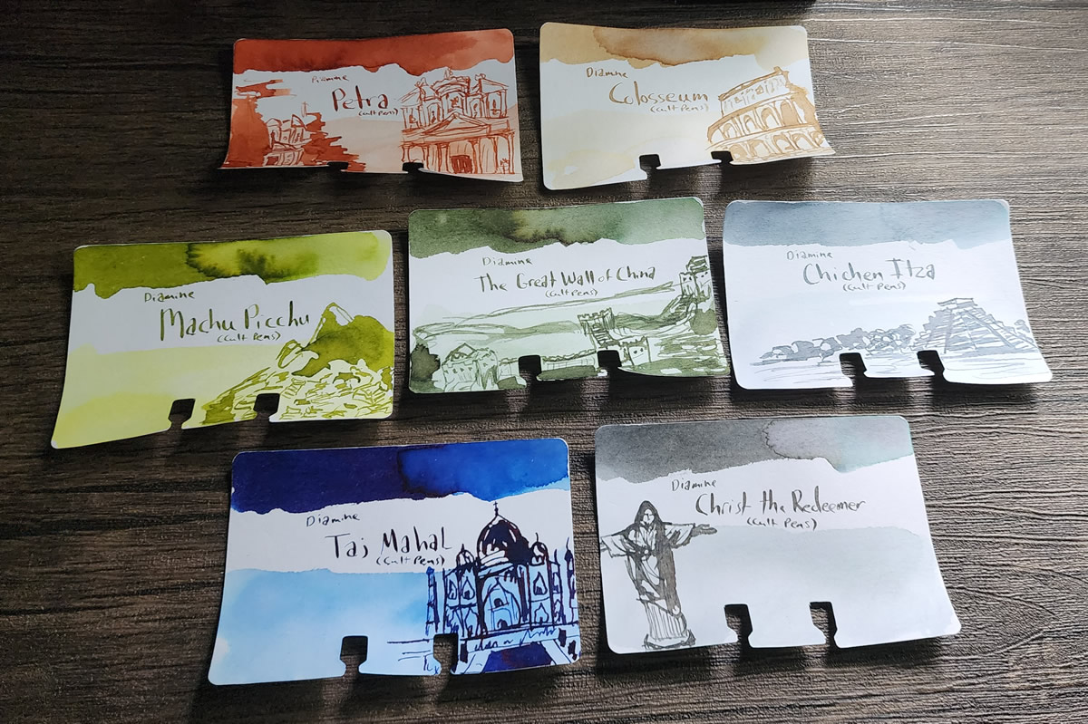
Inks #12 & #13 Diamine Petra and Machu Picchu
The Cult Pens' exclusive Diamine Seven Wonders of the World is another ink series that really captured my attention in 2023. The striking landmarks that inspired the colors of the ink became a keystone moment in finding and embracing the artistic style that I want to nurture and grow for myself.
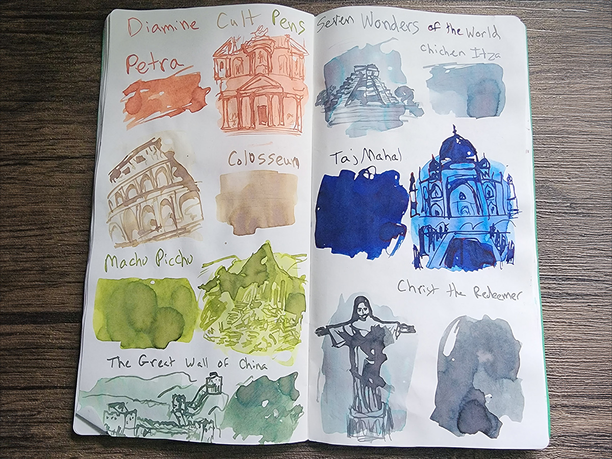
I love the way all these inks look together, but so far the bright green Machu Picchu and rusty red-orange Petra have been my most used and favorite inks in the set.
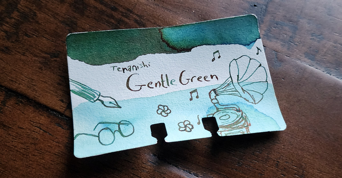
Ink #14 Teranishi Guitar Gentle Green
I saw a swatch of this ink online, and the shading between green and blue with a little reddish sheen immediately caught my attention. In fact it reminded me a lot of Taccia Sabimidori, but more green instead of teal. Once I found a bottle, it quickly became a favorite ink. Initial writing tends to look very blue, with the ink changing rapidly to green as it dries—though paper like Cosmo Air Light retains more of the initial blue.
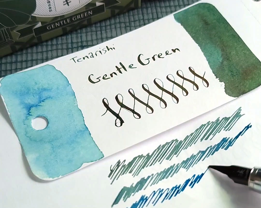
Finding this ink has led me to explore many more lovely inks and other products from Teranishi, but this ink remains a standout that I've kept in at least one pen since I got it.
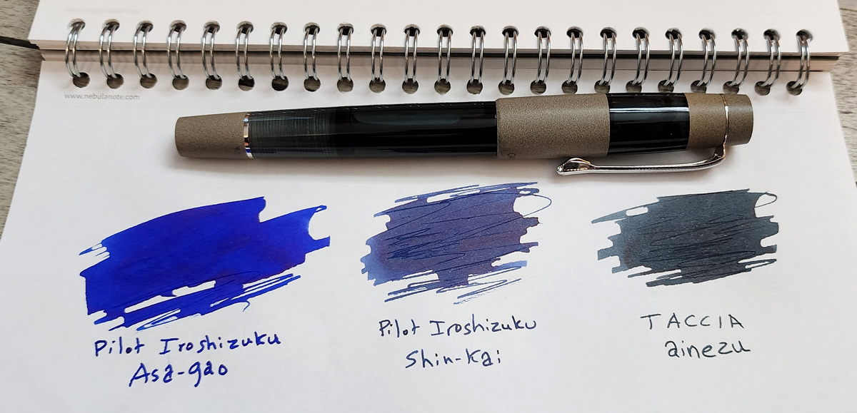
Ink #15 Taccia Ainezu
Taccia Ainezu may be fairly called a gray ink, but I have thought of it as a blue-black that leans gray and slightly green. And, it turns out that's exactly what I'm looking for in a blue-black ink, even if that's not typical. Paired with the Opus 88 Koloro in teal with a medium nib, this ink has been a joy to use.
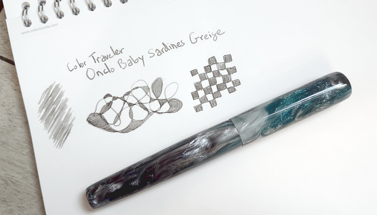
Ink #16 Color Traveler Ondo Baby Sardines Greige
Color Traveler is another brand I've enjoyed exploring this year, but this particular slightly-warm gray really clicked for me in a way I can't quite describe. Many of their inks are named after regional food dishes which is interesting to learn about, but there's just something about how this ink looks more like my expectation for "pencil" than an actual pencil that is really pleasing. Most pencil lines have a shiny finish, but this soft medium gray is delightfully matte.
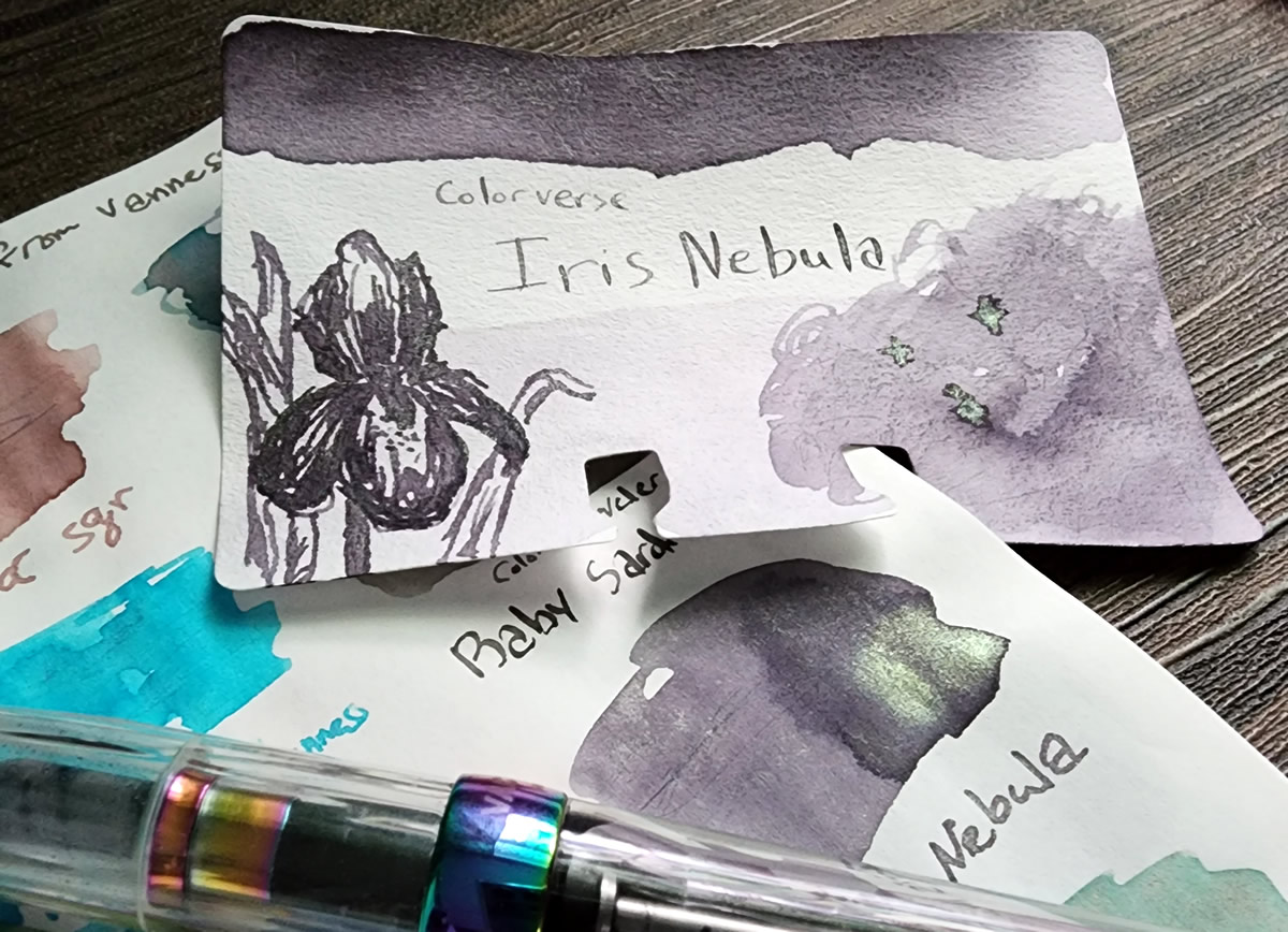
Ink #17 Colorverse Iris Nebula
There were a few nebula-themed Colorverse inks I was curious about so I got samples to try, and Iris Nebula stood out as my personal favorite from the bunch. A dusky gray purple with multi-color shimmer that looks green, blue, and gold, this is the ink I got a full bottle of and it remains a favorite among all my shimmer inks. Fittingly I've been using this ink in the TWSBI Vac 700R Iris.
Ink #18 Kyo No Oto Sakuranezumi
The Sakuranezumi, "cherry blossom mouse," ink was a nice purple ink sample I ordered from Yoseka earlier on in the year that became more significant later on when the corresponding TAG Sakuranezumi pen came my way and I learned more about the inspiration for the name.

I saw in a few places that the name "Sakuranezuma" was in reference to a poem in the Kokin Wakashu (an anthology of Japanese poetry) that calls upon the cherry blossoms to bloom in a color tinged with or resembling ink, as an expression of grief and mourning of the deceased. This discovery corresponded with acute and ongoing grief in my life so I could appreciate the longing for the natural world to mourn with you, at least for a season. It remains a beautiful ink (and pen).
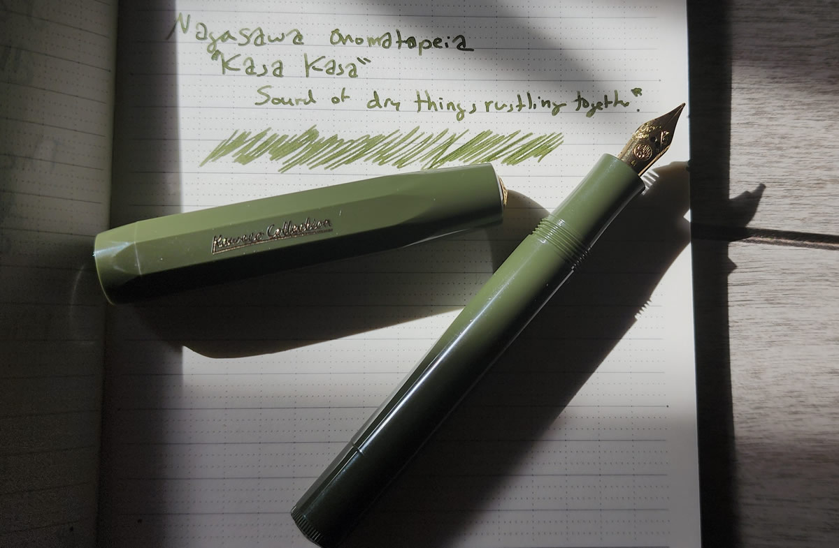
Ink #19 Nagasawa Onomatopoeia Kasa Kasa
This is a shade of green that I really like, but the fact that it was part of a series of inks named after Japanese onomatopoeia took the experience of this ink to the next level. According to the product description, "kasa kasa" describes the light rustling sound of leaves or other small, dry things brushing against each other. This creates a multi-sensory experience by evoking a familiar sound to accompany the color of the ink. Kasa Kasa pairs nicely with the Kaweco Sport in Dark Olive, perfect for autumn.
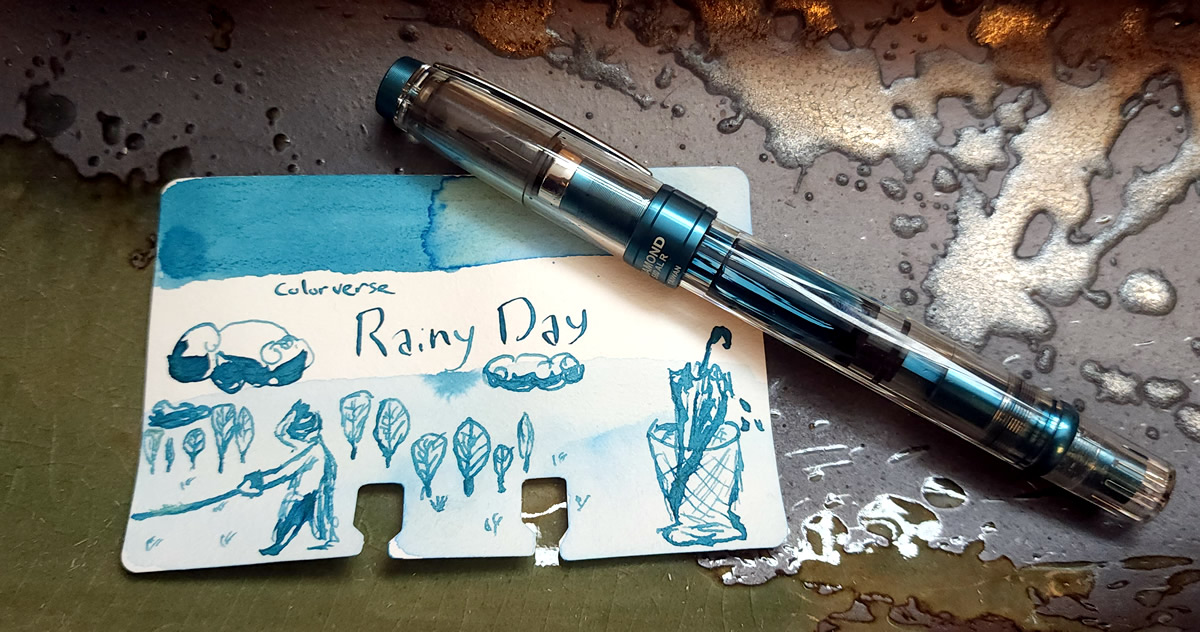
Ink #20 Colorverse Rainy Day
Colorverse Rainy Day surprised me first by being brighter and more vibrant than I expected based on the name, and second by being a very pleasing pairing with the TWSBI Diamond 580 Prussian Blue pen. I found myself reaching for this pen specifically because I enjoyed the ink and the pairing so much.
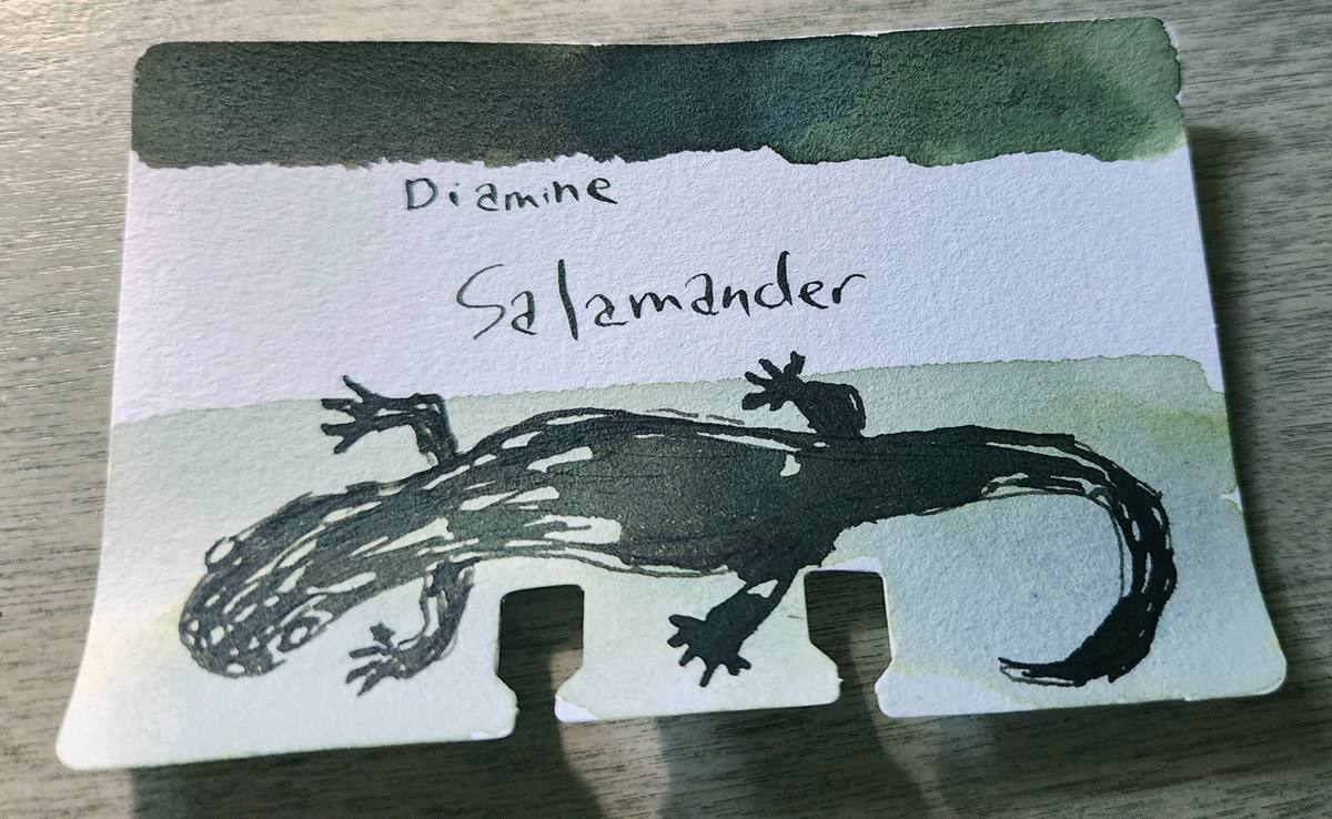
Ink #21 Diamine Salamander
This year I started trading ink samples with pen friends, and Diamine Salamander is one of the inks that came to my attention via a trade. This ink is another delightful multi-shading green that kept surprising me as I tested on different papers. I've seen greens lean either more blue or more green on different papers, but Salamander also leaned quite brown in some cases. I've enjoyed writing with it, but this is also an ink that I know will do lots of interesting things when used in an ink wash or for sketching.
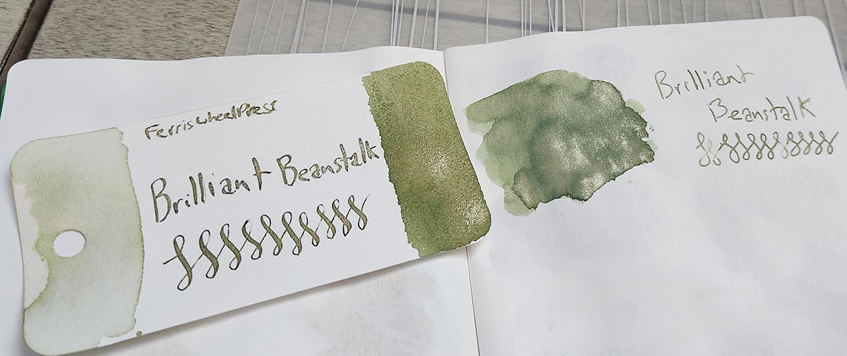
Ink #22 Ferris Wheel Press Brilliant Beanstalk
This sage green ink with champagne shimmer helped me realize how much I enjoy metallic tones that fall somewhere between somewhat cold blue of silver and bright (sometimes gaudy) yellow gold. Brilliant Beanstalk feels earthy even with the shimmer, a color I'd be happy to include in both fall and spring color palettes.
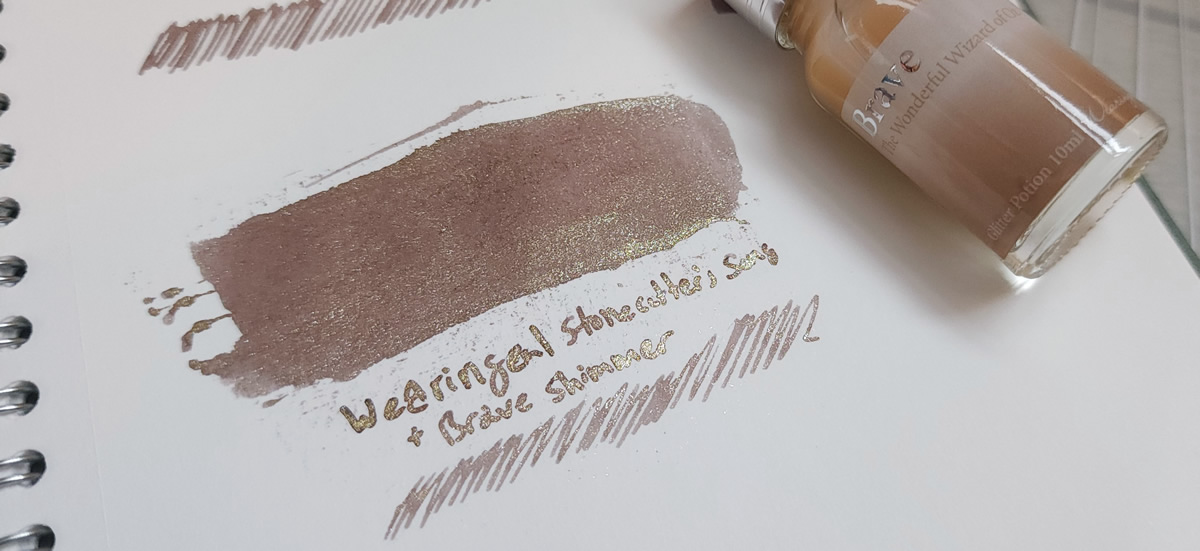
Ink #23 Wearingeul Stonecutter's Song + Brave Shimmer Potion
Another first in 2023 was mixing a few shimmer additives from Pennonia and Wearingeul into inks to create my own shimmer ink combinations. I stuck to only mixing ink and shimmer within the same brand to minimize the chances of unexpected reactions, but overall I'd say all the resulting shimmer inks worked pretty well. The gold and silver "Brave" shimmer potion in particular seemed to enhance any ink it was paired with, but my favorite combination was with the warm brown-gray of Stonecutter's Song.
Based on my general dislike of regular glitter (that gets everywhere!), I would never have expected to enjoy shimmer inks—much less get whole bottles of shimmer "potion" / additive! Still, since it doesn't take very much of the shimmer additive I don't think I'll ever use up these bottles on my own so I've been enjoying putting a small amount into sample vials to share where someone can just add their chosen ink to try their own mixes. Sharing and trading inks has certainly been a highlight in 2023 that I expect to do even more of in 2024.