Ok, hide your wallets (or don't, I'm not your financial advisor)—it's time for me to recount the most memorable inks I encountered in 2024. Looking back, this was a year filled with shimmer, the search for interesting blues, readable yellows, and earthy browns, and as always collecting all the best swampy inks.
About halfway through the year I started swatching inks that caught my attention into a little pocket notebook—by the end of December there were 138 swatches in the "shortlist" of interesting inks encountered in 2024. Colorverse, Dominant Industry, Sailor, and Birmingham Pen Company were all heavily represented in this list. I also tried a few newer or new-to-me brands like The Wet Pen, Kuretake, and Endless Alchemy, and expanded my experience with brands like Color Traveler and Lennon Tool Bar. I find picking "the best inks" or "my favorite inks" impossible, so here are 24 memorable inks from 2024.
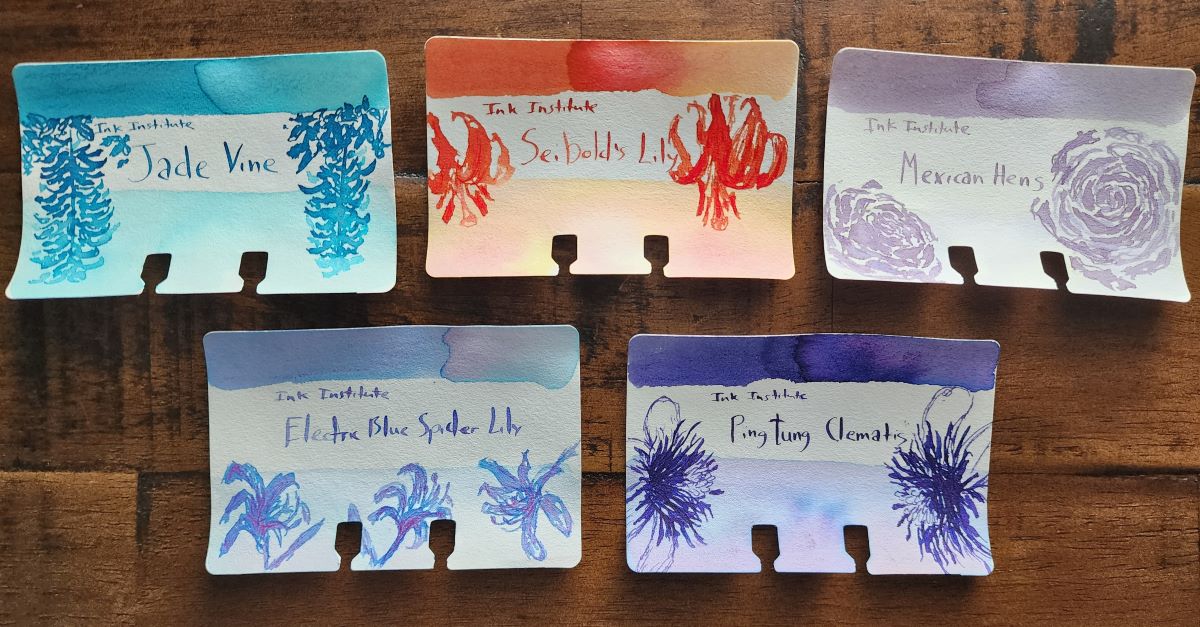
Ink #1 Ink Institute Electric Blue Spider Lily
One of the very first inks I ever got was a flower-inspired shade from Ink Institute called Jade Vine, so when there were more floral-inspired, chromashading Ink Institute inks released I was interested. They are all pretty interesting, but while I've seen some Sailor inks that are close, I haven't seen another ink with quite the same range of chromashading from neon pink, to dusty purple, to electric blue that Electric Blue Spider Lily has. It's a light ink that needs to be matched with the right pen, nib, and paper to get the full effect, but when you do there's nothing else I've seen quite like it.

Ink #2 Teranishi Guitar Emotional Olive
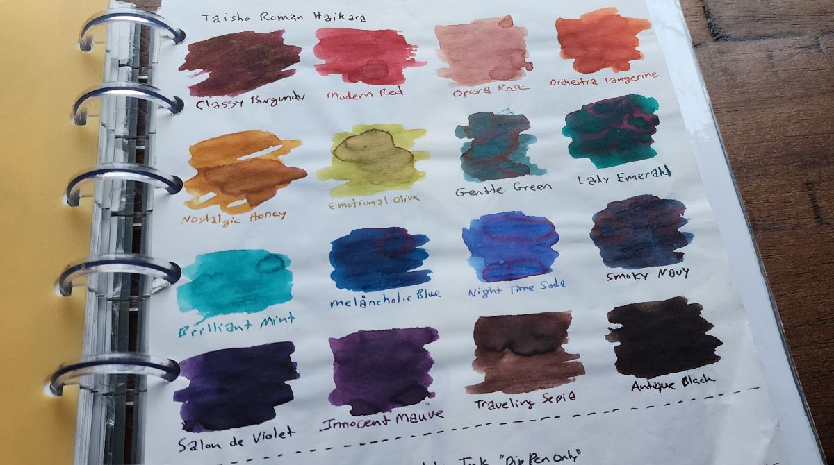
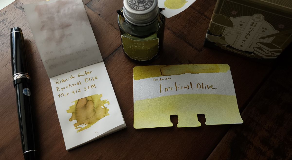
After seeing swatches online and tracking down Teranishi Guitar Gentle Green last year, I worked on collecting samples or bottles of all 16 inks in the Teranishi Guitar Taisho Roman Haikara line.

I think this whole line is really strong, but unsurprisingly I strongly connected to both the name and color of Emotional Olive. I've had this inked up in a Pilot 912 with a SFM nib most of the year and the soft nib really shows off the interesting shading in this ink. It's generally more yellow-brown than a typical yellow-green, though it varies a bit based on paper and amount of ink.

Ink #3 Teranishi Sai Yellow
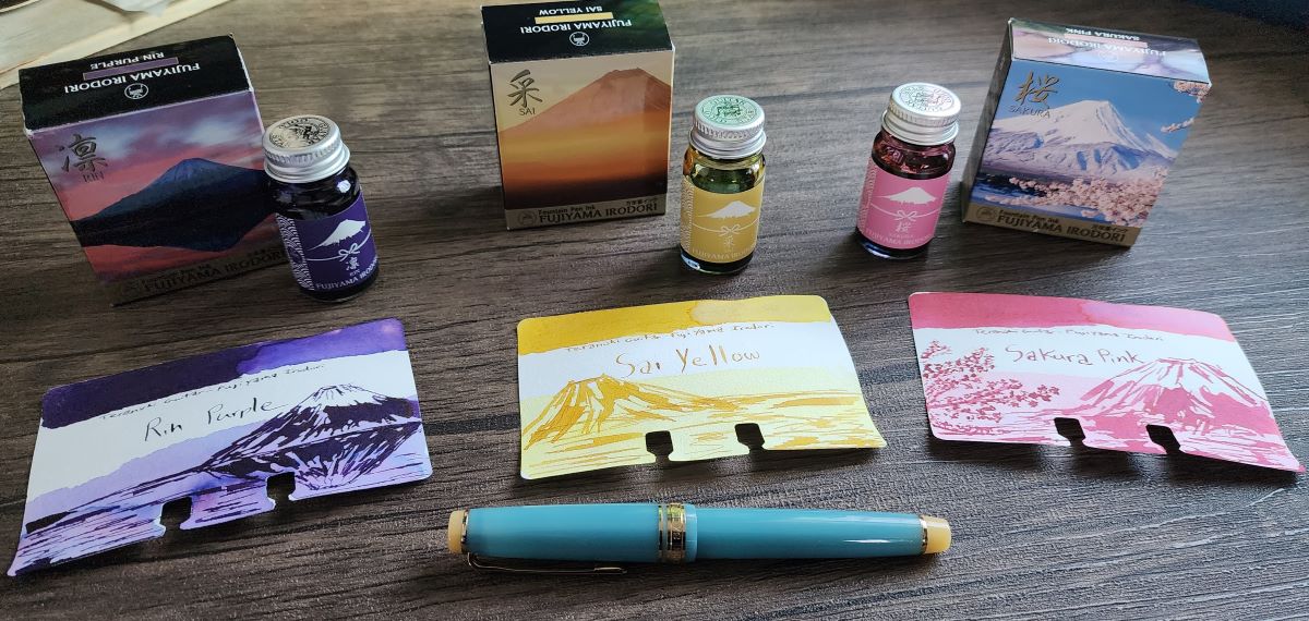
I was enjoying the Teranishi inks so much I didn't stop with the Taisho Roman Haikara line. I found another set of six inks, Fujiyama Irodori, inspired by different views of Mount Fuji and picked out three colors to try.

Yellow inks are a challenge, since yellow really only exists in lighter shades which are often difficult to read on white or cream paper. A "dark yellow" becomes a shade we are more likely to call brown or orange or green. Yellow is becoming more of a favorite color for me, and I had one pen in particular that I wanted to find great yellow inks for, and I think this Sai Yellow has been the best pairing I've tried. It doesn't lean into orange or green tones, and is just dark enough to be readable without too much difficulty.
Ink #4 Dominant Industry Fisherman at Sea
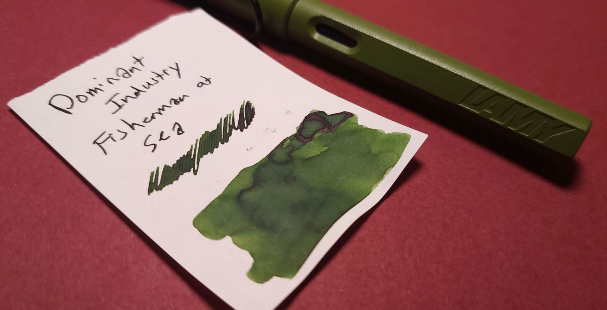
This was an ink that hit my radar when an early teaser swatch and the painting it was inspired by were shared on instagram, I immediately wanted to know more about this moody green. It's a pleasant shading green with just a hint of red sheen—nothing too fancy, just an enjoyable ink.

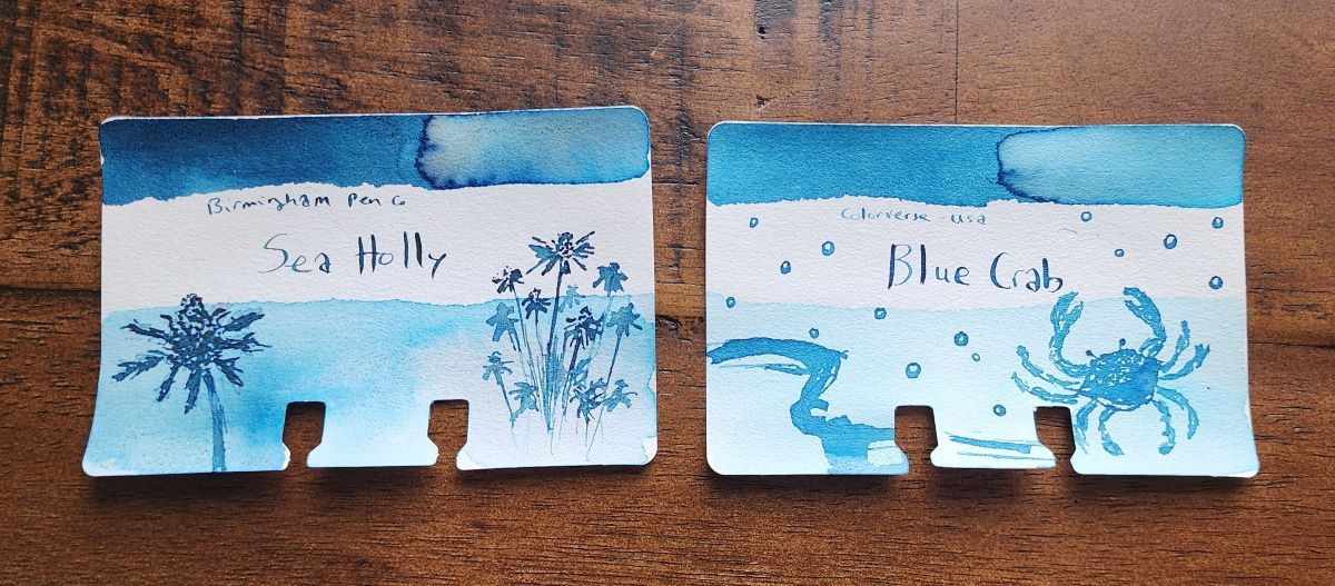
Inks #5 & #6 Colorverse Blue Crab & Birmingham Pen Company Sea Holly
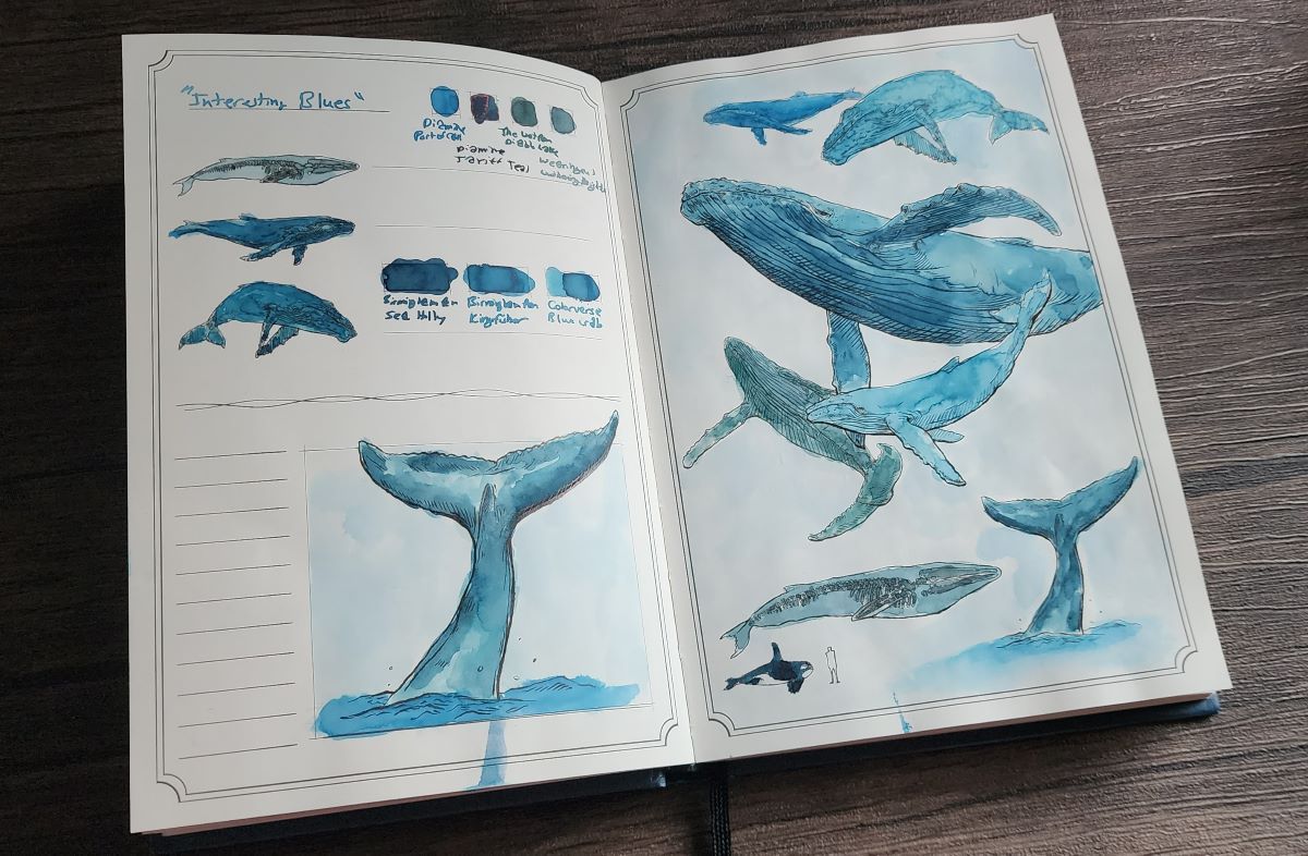
The typical bright blue pen ink color never really appealed to me. When presented with either blue or black standard pens I would always choose black. But I do like the color blue, and Colorverse Blue Crab is one of the inks that caught my attention and made me want to explore shades I liked that were truly blue—not blue-gray, not blue-green, not blurple, etc.

Colorverse Blue Crab, part of the USA series representing Maryland, remained one of my favorite blues. Birmingham Pen Company's Sea Holly is a darker, rich blue that also rose to the top of the list.

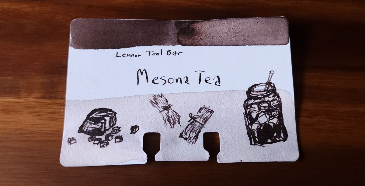
Ink #7 Lennon Tool Bar Mesona Tea
I tried out more Lennon Tool Bar inks over the last year—I like the earthy tones and interesting names inspired by teas or the spirits from Taiwanese tales. Brown is another shade I've been particularly interested in and the warm, slightly gray brown Mesona Tea pairs nicely with my Pilot Metal Brown Falcon.

Thanks to this ink, I learned Mesona is a plant in the mint family used to make a jelly (also called grass jelly) that can be served as a refreshing cold tea, a warming hot tea, or in desserts.
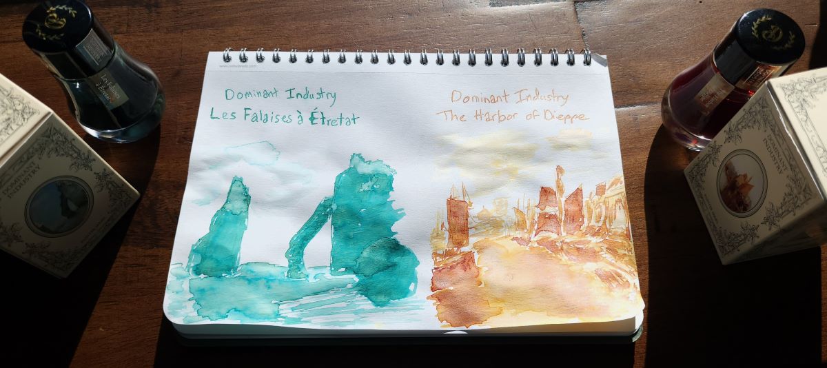
Ink #8 Dominant Industry Les Falaises à Étretat
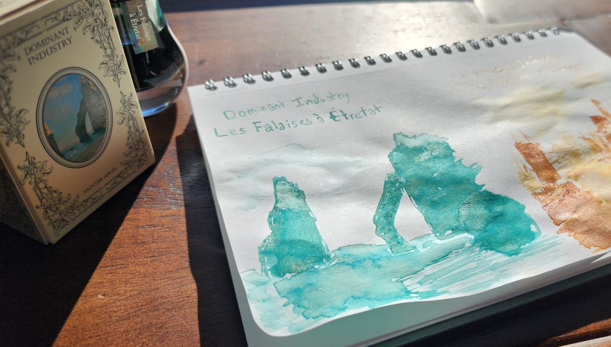
This is another Dominant Industry ink inspired by a work of art, Les Falaises à Étretat by Claude Monet, and it reminds me of the fun of sharing ink samples at pen shows after dark. This is one of those inks where I think the color of the ink and shimmer complement each other very well. Another ink from the painter series, The Harbor of Dieppe inspired by the painting by William Turner, was a close runner up with its golden brown shading and gold and pink shimmer.

Trying to accurately capture the shimmer in an ink is a daunting task, so you might have to just take my word that this is one of the most elegant shimmer inks I've used. The multi-color shimmer with the chromasading copper patina green ink is very striking, especially when the light hits just right.

Ink #9 Birmingham Pen Company Antique Aubergine
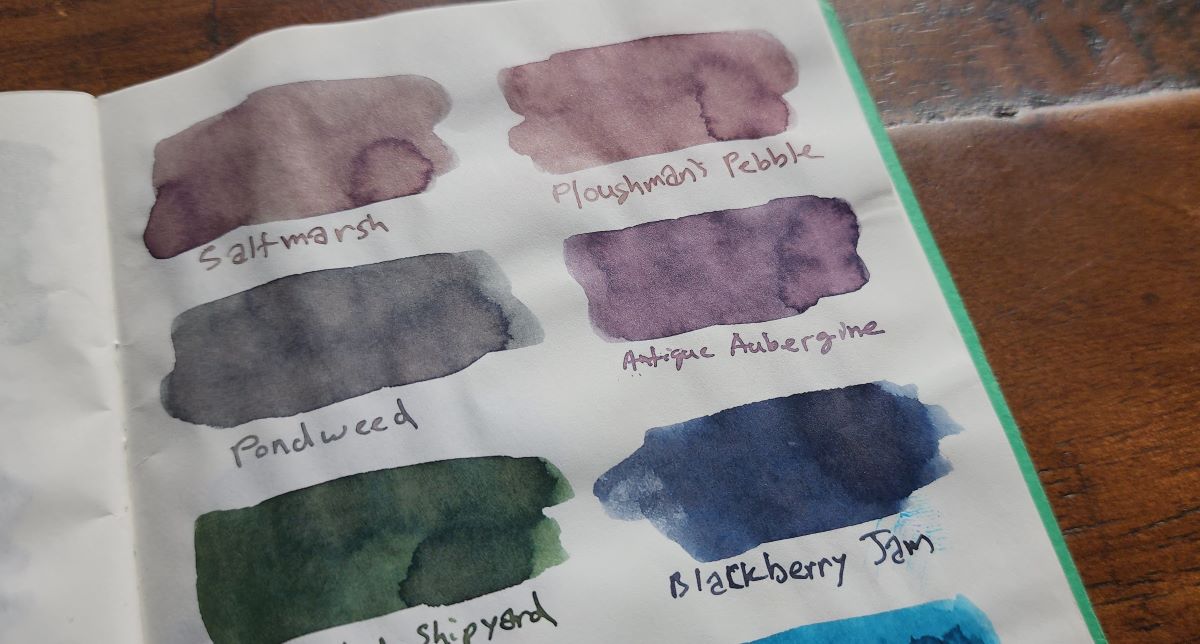
I like the range of dusty, earthy shades from Birmingham Pen Company. I got a few ink bundles with some really interesting weird inks with colors that are difficult to describe, but Antique Aubergine is a more straightforward shading dusty purple that I just kept inking up and enjoyed using.

Ink #10 Wearingeul Anubis
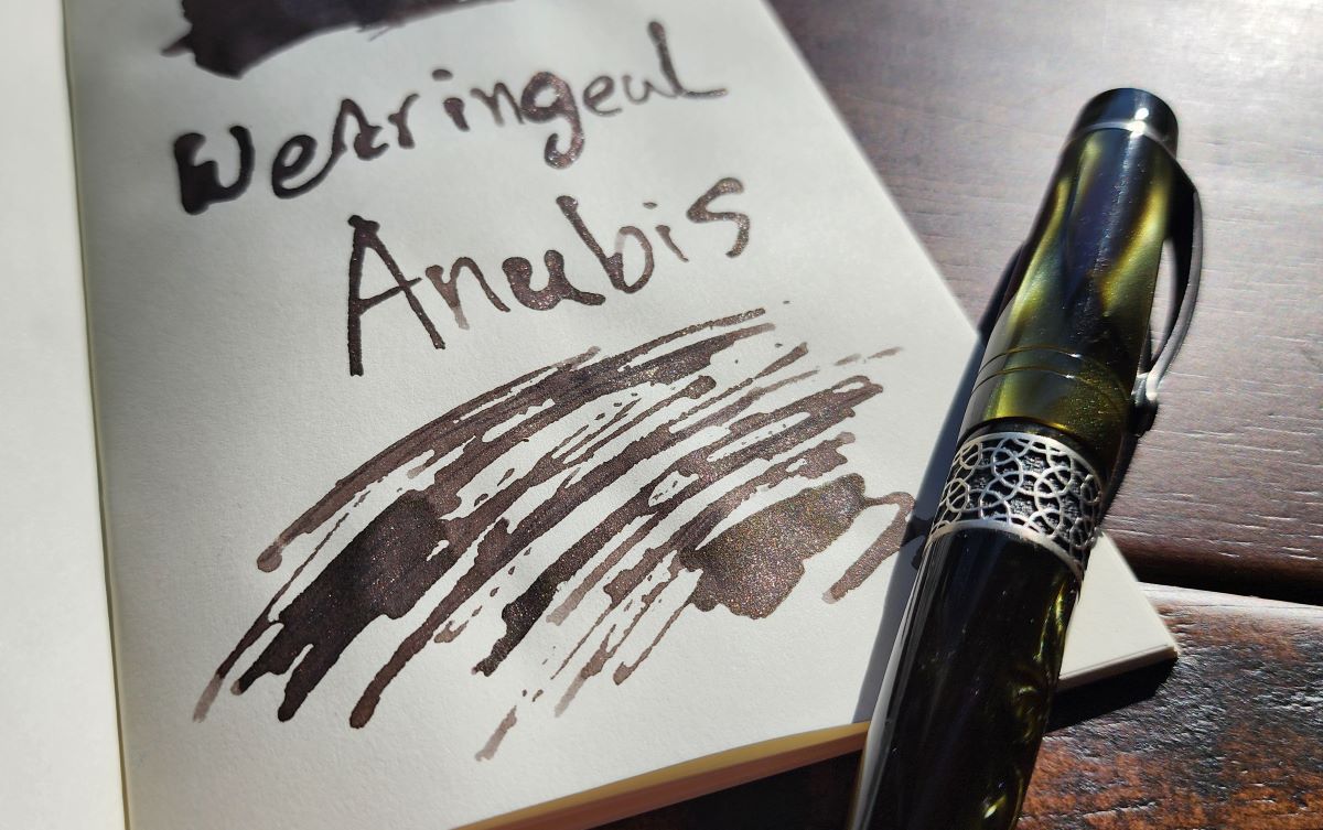
Wearingeul releases so many new inks that I haven't kept up with all of them, but Anubis is one that caught my eye with an earthy shade of warm gray brown and a rich mix of gold and copper shimmer. I got a sample first, then bought a full bottle. I paired this ink with a chatoyant dark green Kilk Celestial pen with silver hardware.

Ink #11 Robert Oster Pink Squirrel
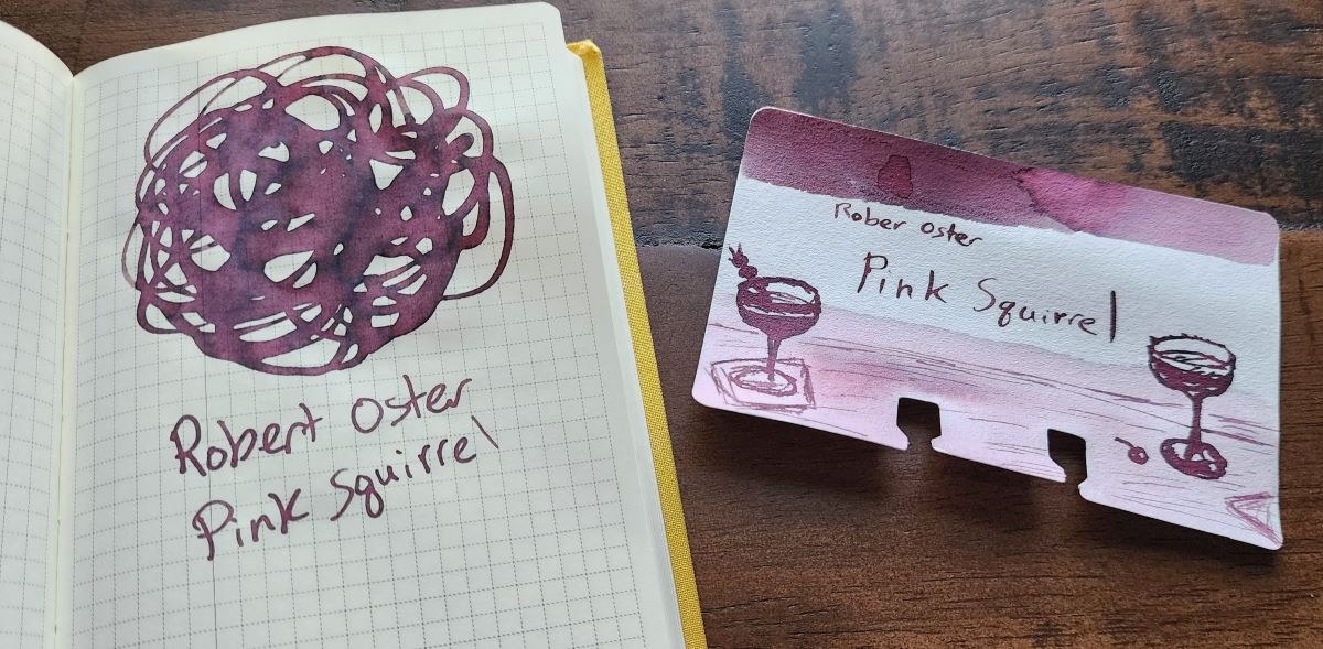
Reds and pinks tend to be the colors I'm least interested in, so I'm trying to explore more to figure out which shades I do like. I received a sample of this ink and later bought a bottle because this ink has a lot of character, with interesting shades of pink, purple, and gray.

This ink is part of a collection of drinks, so I learned that a Pink Squirrel is a creamy pale pink cocktail with flavors of chocolate and almond.
Ink #12 Dominant Industry Atlantis
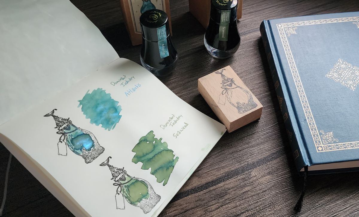
I really like both of the inks released alongside the Dominant Industry Ink Archiving Book, A Log of Atlantis. Seaweed is a complex shading green that appeals to my swampy ink-loving heart, but the blue-green Atlantis has a uniquely shiny blue shimmer. This ink has performed very well for me in a TWSBI Diamond 580 with a fine nib, even though sometimes the coverage of shimmer is so much I've done a double-take because it looks like a super-sheener. It's a very striking ink.

Ink #13 Color Traveler Yamanohaitochikou
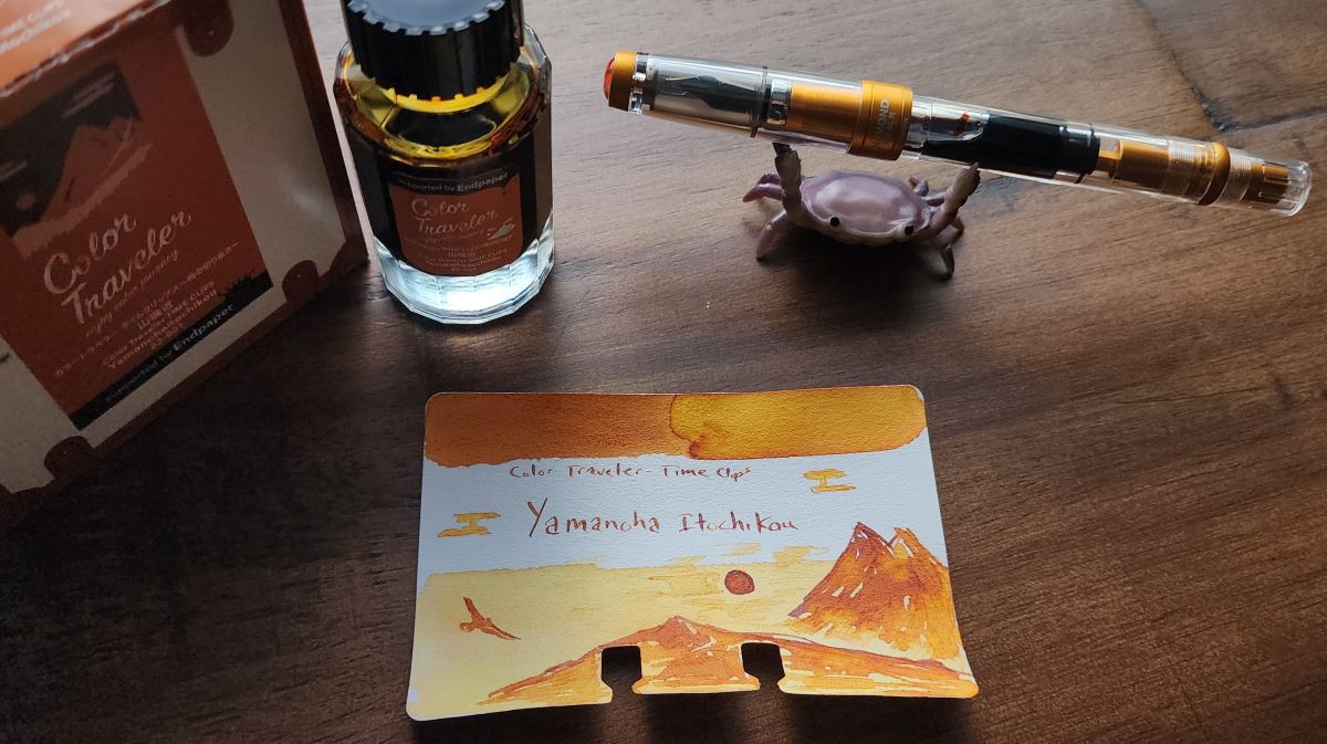
I have been very intrigued by the Color Traveler inks, but these are a little more expensive and not widely available so I've settled for trying out several samples. Anything I have tried has been really great, but the sample of this had such great shading between yellow and orange that I purchased a full bottle. These inks all have interesting inspirations for the name and color, but this ink is simply a gorgeous sunset in a bottle.

Ink #14 Colorverse Project No. 015 α Psc
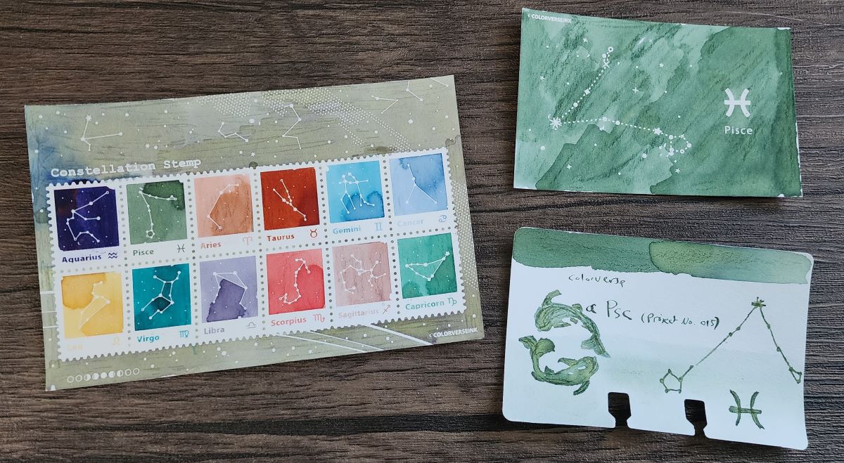
I love this shade of green, I don't even remember where I first came across this ink, but I loved it enough to get a 65ml bottle and it's one of my favorite go-to green inks. I was excited to try out the new Colorverse constellation ink resist swatch cards and collected samples of the other 11 zodiac constellation inks to fill out the swatch cards properly. While there are some other stand out inks in this set, α Psc remains my favorite.

Ink #15 Coloverse Loki Patera
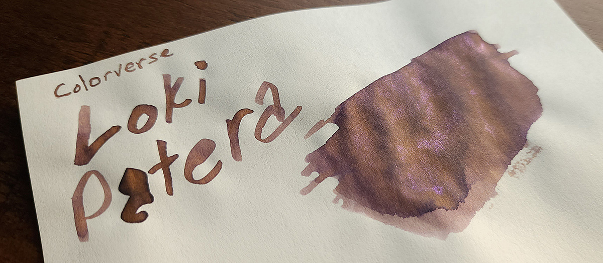
Colorverse Loki Patera is part of the "The Grand Expedition" series of six pairs of inks themed around Jupiter. I call these pairs of inks the "big bottle, little bottle" sets since each pair includes a 65ml bottle and a 15ml bottle. Loki Patera is the 15ml bottle in its set, named for the longest volcanic depression on Jupiter's moon Io. I enjoy digging into these names and learning new things, then being challenged to represent that in a sketch on a Col-o-dex card. This is a delightfully weird ink, an earthy warm taupe ink with shades of yellow, purple, and brown accented by a bright pink shimmer.

Ink #16 Robert Oster Pen Addict Fire on Fire on Fire
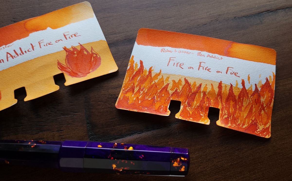
How do you take the signature orange Pen Addict Fire on Fire to the next level? Add more fire! In this case, more fire means shimmer. A trial batch of this shimmery version of the Pen Addict exclusive ink was released in 2024, and I think I've sampled out over half of my bottle so more people could try it out. When swatching this ink I noticed that the color of the coppery shimmer can look either shiny bright or metallic dark depending on the angle, which is not something I've noticed in a shimmer ink before.

I've had this ink in my Pen Addict x Benu 15th Anniversary Euphoria pen (with a cool Scythe grind from Kirk Speer) since it arrived and it's performed really well, even with lengthy gaps in usage. 3 out of 3 flames! 🔥🔥🔥
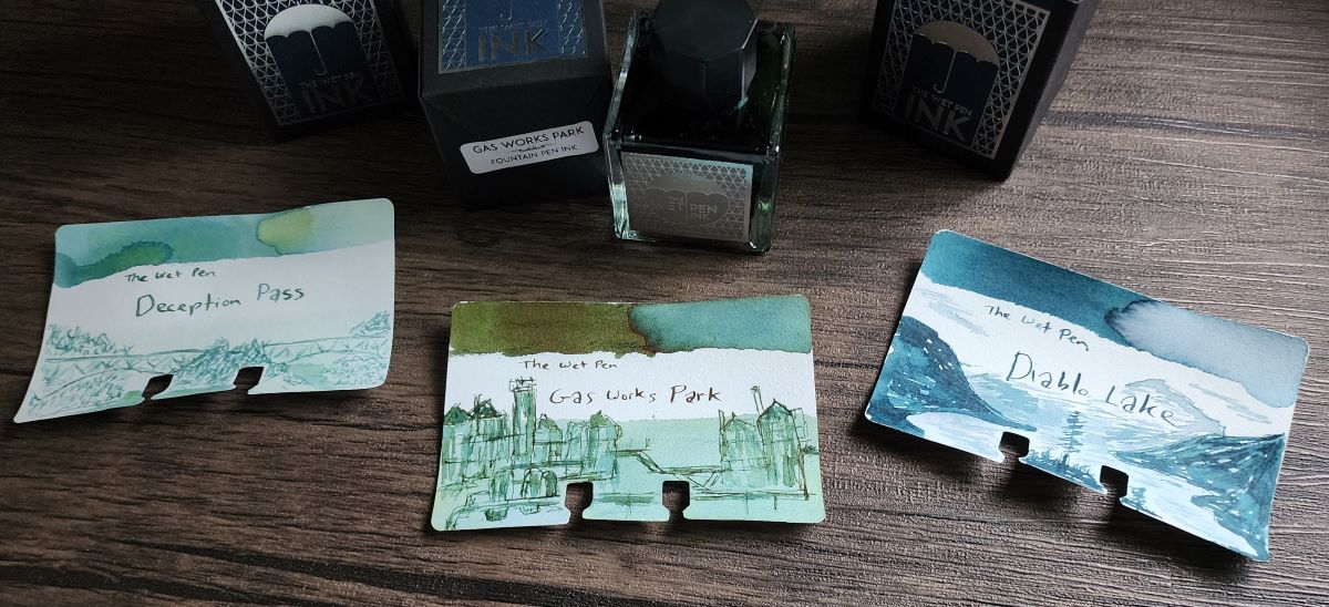
Ink #17 The Wet Pen Gas Works Park
I missed out on the initial release of Wet Pen Inks, but I was prepared to jump in when more were released. I grabbed Deception Pass, my favorite from the first three blue and green chromashading inks I saw swatched online, an experimental blue gray shade called Diablo Lake, and a new interesting green chromashader with some red sheen called Gas Works Park. I remember seeing the distinct structures in this park from a boat tour of Lake Union in Seattle.

This ink reminds me of a couple other favorites, Taccia Sabimidori and Teranishi Gentle Green. All of these inks initially look quite blue, but transform as they dry into shades of teal for Sabimidori, green for Gentle Green, and yellow-green for Gas Works Park, all with a rusty red sheen.
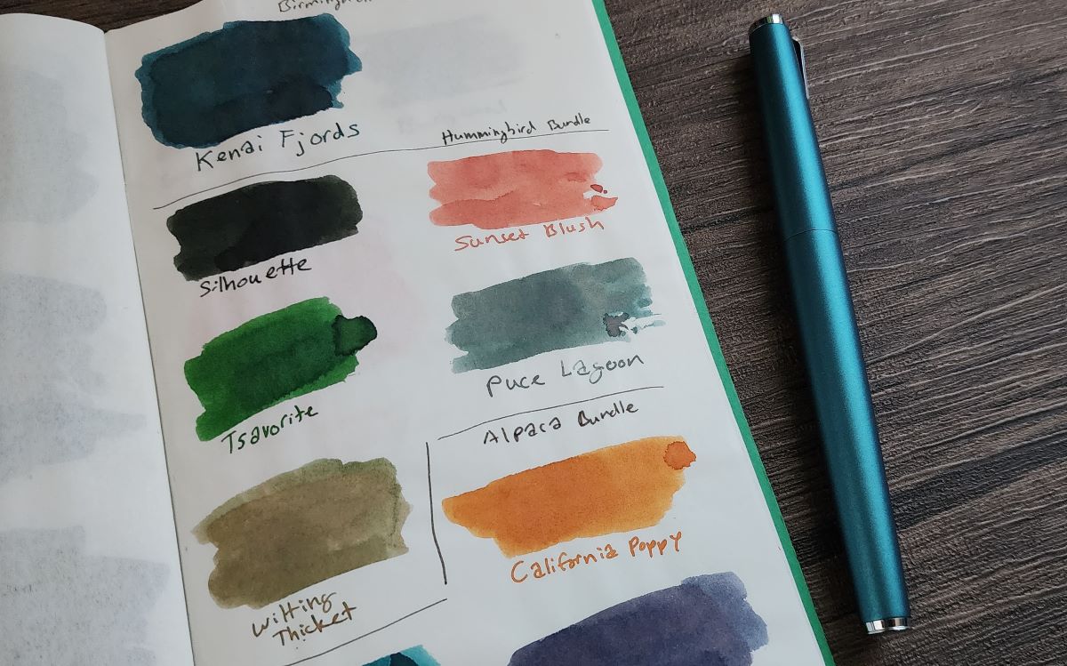
Ink #18 Birmingham Pen Company Puce Lagoon
I've seen inks that can look very different based on the paper used, amount of ink applied, etc., but in the past year I got several Birmingham Pen Company inks whose apparent color might shift wildly based on the nature of the light they are viewed in, or by viewing them through a camera.

In this photo, Puce Lagoon (also, what a name) looks like a dusty teal with shades of gray and pink, which is why I paired it with a teal Lamy Studio. When viewed in person the ink would often look like a dusty purple or pink gray with little or none of that teal shade. The way some of these inks shift in the light was a new and interesting experience to explore.
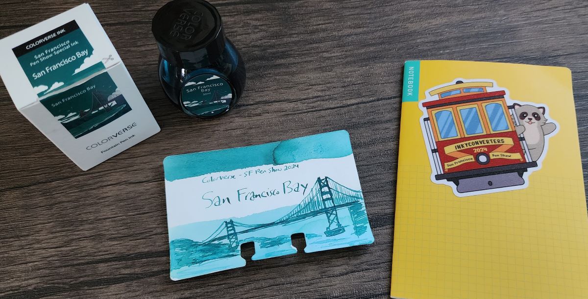
Ink #19 Colorverse San Francisco Bay
It's fun to get a "souvenir" ink from a particular event, in this case attending the San Francisco Pen Show, and even better when the ink is a fantastic shade. I had a great time at this pen show, and this teal ink representing the San Francisco Bay will remind me of that experience every time I use it.

Ink #20 Sailor Manyo Uri
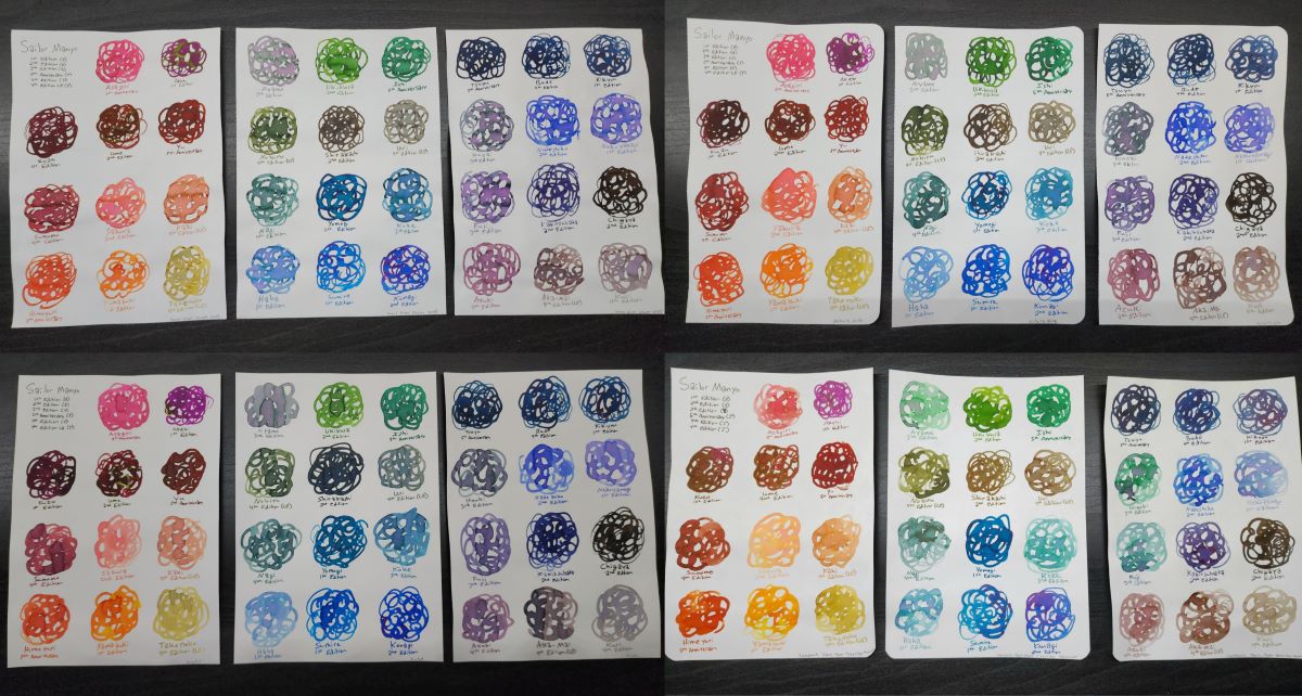
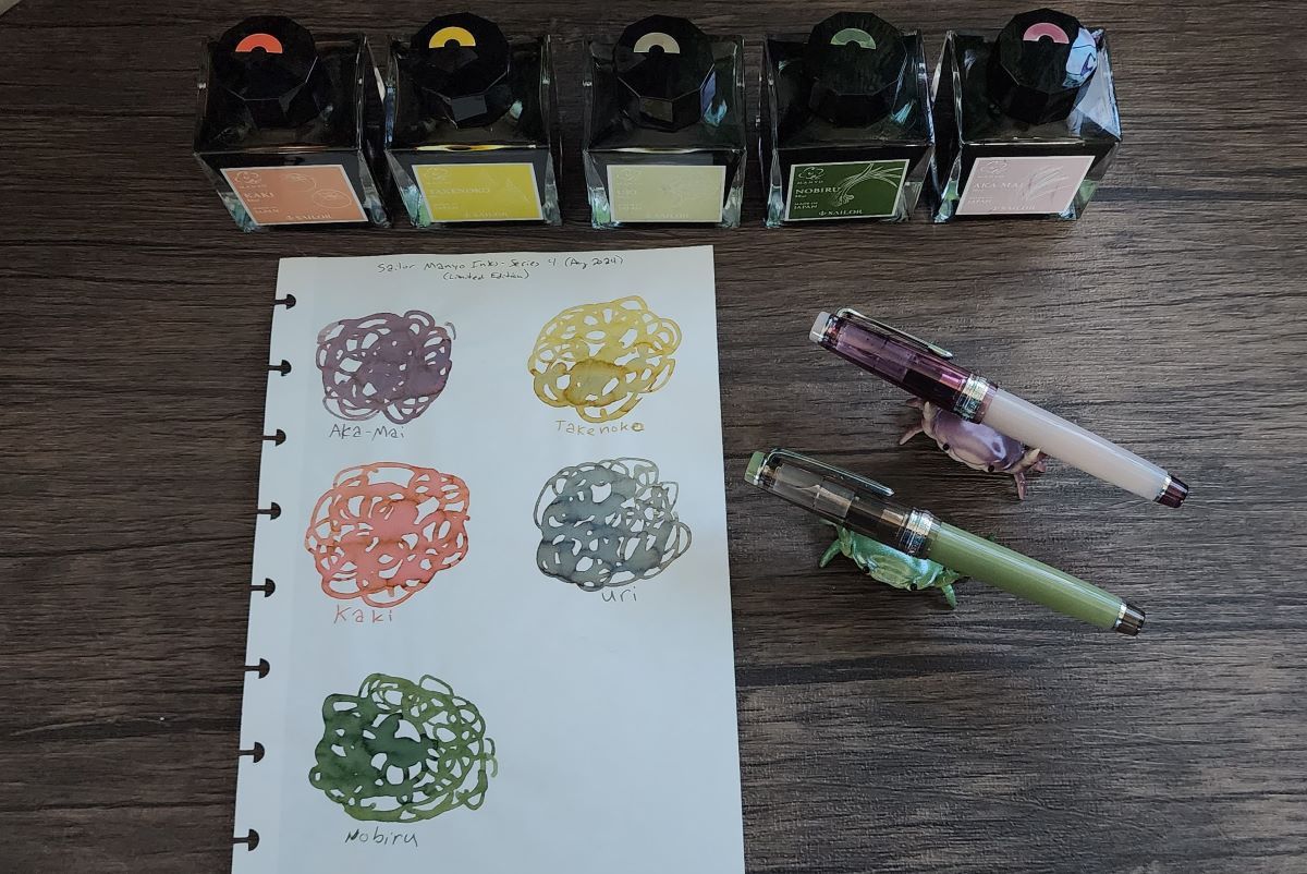
In 2024 there were 15 new Sailor Manyo inks released, five for the fifth anniversary of the Manyo series early in the year and then ten new inks (including five limited edition colors) that corresponded to the five Sailor Manyo Pro Gear Slim pens. Since the Manyo inks were some of the very first inks that caught my attention, and continue to be some of my all-time favorites, I decided I wanted to "collect" the full line of 35 inks. Once this collection was complete, I swatched all the inks together by color on four different papers.

Most of the recent Manyo releases are the more muted, dusty, interesting shades that I really enjoy.

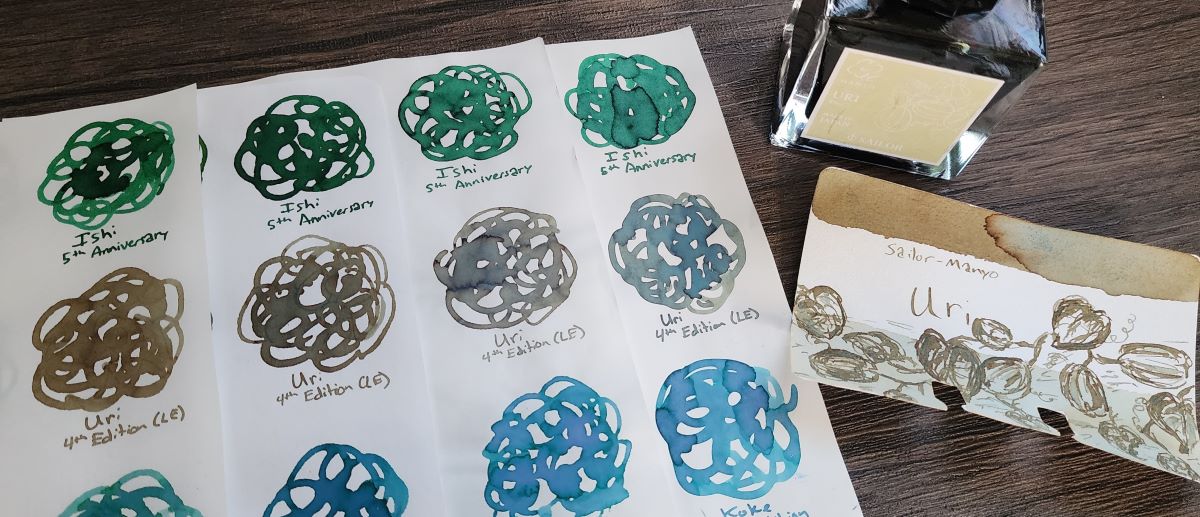
Exploring the full line of Manyo inks and the corresponding pens was memorable, particularly the most recent ten inks, but for me one ink stuck out among the rest—Uri. Sailor Manyo Shirakashi continues to be a favorite ink, and Uri seems to be a very similar but lighter shade that shows off the complex blend of green, brown, gray, and blue shades even more.

This ink is an excellent example of how much the qualities of a paper can affect the look of an ink.
Ink #21 Troublemaker Golden Orchid
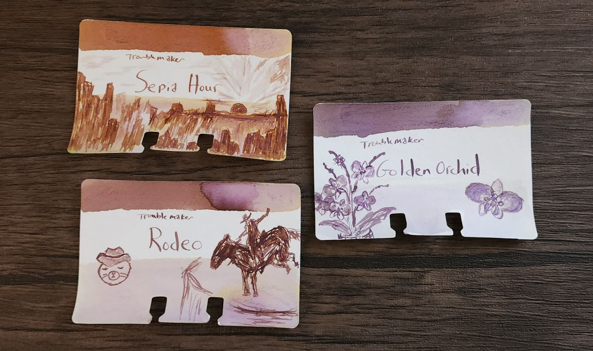
Troublemaker has several popular chromashading inks, so when this trio of Sepia Hour, Rodeo, and Golden Orchid were announced I was intrigued by the blends of rusty orange and dusty purple that I hadn't really seen before.

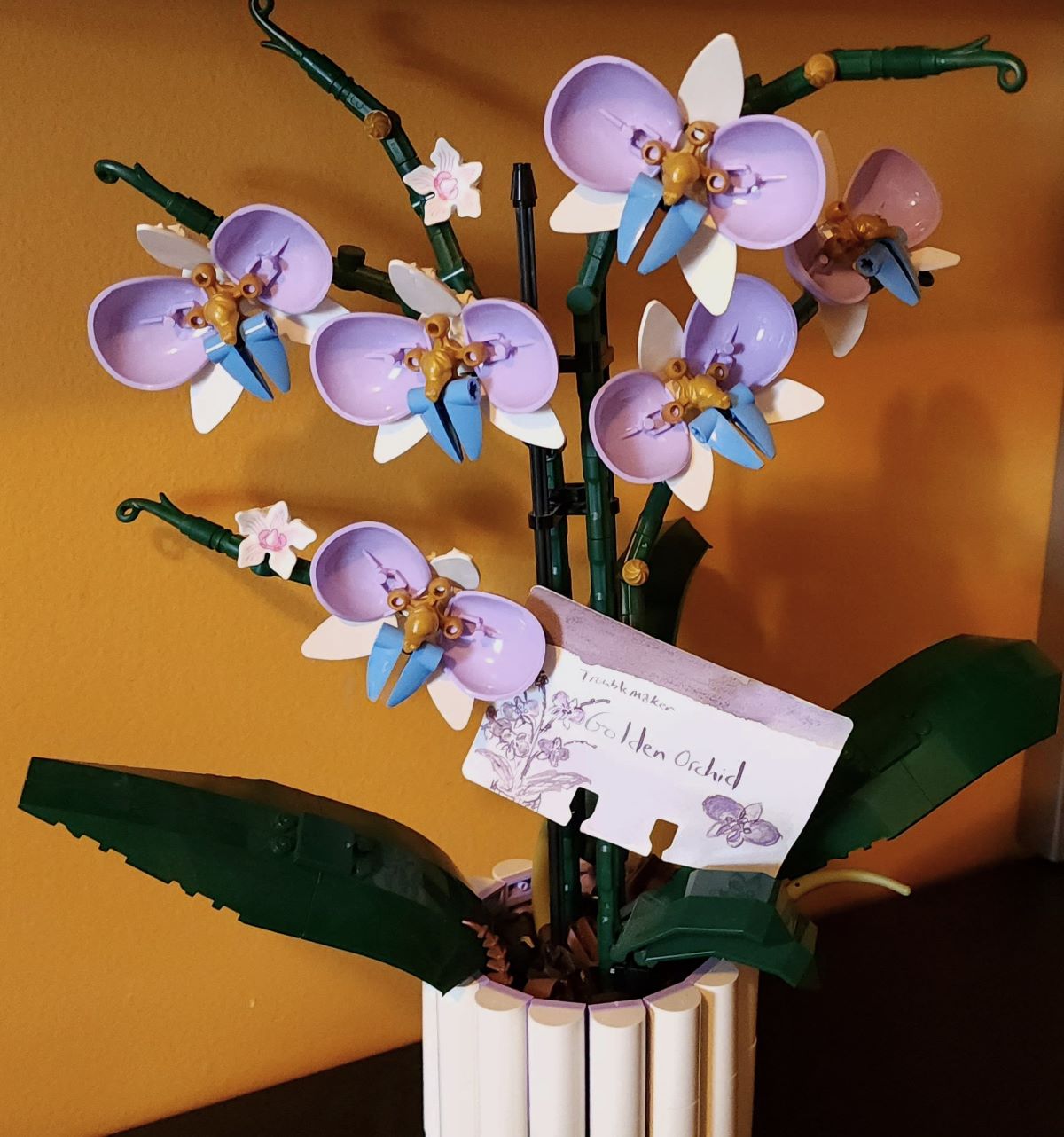
A coincidence that made the Golden Orchid ink particularly memorable was that I had found alternate pieces to modify a second build of the Lego Orchid set from the limited selection of available colors and ended up with these lavender, gold, and periwinkle orchid blooms, months before I bought this ink. All three of these are interesting inks, but Golden Orchid ended up being the most memorable.

Ink #22 Diamine 160th Anniversary Port of Call
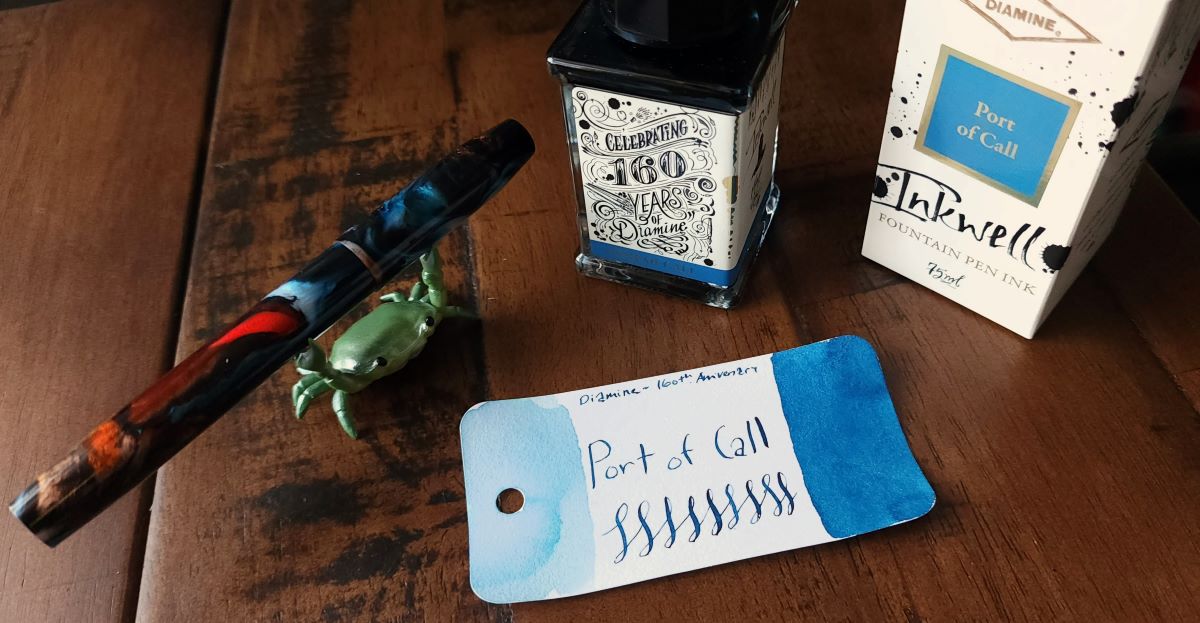
Diamine is celebrating their 160th Anniversary with the release of six inks in new tall, rectangular 75ml glass bottles. I was surprised by how much I liked the swatch of Port of Call in person, so even though it wasn't a color I expected to get, I'm glad I did. Another "interesting blue" makes the list!

Ink #23 Colorverse Colorvent Portuguese Meteor
I was excited to check out the debut Colorverse Colorvent ink advent calendar. Overall I think it turned out to be a pretty good mix of inks, distinct from the Diamine Inkvent calendar with a much greater focus on "everyday" inks, though if it were up to me I would have shifted around the order a little bit. It was difficult to pick just three to vote for as my favorites—Colorverse plans to only release larger bottles of the top three inks based on feedback.
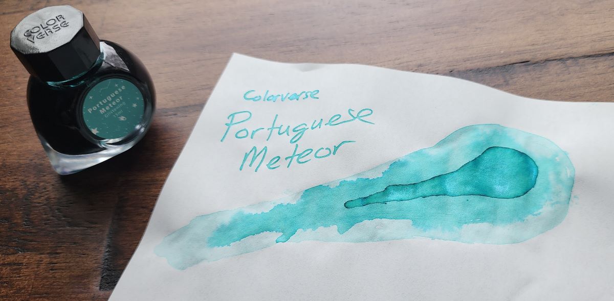
This ink, Portuguese Meteor, was Day 22 of 24. It became the most memorable because the color and the name immediately brought to mind the videos that spread through the internet of the vibrant blue-green meteor that flew through the sky over Spain and Portugal in May 2024. I may not have witnessed this event in person, but I remembered those videos immediately when I opened up the little cardboard door and revealed this ink.

This became the first ink from the calendar that I put into a pen, and the color is beautifully bright and sparkly on the page. Dusty, swampy inks may be my wheelhouse, but occasionally I'm happy to have a vibrant blue-green to brighten things up.
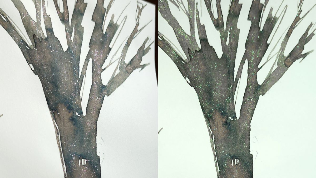
Ink #24 Diamine Inkvent Wishing Tree
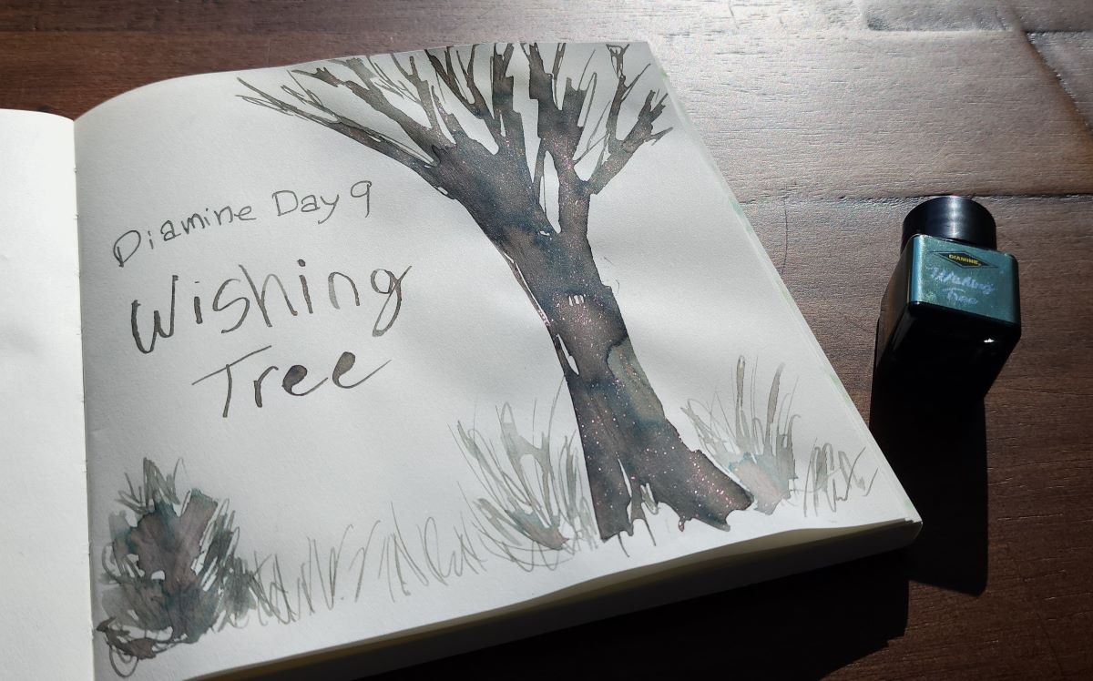
I've gotten the Diamine Inkvent calendars since the red version in 2021, so for 2024 I was planning to take a break and focus on the brand new Colorverse Colorvent and my second year doing the Enigma Inkvent calendar instead. But, as December progressed with people sharing their ink swatches and art every day, I decided I didn't want to sit out the 2024 Inkvent after all. In particular, the ink for Day 9, Wishing Tree, was one I didn't want to wait 6 or 7 months for (when the full bottles are expected to be released).
While this Inkvent calendar leaned into the supersheener trend which I'm not really a fan of, there were also several interesting neutral, earthy, taupey shades that I am very much interested in. Wishing Tree in particular is a chromashading gray with hints of pink and dark blue, and shimmer.

This ink uses Diamine's chameleon shimmer, which changes color depending on the angle and light. For Wishing Tree this means the shimmer could look either pink or green.
