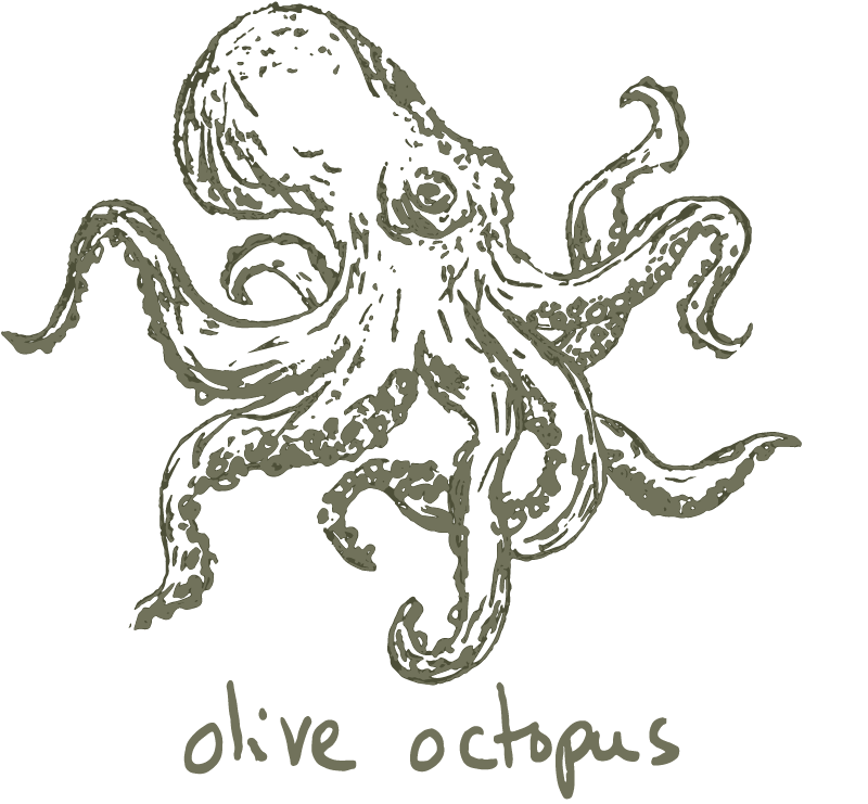
With this annual series of posts I give myself one more slot each year for a memorable ink, but with over 300 entries added to my Fountain Pen Companion ink collection list in 2025, it's still not easy. As a reminder, this is a list of memorable inks from the year—they may not have been released in 2025 and are not necessarily the best or my only favorites, they are just the ones that have stuck with me for one reason or another and became part of my story in 2025.
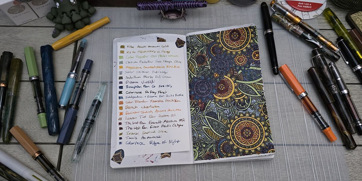
I think my "currently inked" pens at any given time can only be described as colorful chaos. The opportunity to color in a page in the traveling Amarillo Stationery coloring book last year was very cool, and this list of inks is not a bad snapshot of what was catching my attention in 2025.
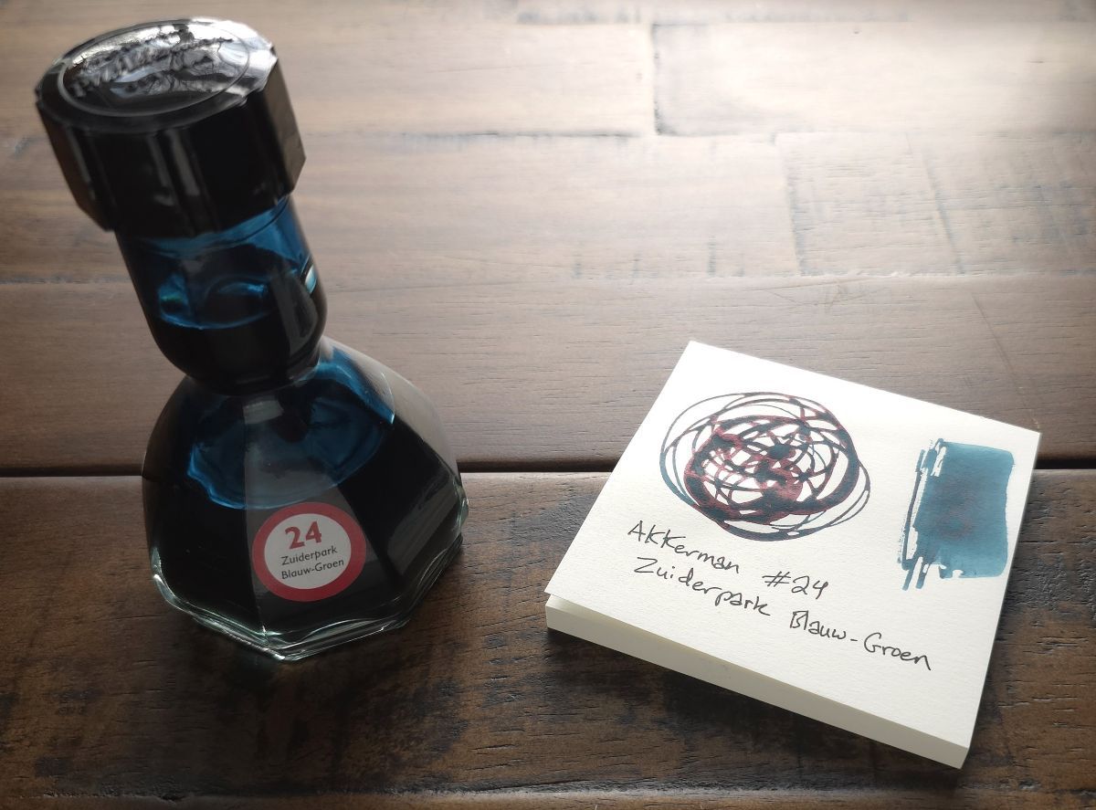
Ink #1 Akkerman #24 Zuiderpark Bluaw-Groen
With Akkerman the bottle is a significant part of the ink experience, and of course I wanted one but I was having a hard time picking out a color. Well, a friend fixed that problem for me by surprising me with a bottle, and I love the color. There is a marble in the neck of the bottle that allows you to tip the bottle upside-down to fill the top with ink, then the marble holds the ink there to make it easy to fill a pen even as the amount of ink is reduced with use. Tilting the bottle at an angle allows the ink to return to the bottom.
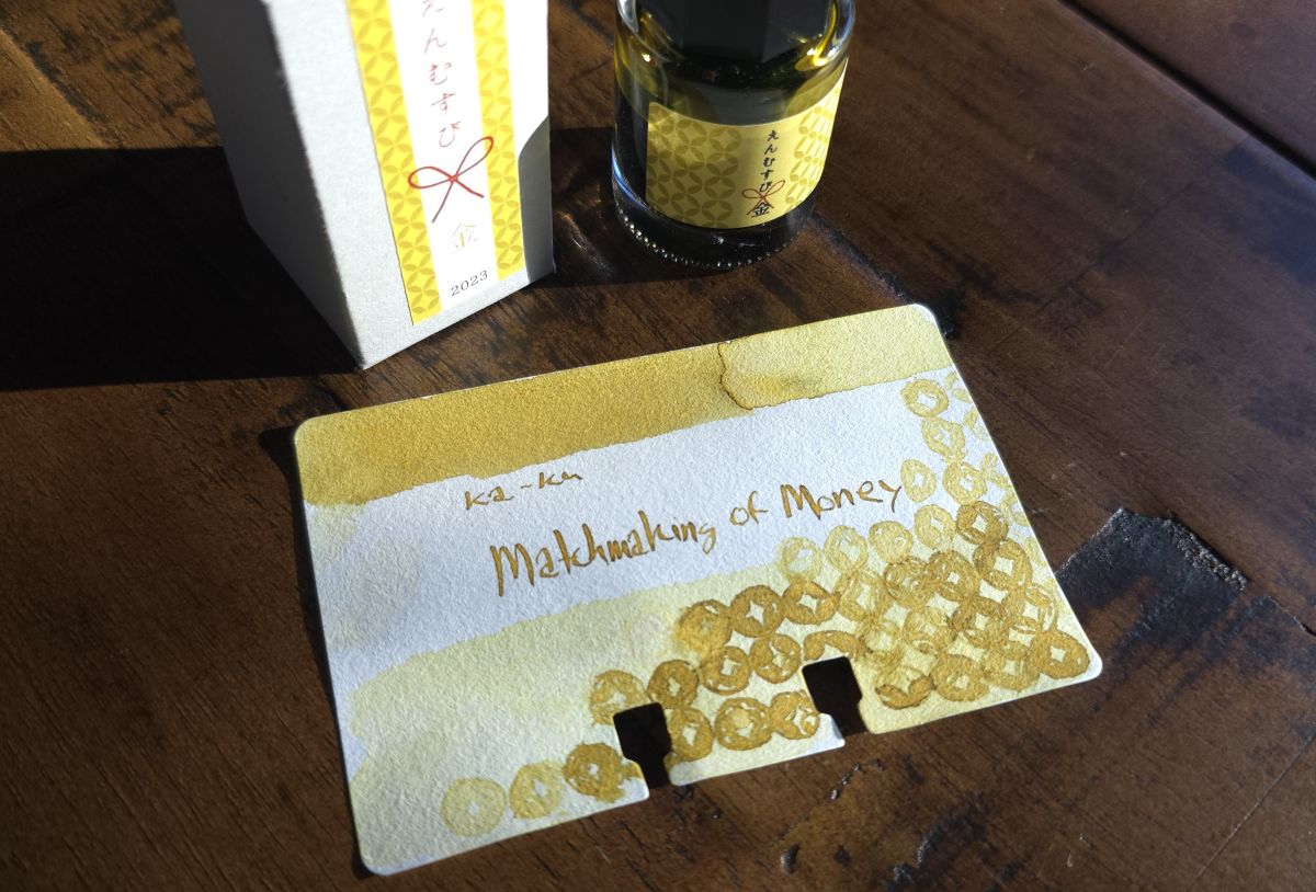
Ink #2 Ka-Ku Matchmaking of Money
At the California Pen Show in February I headed directly to the Plotter table to take another look to try to figure out if one would fit my needs. After a few minutes I decided the answer was still no and turned to the M. Lovewell table across the aisle where I saw several inks from Ka-Ku, a brand I'd never seen before. There weren't swatches for all the colors but a yellow ink called "Matchmaking of Money" really caught my eye. Next to "Matchmaking of Friendship" (another excellent color that I did get later in the year) and "Matchmaking of Love" it may not have been the best match for my life priorities, but it 100% was a match for helping kick off my year of yellow. I loved exploring several offerings from this brand last year such as Cafe Noir and Pistachio, but this interesting, usable yellow is a special one.
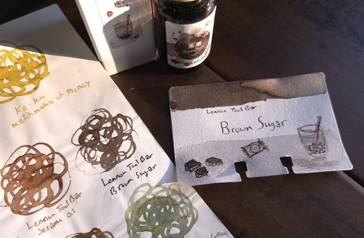
Ink #3 Lennon Tool Bar Brown Sugar
Another ink that caught my eye at the M. Lovewell table at CAPS was Lennon Tool Bar Sesame Oil, a toasty light brown ink that I'd been hearing a lot about so I grabbed a bottle and was not disappointed. However, right near that was another brown that I was not expecting, a rich dark gray-brown that just rocketed into being an all-time favorite brown.
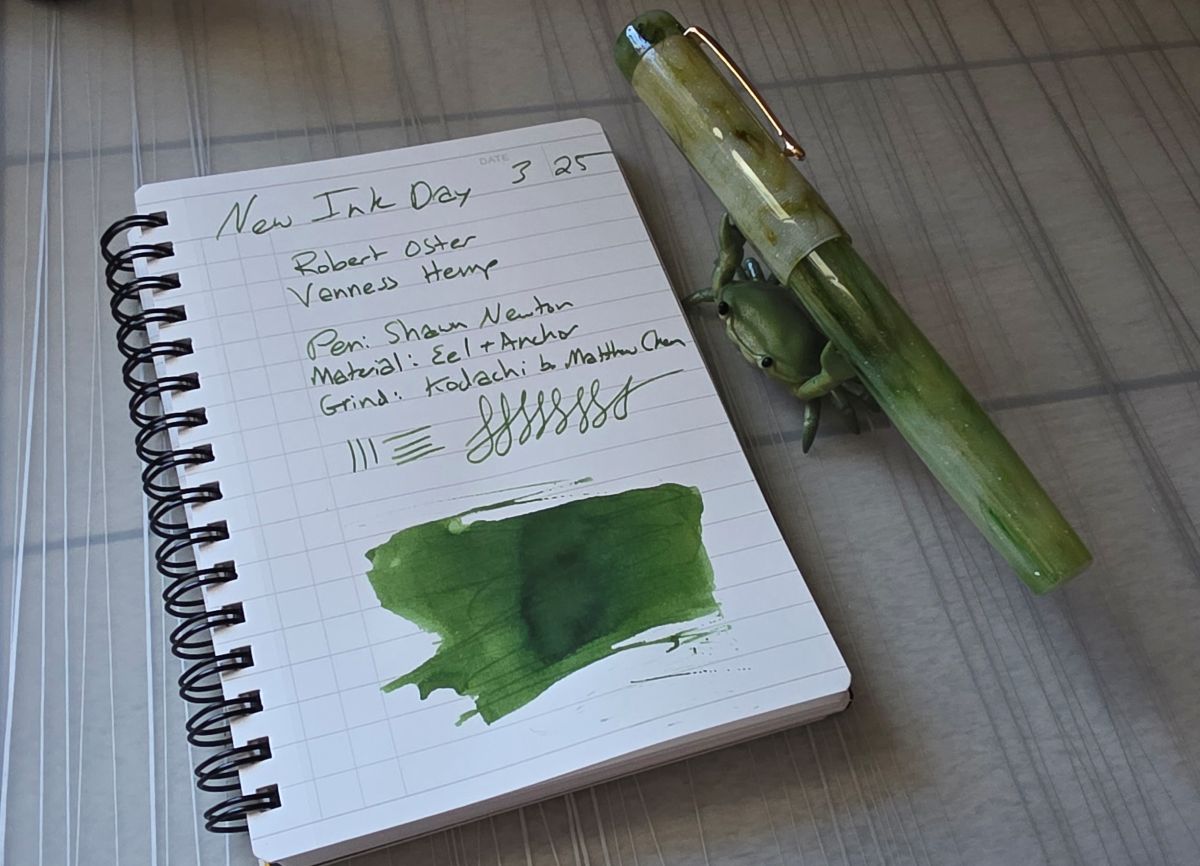
Ink #4 Vanness x Robert Oster Hemp
This ink is actually a surprisingly rare shade of green in my swatches. One of the inks in the 2024 Colorvent, NGC 2264, is the closest but for all the green inks I have, this stands out. I've had this ink in a pen with material made by the person who made sure I tried out this ink—I love that connection, and he wasn't wrong. I've really enjoyed this rich green that doesn't sheen over with red, especially with the Kodachi grind on this nib.
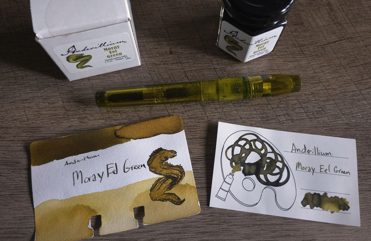
Ink #5 Anderillium Moray Eel Green
I enjoy the themed sets of Anderillum inks, and the newest collection is Ichthyoformes. This murky yellow green is a great color that I particularly enjoyed pairing with my Franklin-Christoph Model 46 in Olivae. The fine SIG nib on this pen really worked with the shading in this ink, I've inked up this combo multiple times. Anglerfish Deep was another standout for me.
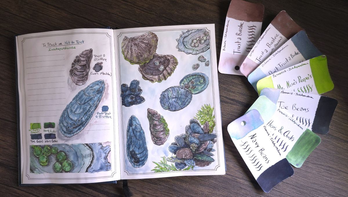
Ink #6 Inkdependence x Diamine Trust a Bivalve / Don't Trust a Bivalve
Trust a bivalve or not, that is the question. I'm going to cheat here and leave the question unanswered to squeeze this pair (technically a trio) of inks into this list. If you've joined Inkdependence Mike and Audrey on YouTube for Friday streams you may have participated in this debate, now represented by custom Diamine inks (and stickers!).
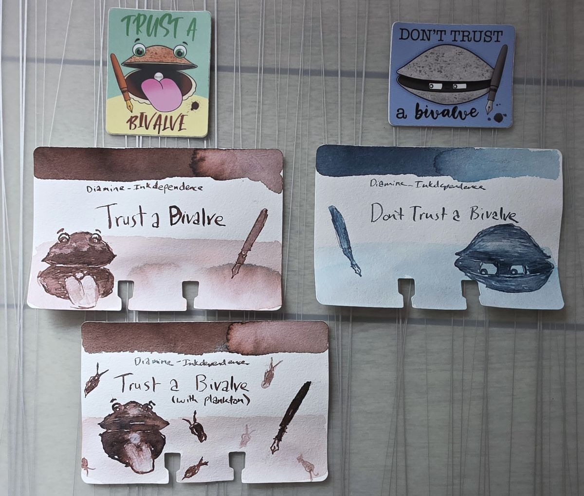
I really enjoy the taupe and soft blue shades of these inks. I might be undecided when it comes to using bivalves to monitor water quality—but happily using both of these colors, especially on the perfect page in the Dominant Industry Ink Archiving Book: A Log of Atlantis.
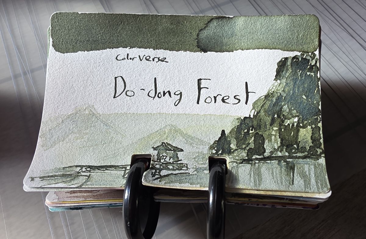
Ink #7 Colorverse Do-dong Forest
Green may be my favorite color, but I don't love every shade of green. This slightly gray green is right in the pocket though, and I love all the character that came out in the sketch on a Col-o-dex swatch card.
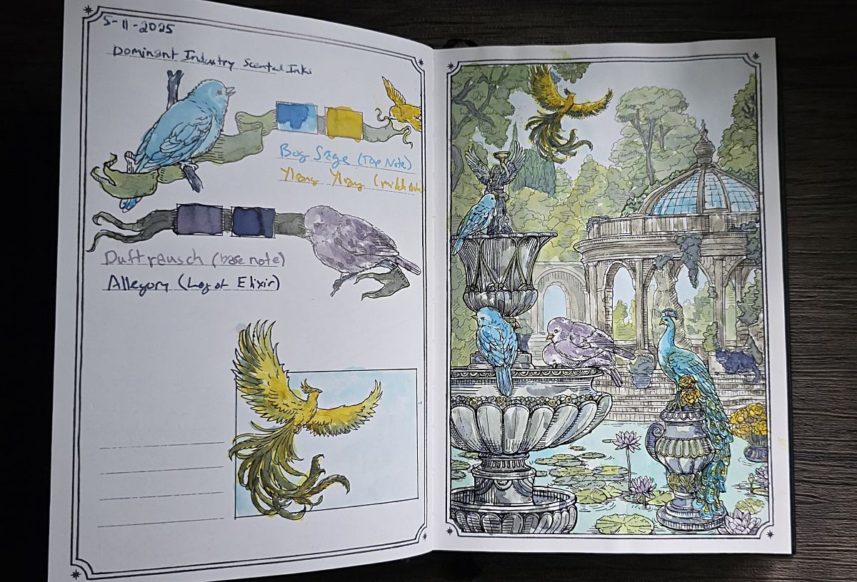
Ink #8 Dominant Industry Twilight Garden (Scented Inks)
This is another case where it's really a trio of inks that are memorable—these three scented inks from Dominant Industry are all floral scents meant to represent a top note, middle note, and base note. Sometimes scented inks can be feathery but these have performed well on a variety of papers. The scent is very present as the ink is used, but doesn't linger on the page. One thing I have not tested is whether the scent might linger in a pen after it's been inked with one of these.
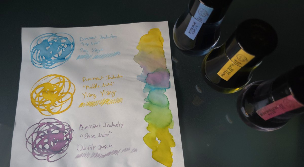
Bog Sage is an intriguing light blue, but has the least pleasant scent. Ylang Ylang is a vibrant yellow that has a bright floral scent. Duftrausch is rose-scented which might be the most appealing, and a unique pink and blue gray chromashader. I was happy to see that these scented inks performed well for writing, but the colors I was able to get using and mixing these inks on a page in a Dominant Industry book made this one of my favorite painted pages also.
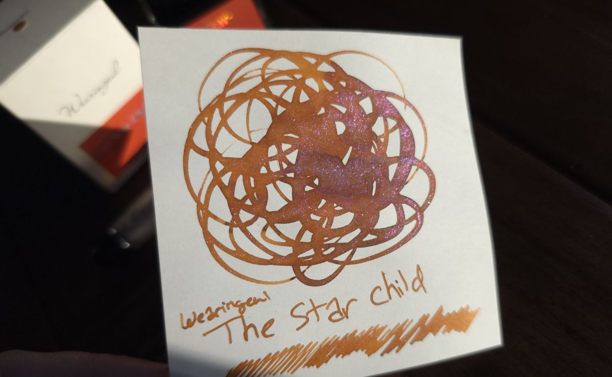
Ink #9 Wearingeul The Star Child
I like an interesting combo of shimmer and ink shades, and this dark rusty orange with pink shimmer is striking and fun. Colorverse has often had the interesting pairings that catch my eye but Wearingeul got me with this one.
Ink #10 Kitty Inkpot Gramophone That Can Only Rewind
A bunch of interesting chromashading inks from brands including Kitty Inkpot started spreading through inky communities online—I wasn't an early adopter, but took advantage of a group buy to check out several inks from Kitty Inkpot and also Hosia.
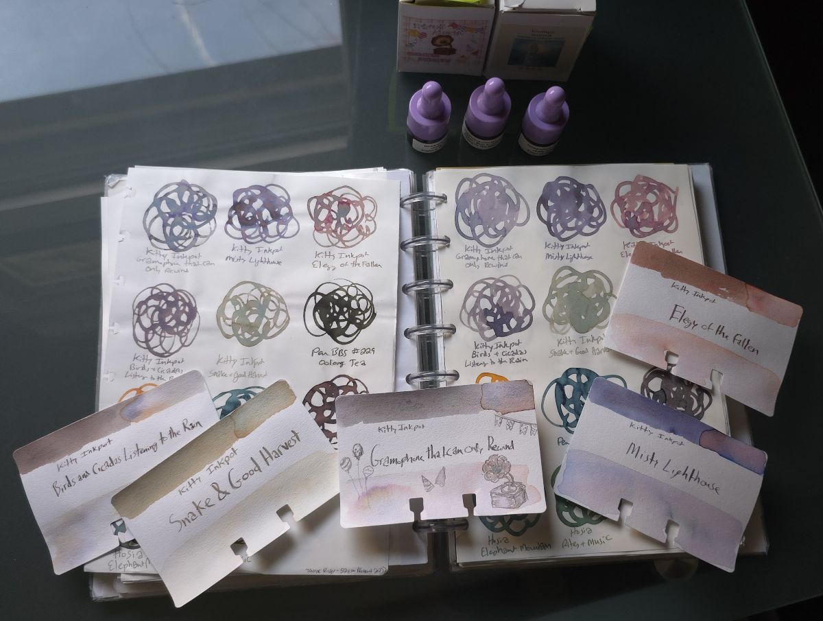
I'm cautious when using inks from a newer brand that I don't know much about, but it's been fun to explore combinations of chromashading colors that I've never seen before. These inks have interesting names and can vary widely based on paper or light, and are difficult to capture accurately in photos. One of the most interesting has been Gramophone That Can Only Rewind, which on Tomoe River paper has shades of gray, blue, and purple. Elegy of the Fallen might be my favorite name in this bunch, with pink and green shades that remind me of succulents.
Ink #11 Kobe Akashi Museum Gold
Spoiler alert, this will not be the only Kobe ink on this list. It seems that's what happens when you visit the Vanness Pen shop in person (...maybe it's just me). I picked out this ink during my first of three visits to Little Rock in 2025, I love that Lisa Vanness has made these special releases available in the US.
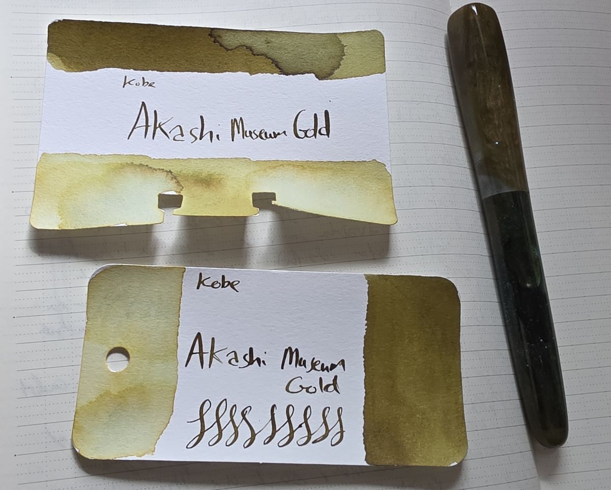
This greenish dark gold happened to pair perfectly with another acquisition from a trip to Arkansas, my second D² Arts pen—I love this combo.
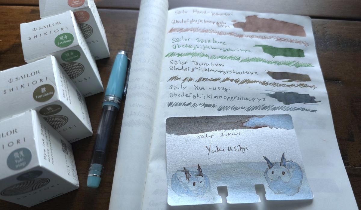
Ink #12 Sailor Yukiusagi
2025 was a year without any new Manyo inks, but I did pick up one of the new Shikiori lines. Yukiusagi stood out with the way it shades gray and blue. This ink is striking, particularly from a Sailor Pro Gear Slim broad nib in my Hobonichi weeks.
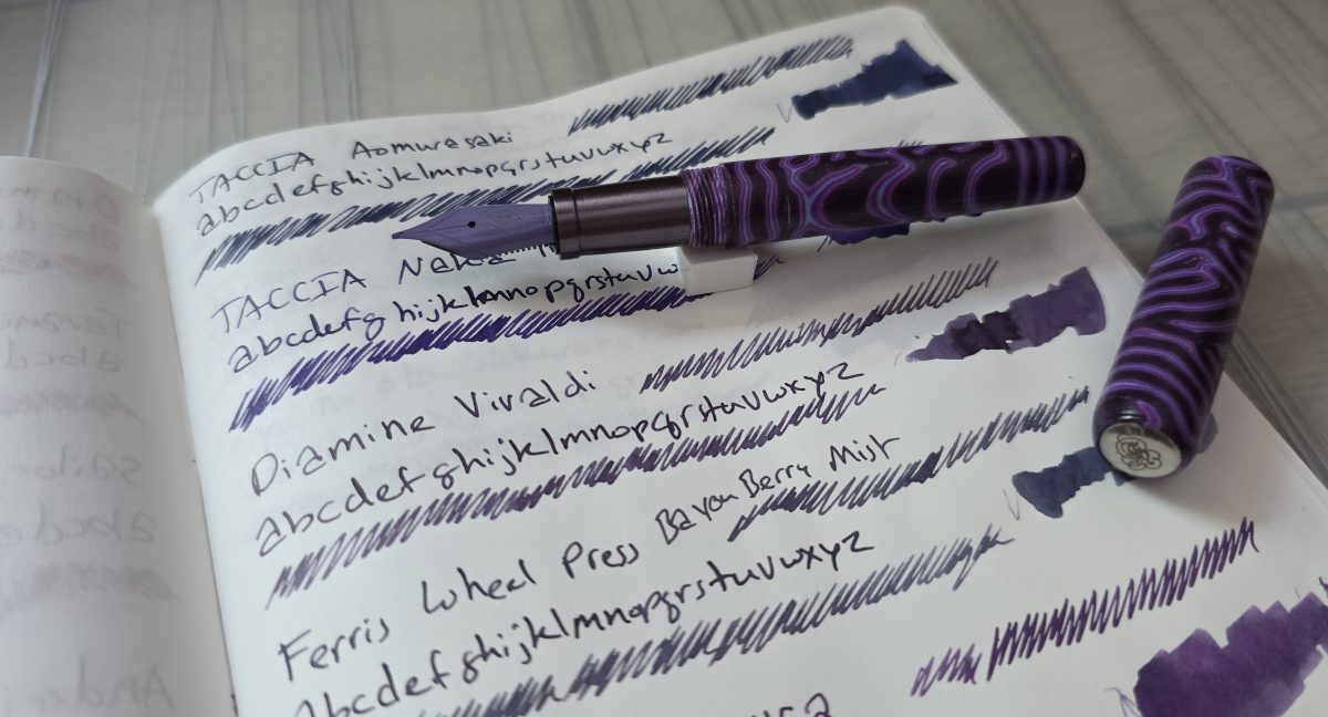
Ink #13 Diamine Vivaldi
This purple Micarta pen has had me really enjoying several excellent purple inks, and since it's a pocket pen with limited capacity I've cycled through several of them. One of my favorite pairings so far is the Diamine music series ink, Vivaldi. The dark, dusty shade that leans slightly red is one of my favorite shades of purple and was one I refilled at least once before switching to a different color.
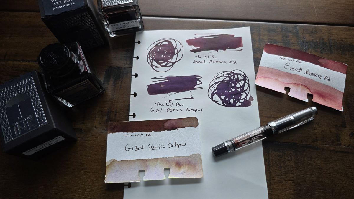
Ink #14 The Wet Pen Everett Massacre #2
The Wet Pen released several new inks this past year and I picked up Giant Pacific Octopus and Everett Massacre #2. You would think I'd be writing about the octopus ink that changes colors from brown to purple shades depending on the amount of ink and paper (which is very cool) but Everett Massacre #2 makes the list because of how surprised I was to really enjoy using this dark, bloody ink. Reds and pinks are usually at the bottom of my preference list—until you start making them dusty, dark, or moody. Inadvertently, I inked this up in my mini TWSBI Vac—a notably clear pen that fully showed off the bloody red shade—and wrote it dry.
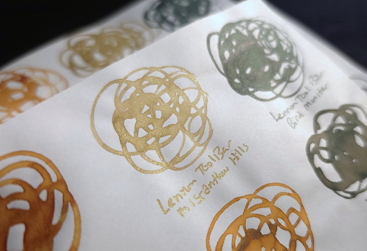
Ink #15 Lennon Tool Bar Miscanthus Hills
This is the first shimmer ink I tried from Lennon Tool Bar. After being slightly concerned by the sound coming from the box (there are tiny ball bearings in the bottle to help mix up the shimmer particles), I was mesmerized watching this ink in the bottle. When the shimmer settles it's an unassuming dark brown shade, but transforms into liquid gold when swirled around.
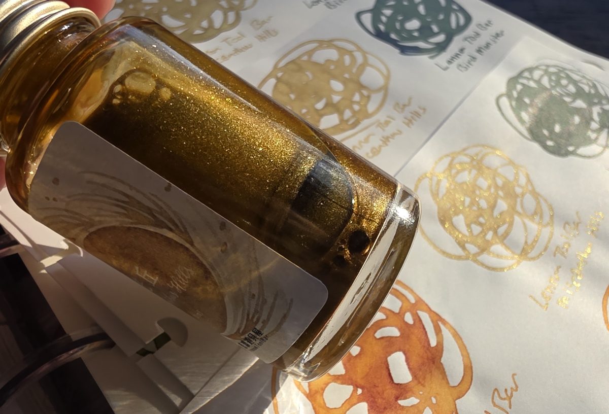
This ink is on the lighter side but still one of the prettiest representations of a gold ink that I've seen.
Ink #16 Van Dieman's Natura Dualis Harvest Tide
The Van Dieman's Natura Dualis chromashading inks were another popular release in 2025. A friend generously shared samples of all of these with me to check out, and I was surprised at how many of these were not really that close to my other chromashading ink swatches. I think this is in part because these inks are lighter or brighter than similar shades. I've picked Harvest Tide as most memorable to me because the light yellow green with dusty pink is an interesting, earthy shade. You'll want a pen that puts down a lot of ink to use this for writing.
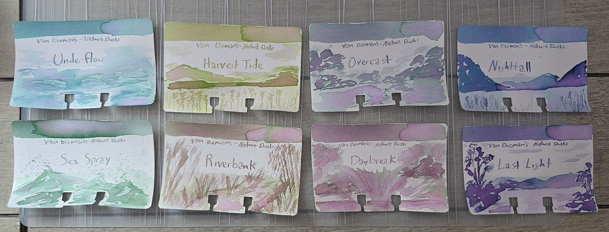
Chromasading inks are some of the most fun inks to sketch with, and these were no exception.
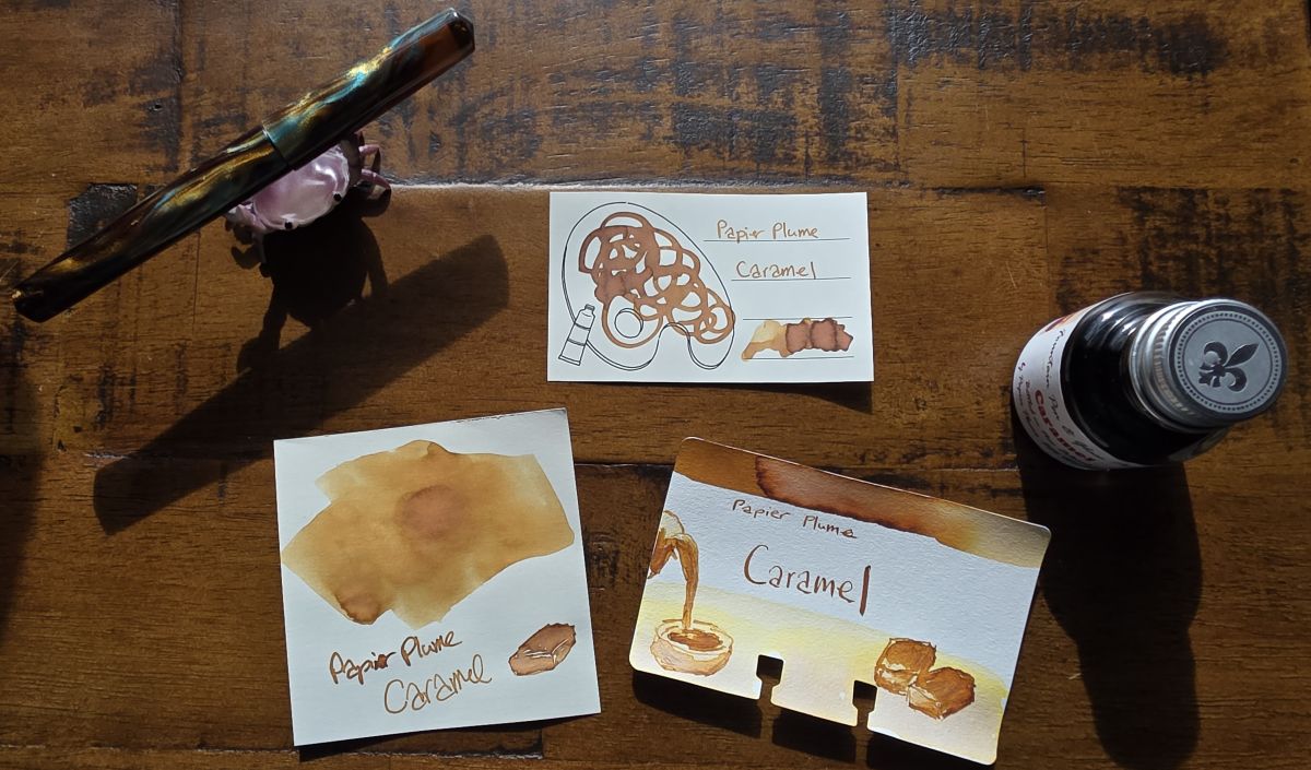
Ink #17 Papier Plume Caramel
After being disappointed by another ink in this shade, Caramel really hit as a beautiful ink. I started picking up a few of Papier Plume's standard colors once they were being stocked locally at The Gentleman Stationer. This ink is not new, not particularly fancy, just exactly what I was looking for in a warm yellow brown shade.
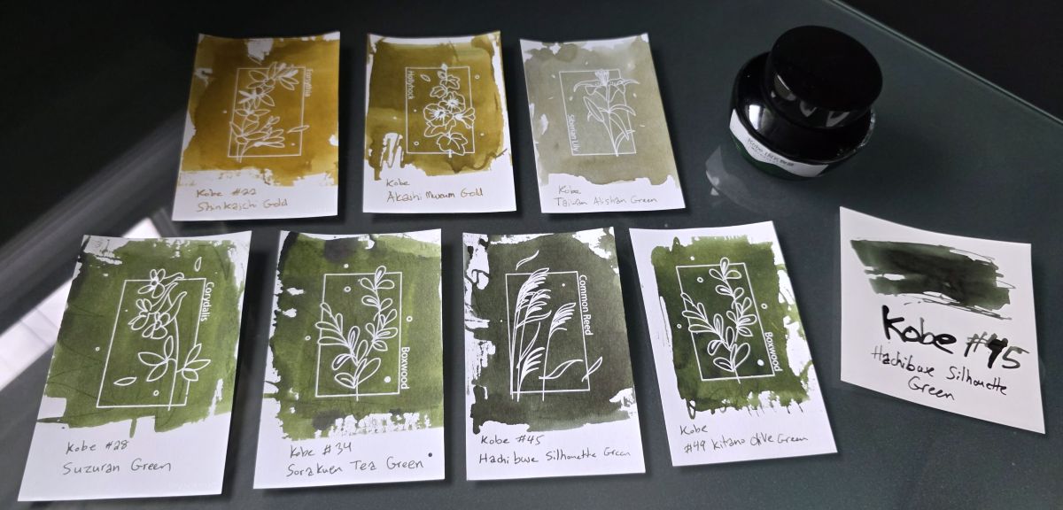
Ink #18 Kobe #45 Hachibuse Silhouette Green
Starting with visiting the Nagasawa table at the California Pen Show, I went a lot further down the Kobe and Onomatopoeia inks rabbit hole last year. Before one of my visits to Vanness Pens I made a short-list of Kobe inks to look at and most of them ended up being a shade of green. In some swatches it can be difficult to tell them apart, but what kind of inky octopus would I be to not study the subtle nuances? After looking at the swatchbook and what was in stock, I narrowed down my list and this green black is dark but has a lot of character that I was pleasantly surprised by.
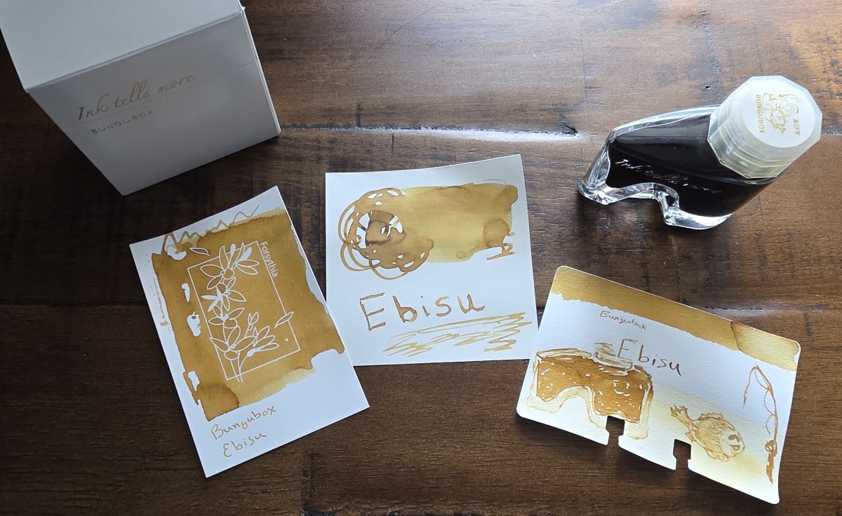
Ink #19 Bungubox Ebisu
Bungubox is another brand noted for a highly-curated range of colors and a unique bottle shape. These are pricey, so while I've looked at them often at pen shows I didn't buy a full bottle until I looked at all the swatches again at Vanness Pens and picked out Ebisu. In the past Fujiyama Blue was the signature shade I thought of with Bungubox, but Ebisu fits my autumnal vibes better and I'm very happy with my choice for a full bottle. (I got a sample of Fujiyama Blue to explore more this year.)
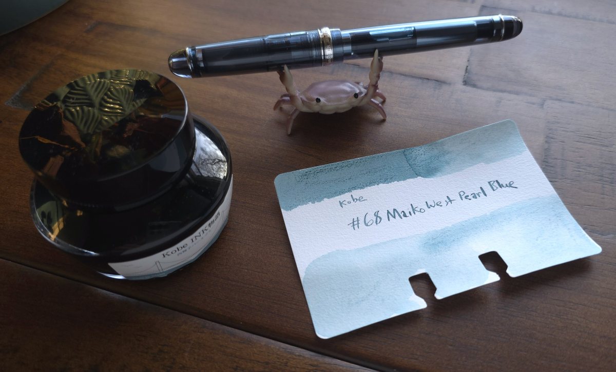
Ink #20 Kobe #68 Nishimaiko (Maiko-West) Pearl Blue
I first purchased a sample of this ink a couple of years ago, and this particular shade of light gray blue has stuck with me and I considered getting a full bottle multiple times. As I dug more into the Kobe inks and was trying to decide on new colors to try, this one persisted and I got the bottle. This is the sort of ink I'll reach for with pens that aren't very unique but have a good nib like my standard Diamond Black Platinum 3776. However, I decided I wanted to get a "regular" Pilot nib and chose the Pilot 74 in Blue Stone with a fine nib, which is a good color match with this ink.
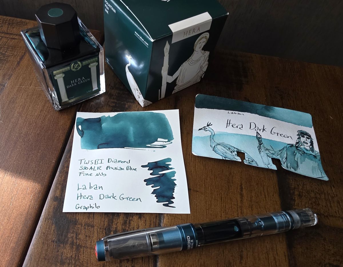
Ink #21 Laban Hera Dark Green
Laban is a brand that I was only slightly familiar with and wanted to get to know better. I'd flipped through the swatches of the Mythology series often and expected Hera to be a good representation of a popular dark teal shade, but it turned out to be more interesting than I expected, leaning blue and showing a lot of character even in the fine nib in my TWSBI Diamond 580ALR Prussian Blue pen.
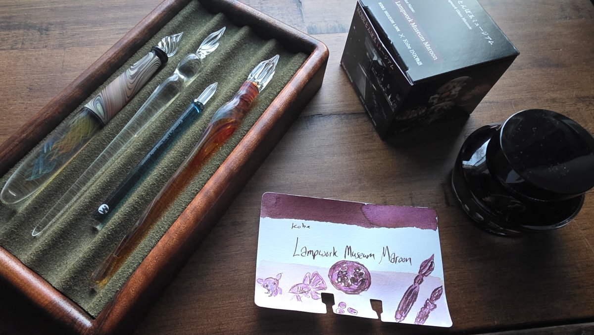
Ink #22 Lampwork Museum Maroon
Oh look, another Kobe ink. The theme of this one drew me in as much as the color. I've loved glass work since I was a kid going to the Corning Glass museum in New York, where I remember watching artisans do lampwork demonstrations. My collection of really nice glass pens has been growing as well. This is a rich maroon with occasional hints of purple.
Ink #23 Papier Plume Honey Island Swamp Monster
For the last few years I've participated in an "inkvent" swap through the Pen Addict slack and received a lot of interesting inks. One special edition ink that I was excited to get a sample of was Papier Plume Honey Island Swamp Monster. This is a very pleasant swampy green.

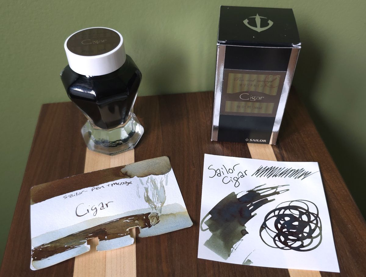
Ink #24 Sailor Pen & Message Cigar
Cross one more really cool bottle of the list—this ink was a lovely surprise. It reminds me a lot of my sentimental favorite ink, Sailor Shirakashi, but in a slightly different shade. The ink starts out more blue but turns green with a rusty sheen as it dries. Some papers will show less sheen or retain more of the blue shade, giving this ink a lot of variety and character.
Ink #25 Colorverse Colorvent 2025 Erebus Crater
For 2025 I decided to stick with just one inkvent offering—the second year of the Colorverse Colorvent calendar. I actually was able to explore every ink with multiple swatches and painting in four batches of six in the Dominant Industry Ink Archiving Book in December. My favorite ink was Erebus Crater, a really unique chromashading ink. There's a lot of variation when writing but it really splits into a rainbow of color when a little water is added to paint with it.
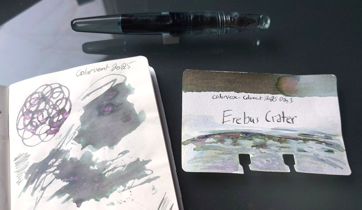
Also, like many I was surprised at the offering for Day 9, a whole 15ml bottle of shimmer additive ("Gleamix") called Morning Frost on Mars that lets you make your Colorvent experience as festive and sparkly as you like. I ended up mixing this in with 6 inks from different days—every combo was interesting and since the shimmer mix included a few different colors it took on different character in each ink.
The first ink I mixed it with was Erebus Crater, which I put into a Franklin-Christoph Antique Glass Pocket 66. The cursive nib that is usually in this pen was swapped out for a broad nib to really let this ink show off. I was disappointed that none of the interesting chromashaders made the top three from the first Colorvent calendar, but I really hope this one makes the cut.