I've been intending to write an update about this project for <checks watch> over a year. Part of what's held me back was self-imposed pressure to do a thorough audit and pull together stats about the exact number of cards, how many of those cards have sketches, etc., but you know what? The specific stats don't matter.
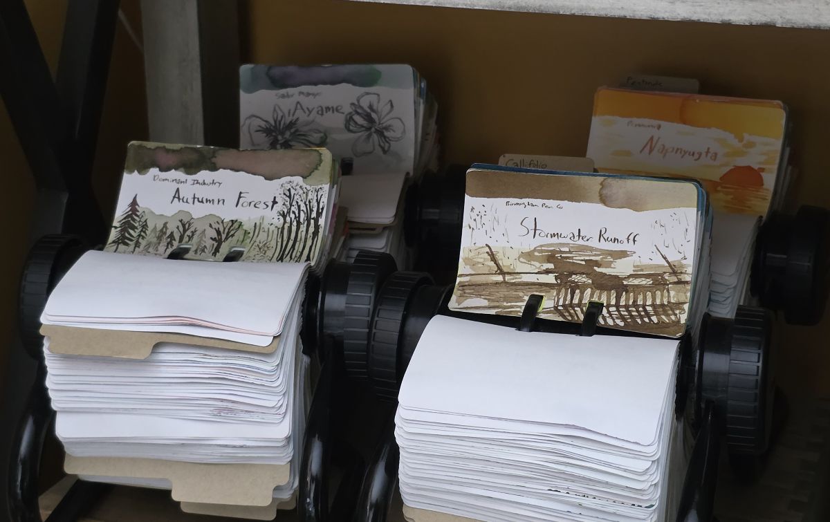
I have a lot of cards stored in four circular Rol-o-dex holders that should essentially match the number of inks in my Fountain Pen Companion list (just shy of 1300) because I swatch every ink on both Col-o-ring and Col-o-dex cards.
At some point after the initial swatch is made, I will dig into the name and any artwork on the packaging, marketing content, or other details associated with an ink to inspire a little sketch with that ink on the card. That number is much lower, around half of the cards have sketches so far. For a long time, I kept up with posting all the sketches to Instagram, but there are over 100 sketches that haven't yet been posted. There, those are the stats.
What's more important than exact numbers is how much this project still means to me, and how it facilitates a deeper connection to the inks I'm obsessed with.
Art Practice
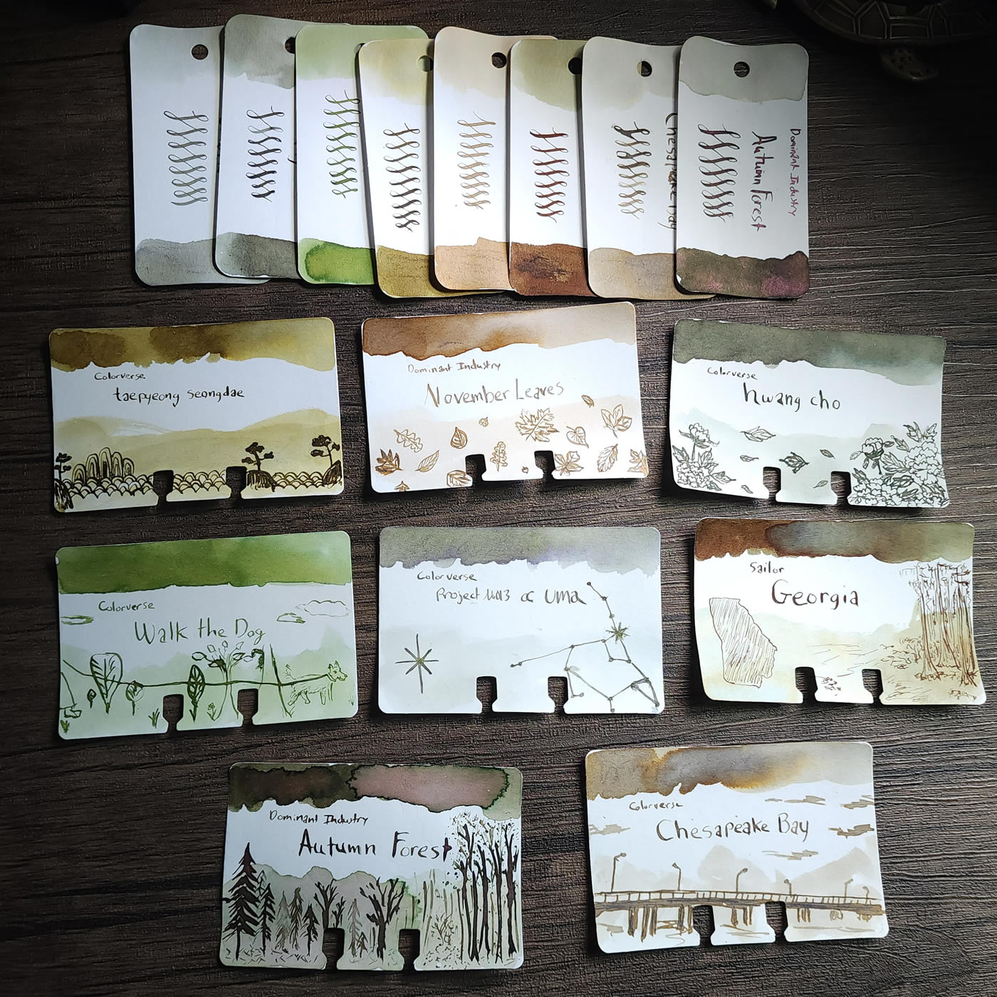
I wrote a post a few months into this project after completing sketches on 120 Col-o-dex Cards that covers how I got started. Here are the first eight sketches, could I interest anyone in some swampy earth-tones?
I don't consider my Col-o-dex as simply swatches, these cards are also an art project—a restricted, defined set of parameters within which I explore and develop an artistic style I really enjoy and want to get better at. As this project has continued I've attempted more complex or detailed subjects, especially human figures and faces. I particularly hope that I'm able to represent inks inspired by works of art respectfully, if not terribly accurately.
I've been working on creating depth and shading by starting out the sketch with the full ink then adding water, which can pull more character out of the ink and create a range of pale to saturated areas to bring depth and detail to the sketch.
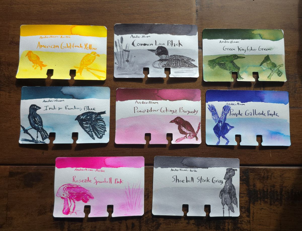
When I look back at different cards over the past 3 years of doing this there are appreciable differences in the style. In this group of eight Avian inks from Anderillium, the Indigo Bunting Blue card was a sketch I did early on, and the rest were done more recently with a lot more shading and detail.
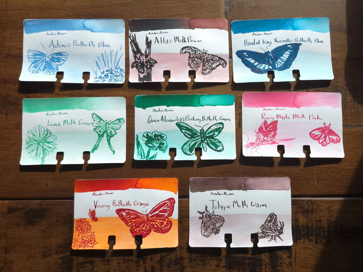
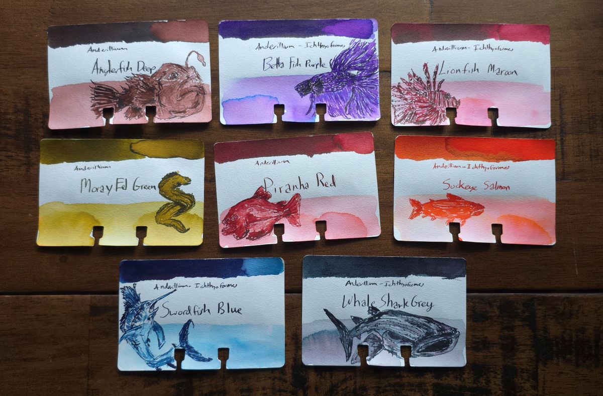
The sketches for the Lepidopteran series are also older but show a bit of shading starting to be used.
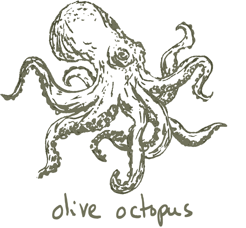
I delayed sketching the Cephalopod series of inks for a while because I wanted the octopus (and similar creatures) to turn out well.
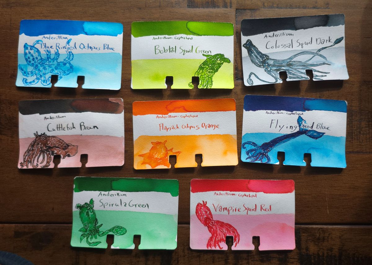
I continue to be surprised at how these turn out—I think the inks themselves do a lot of heavy lifting, but also, three years of practice is paying off.
I'll always consider myself a designer rather than an artist, but this is probably the closest I get to blurring that line.
Shading Technique
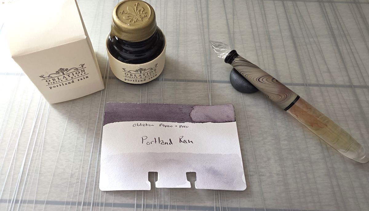
When painting with inks I will often dilute ink in a paint palette and build up layers from pale to more saturated, but with the sketching it's mostly the other way around. Part of this is a practical constraint I've put on my process—I'm not putting this ink into a separate paint palette or container, I'm working directly out of the bottle or sample vial. I do get a head-start on shading by including a diluted ink wash along the lower 1/3 to 1/2 of the card when it's initially swatched.
I dip a glass nib pen into the ink, and do the initial parts of the sketch with the full saturation of the ink.
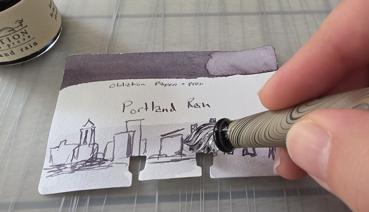
Once I think I have enough ink down in the initial sketch, I will start dripping water onto the nib with the ink remaining. After this point, I won't dip it back in the bottle again without fully rinsing and drying the nib, to avoid introducing any water into the bottle.
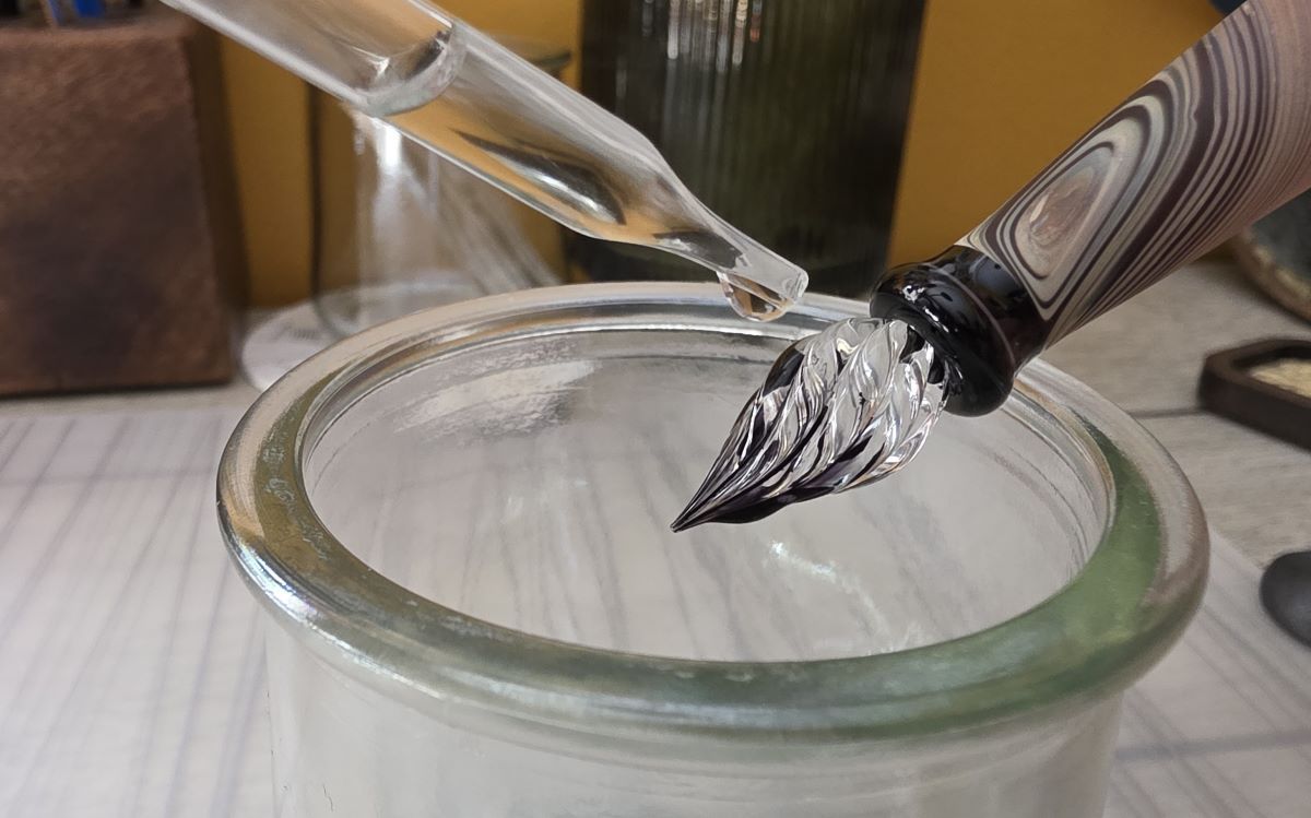
I will then use the now diluted ink on the nib to continue to sketch. Most of the inks I use are not pigmented or water-resistant so going over areas that already have ink allows me to grab, dilute, spread out ink by re-wetting parts, moving the ink around, letting it dry differently, etc. Sometimes I'll just use some water on the nib—though plain water is like a dry ink (dry ink = more watery) and doesn't flow as well on the nib.
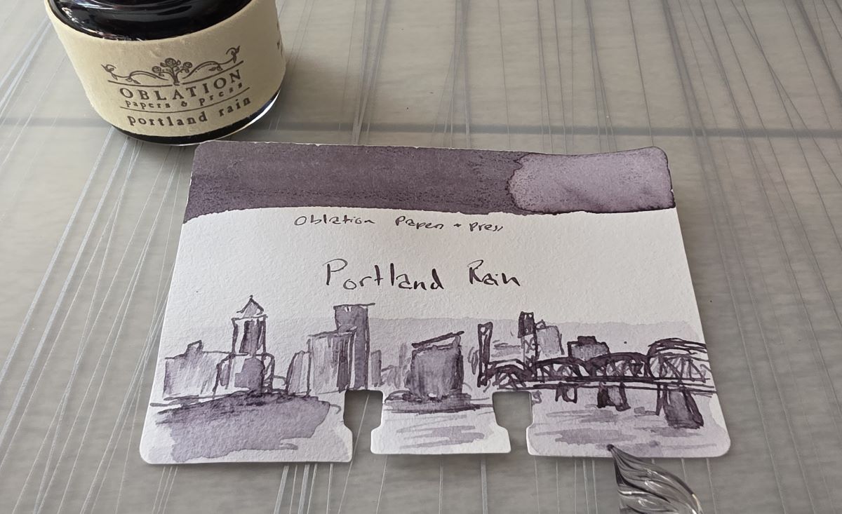
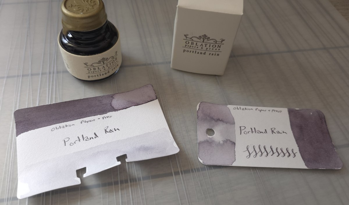
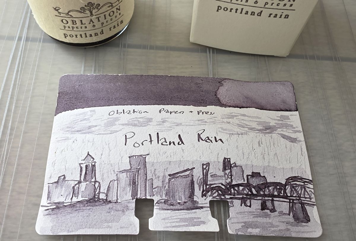
Here I've filled in the buildings of the Portland skyline with diluted ink/water, softening the initial lines. Now it's time to add some clouds and rain. Sometimes at this point I'll clean and dry the nib and dip back into the full ink again to add some final detail, but didn't in this case.
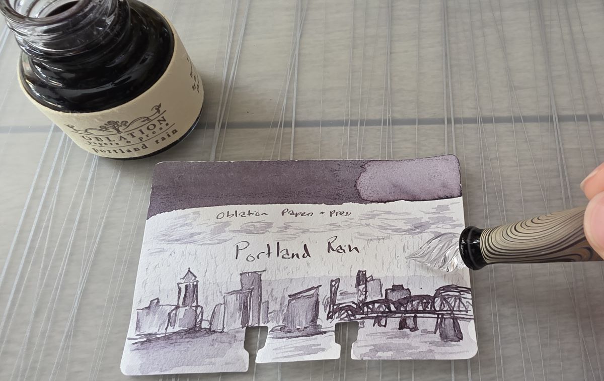
When finished, I've hopefully created an interesting level of variation between full saturation and pale levels of ink.
Memorable Cards
I try to not overthink or overwork a design and only spend a few minutes doing the actual sketch, but I may spend a fair amount of time digging into the inspiration or story of an ink or ink series. With a large and still growing collection of ink, I can't ink up everything to write with but especially when there's a story or something someone loved behind a particular ink name or color I want to learn about and honor that. I may learn more about a place, plant, animal, artwork, regional food dish, etc., or have to exercise my creative muscles to represent "orange" for the fifth time, a number (looking at you Sailor Ink Studio line), or the concept of "bliss."
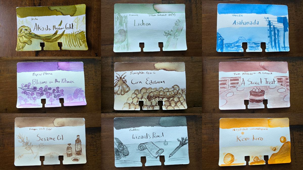
I pulled a mix of more recent sketches and this group of cards represents a museum in Japan, a plant, a work of art, blossoms in the spring, a moth, the 2025 color of the year, cooking oil, a fantastical writing device, and the onomatopoeia for something small and spherical rolling or tumbling.
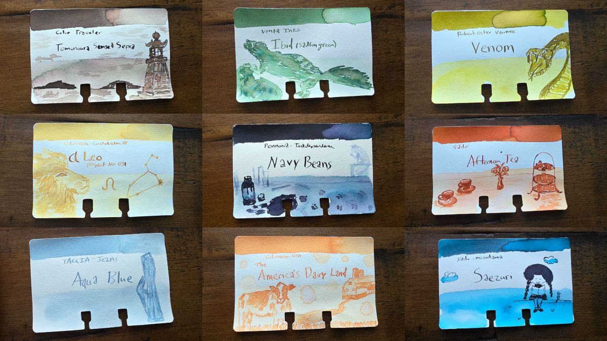
In this group there is a beautiful location, endangered animal, angry snake, zodiac constellation, mischievous cat, tea service, blue jeans, the state of Wisconsin, and an artist's original character represented.
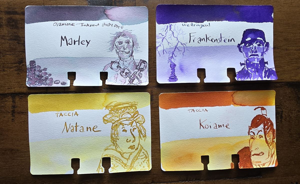
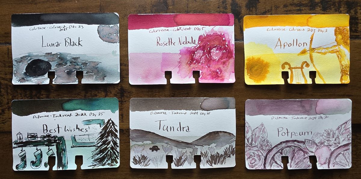
The annual holiday advent calendars including the Diamine Inkvent of 25 inks and Colorverse Colorvent with 24 inks have been pretty fun to sketch. Colorverse continues to lean into space themes, and Diamine is loosely festive/holiday-themed, though it can be a creative challenge to figure out the holiday connection and/or how to represent each ink visually.
Going Forward
I'm 18,000 unfinished projects in a trenchcoat so there's always something to be working on, but doing these sketches remains a significant and enjoyable part of my inky pursuits.
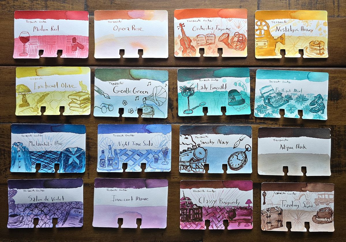
I love the Teranishi Guitar inks, and the box art is fun to represent on the card. I've completed 13 sketches so far, I'm anxious to finish the last 3.
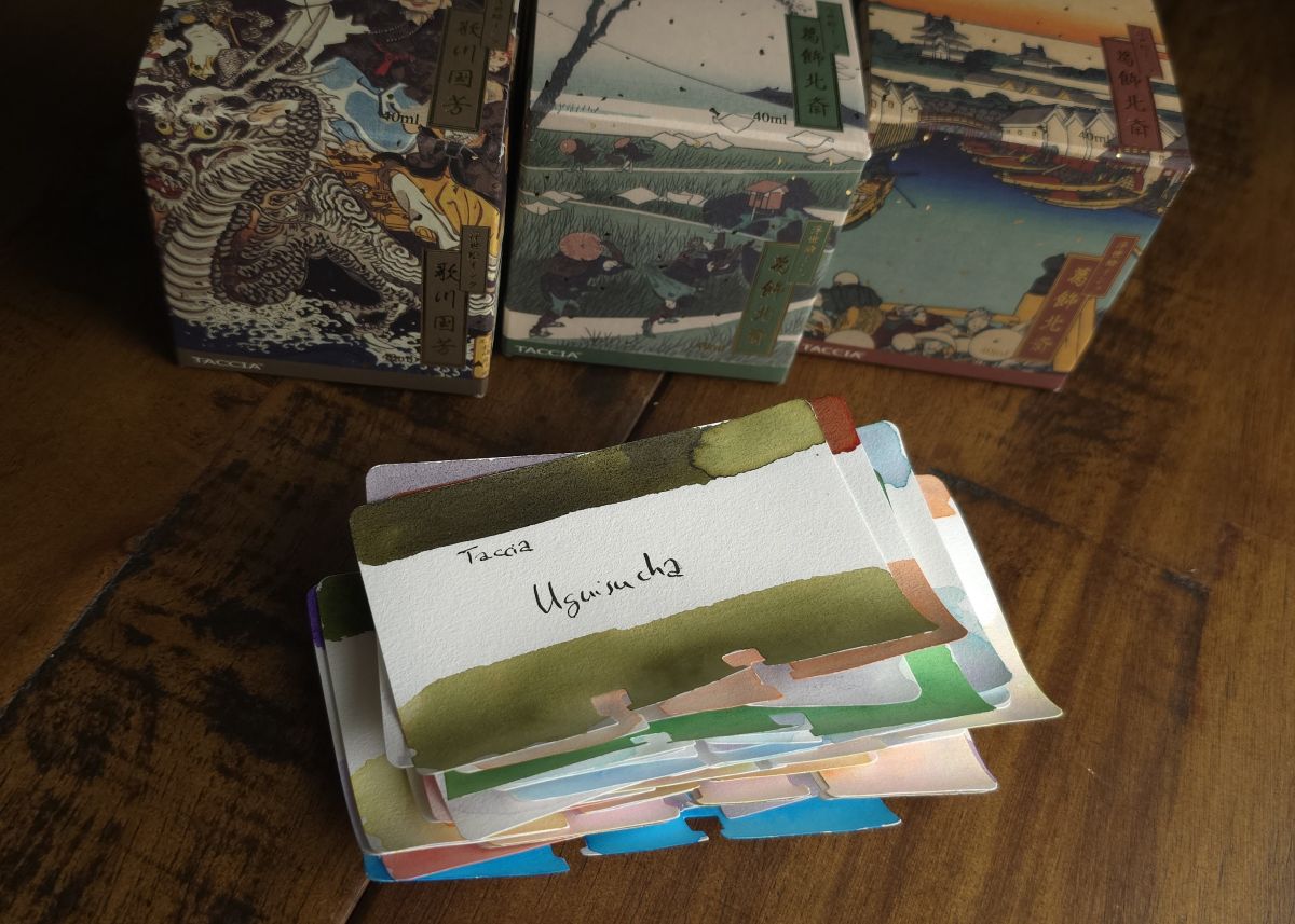
This pile of recently-swatched Col-o-dex cards waiting for sketches includes three of the new Taccia inks inspired by more Ukiyo-e art, and finishing sketches on all the Taccia cards is also on deck—but I don't have to worry about running out of inks to explore anytime soon.