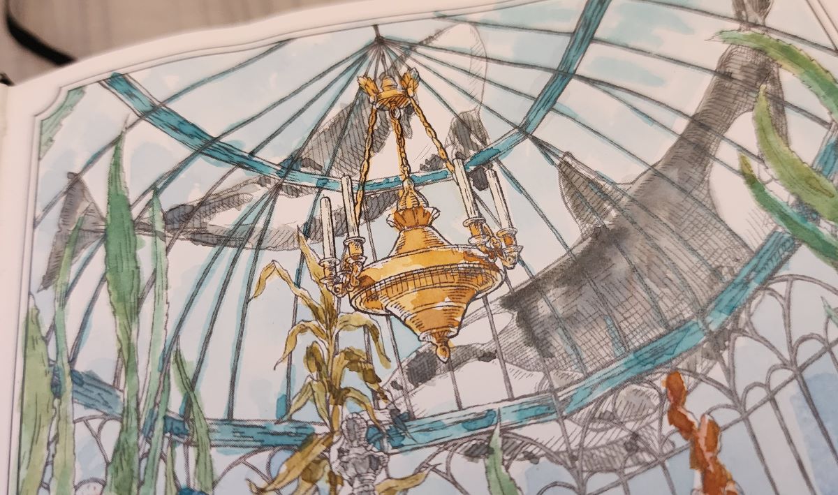
The Dominant Industry Ink Archiving Book: A Log of Atlantis is a hardcover B6 coloring book for fountain pen inks, and hands-down one of the products I have enjoyed most this year.

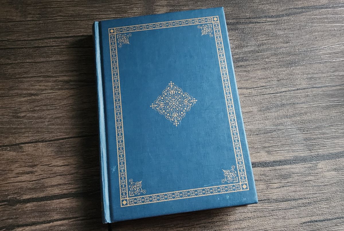
The book has an elegant dark blue cover with bronze gold foil, filled with over 250 pages of ivory 100gsm fountain pen friendly paper. The page designs are in the style of a field journal documenting the creatures and environments of "Atlantis."
An Ink Archiving Book
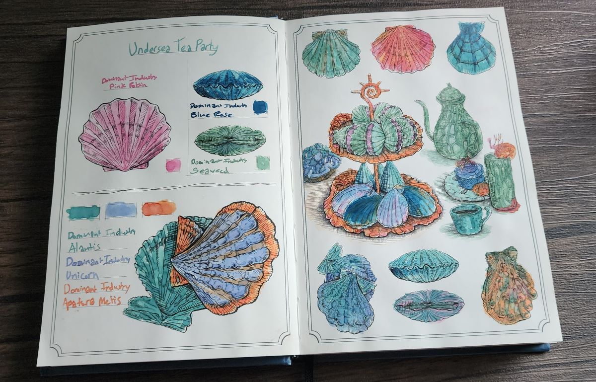
I think you could use a variety of materials such as traditional watercolor paints, markers, colored pencils, etc. in this book, but I love that it's been designed to use with fountain pen inks. Since I have more skill in using color than drawing, I am really enjoying using my growing collection of inks to paint these "coloring book" designs. The watercolor style really brings a lot out of these inks.

Dominant Industry lists the paper as Be Seven 100g/m² and it holds up to fountain pen ink and painting very well. The color representation of inks reminds me most of Cosmo Air Light or Iroful. The inks that tend to look much more blue on those papers also look more blue here.

A Log of Atlantis
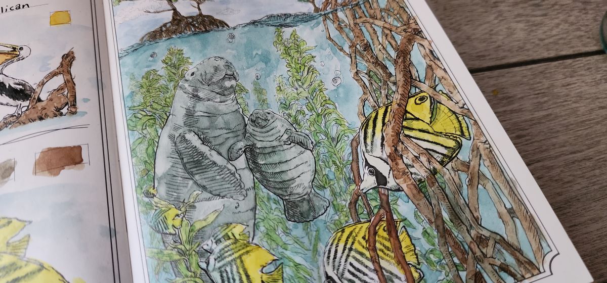
The Atlantis theme involves a lot of undersea creatures, but some of the most delightful art in this book is a juxtaposition of things from the human world in an undersea environment.

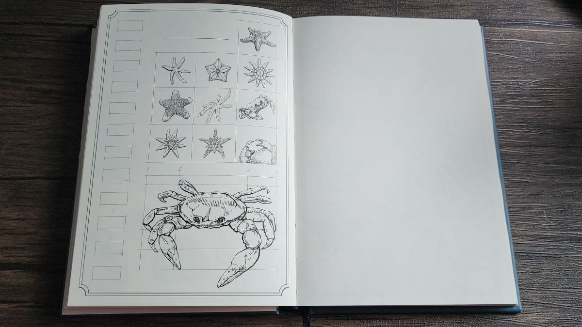
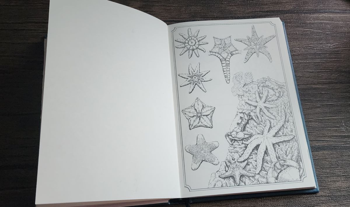
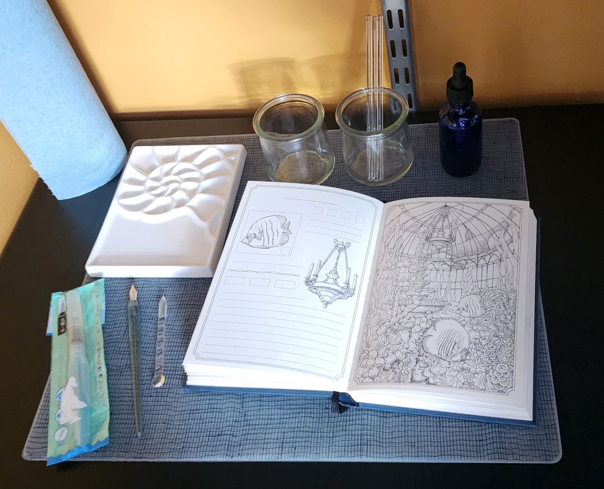
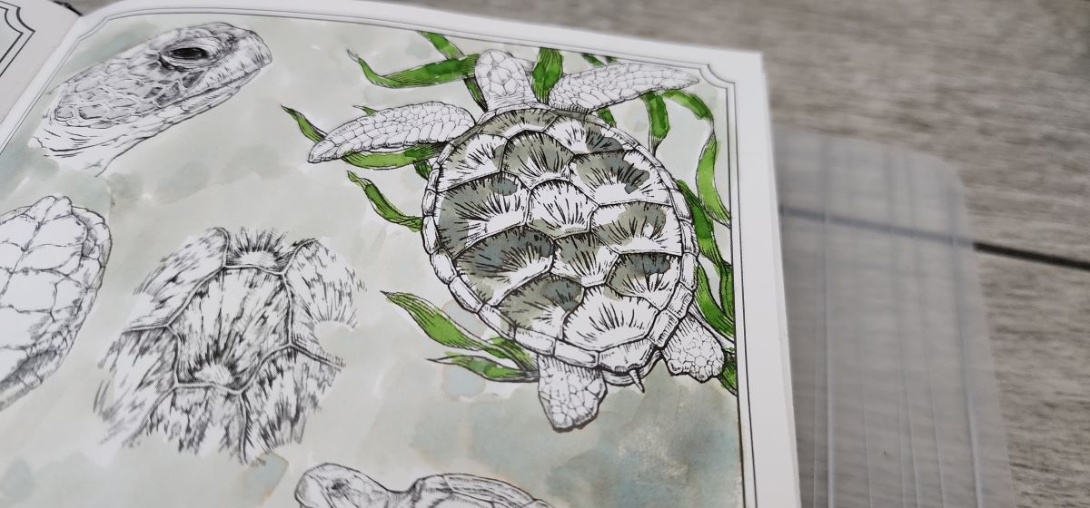
The contents of this book are thoughtfully laid out in three distinct sections. The first section has full two-page spreads of art to color in, with two sets of the 25 designs. The designs are a combination of full scenes and studies of a particular group of creatures. The pages include lines for text and small "swatch" squares for documenting the inks used.

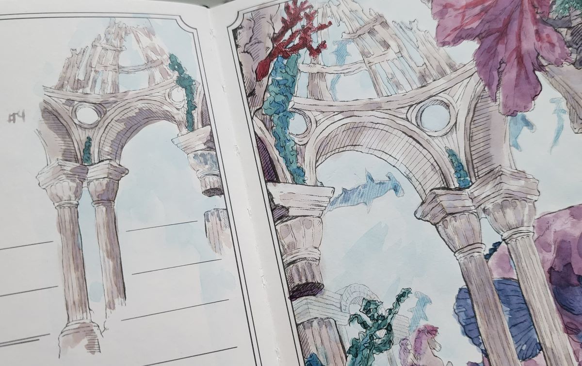
The middle section repeats a third set of the same artwork but with a blank page inserted in the middle of each spread to allow for free-form drawing, painting, or writing. I think the repetition of designs is a feature—I look forward to seeing how the same design will turn out completely different with a new selection of inks.


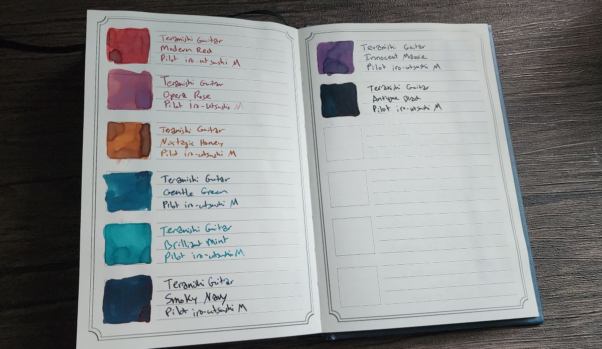
The last section has 50 pages of boxes and lines for swatching and describing 300 inks, though I'm sure it would also work well for tracking other things like currently inked pens.

Painting Toolkit
I'm curious about how others are using this book—this is my typical setup. It may look like a lot at first, but it's essentially just tools I use for ink swatching plus a paint palette and a water brush. I think just about anyone who enjoys inks and is interested in getting a little artsy could have some fun with this book.

Silicone Placemat
This is optional, but the Modern Twist silicone mat creates a nice, cushioned work surface that easily wipes clean.
Fountain Pen Inks
For each page I'll pick a group of 3 - 10 inks to use, usually related in some way—all the same brand, color family, etc. This is also an excellent way to use up samples, or the ink that's left in a pen you want to clean.
Paint Palette
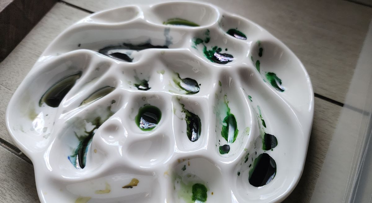
My favorite palette is a white ceramic dish in the shape of a flower with several asymmetrical wells in a variety of sizes, which makes it easier for me to remember which colors I put where.
Glass Stir Sticks
These glass sticks are great for swatching the inks and then transfering a few drops of ink into the paint palette (a little goes a long way, especially with darker colors).
Dip Pen
I'll grab a dip pen like the Pilot Iro-Utsushi pen or a glass nib pen to write down the ink details for the swatches and any other text.
Water Brush
I use a single water brush to paint, which is a synthetic paint brush with a water reservoir in the handle that you can squeeze to deliver water to the bristles of the brush. I use the water in the brush to help rinse inks between colors, or to dilute inks in the ink palette.
Shop Towel
The iconic blue shop towels are sturdier and leave fewer fibers than regular paper towels. I try to avoid getting excessive amounts of water or pooling ink on the pages so I'll dry the brush a bit on the towel if it's getting too soaked, or may occasionally blot the page with a clean section of towel if it gets too dark or wet in spots.
Glass Jars
I use glass food jars, especially some that originally held yogurt, to hold inky glass stir sticks and catch rinse water.
Glass Dropper Bottle
I fill a small glass dropper bottle with clean water to use to rinse tools like dip nibs in between uses.

A similar kit I put together uses a shell palette design that complements the theme of this book well.
Example Pages
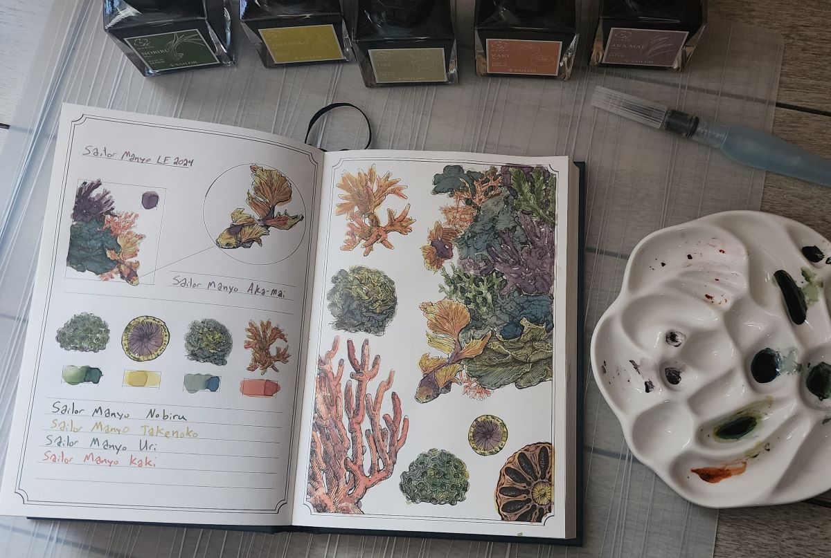
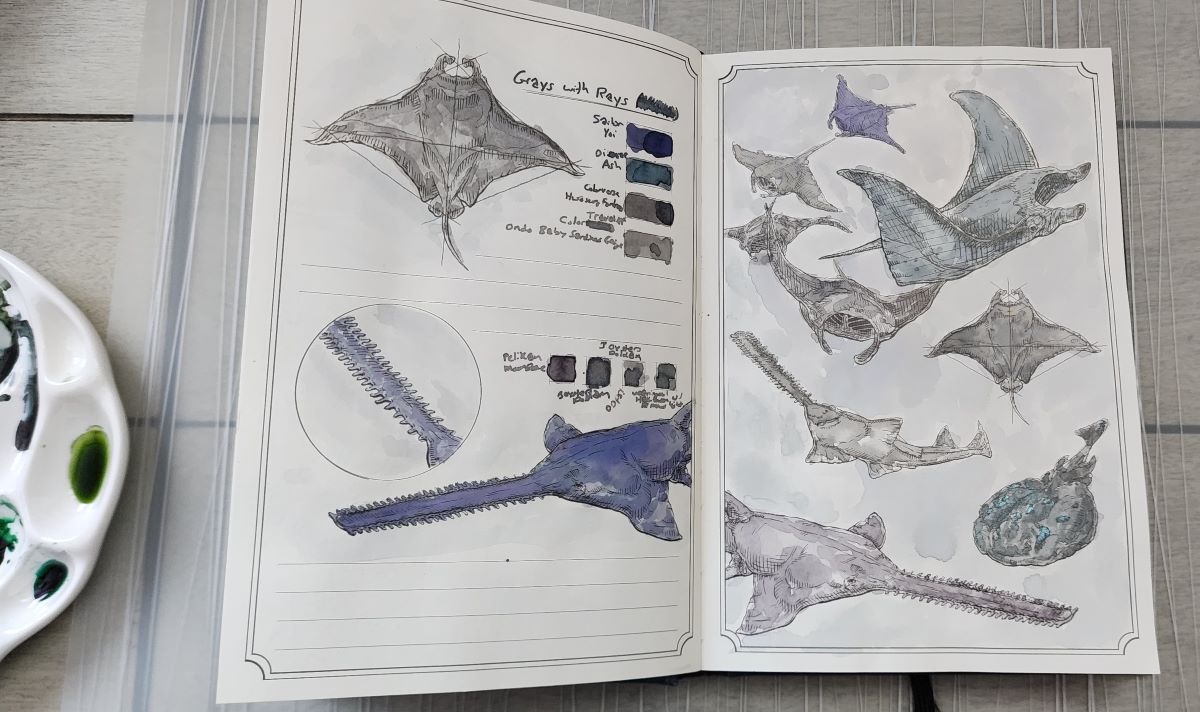
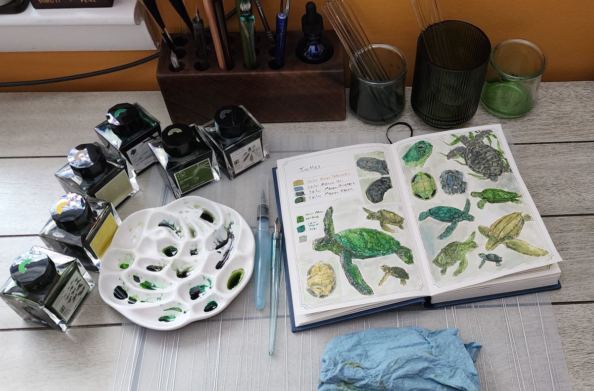
So far I've used this book to explore different groups of inks—such as a selection from a particular brand or series or inks from the same color family.
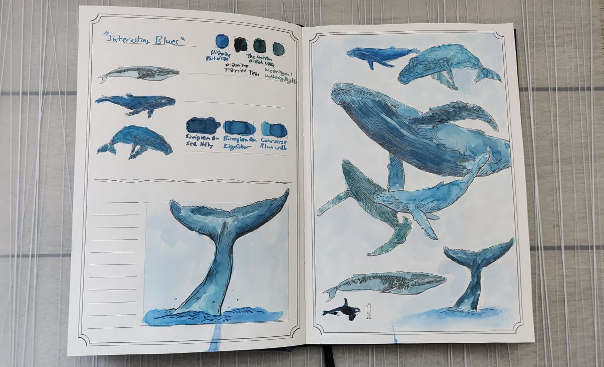
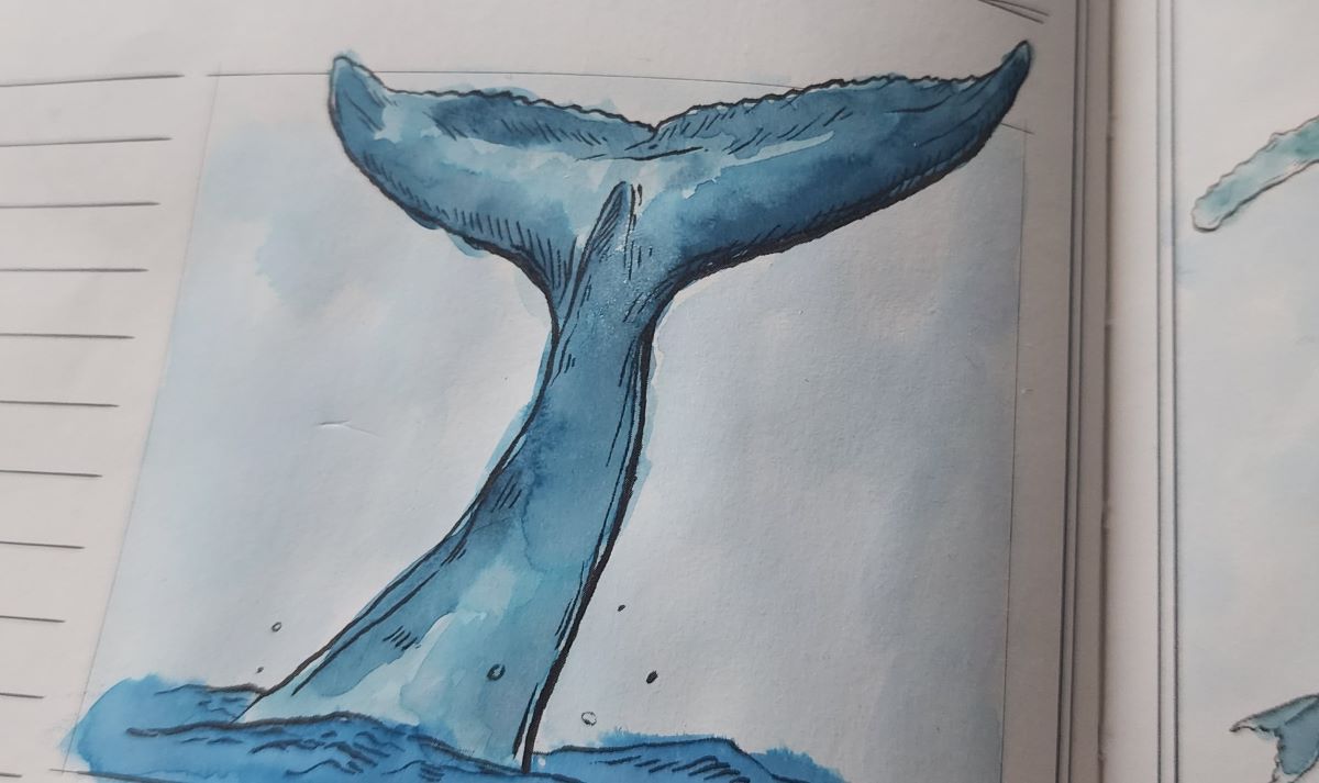
This year I've been on the hunt for earth-tone, dusty blues that for lack of a better descriptor I've dubbed the "interesting blues," and these whales are showing off some of my favorite discoveries.

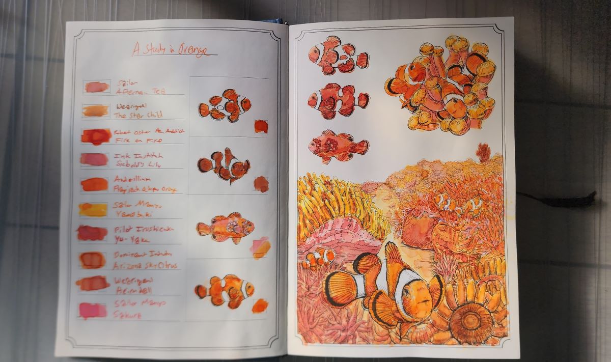
Orange, anyone?

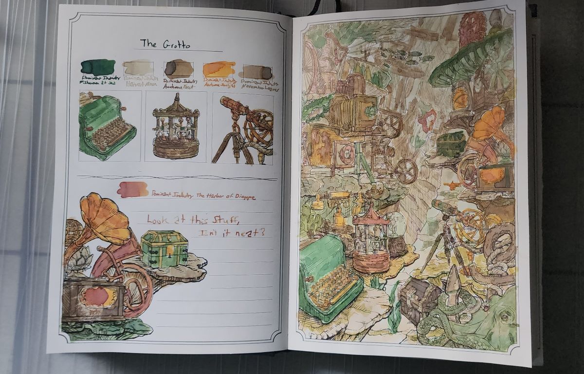
This page used an autumnal palette of Dominant Industry Inks, including several Pearl (shimmer) inks.

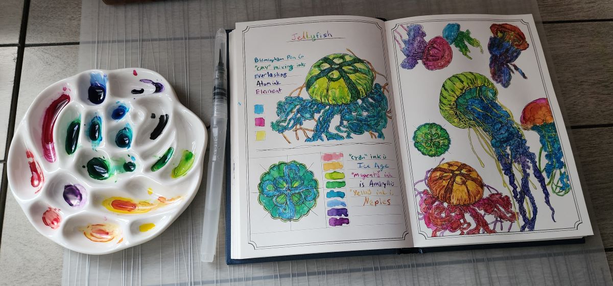
Another thing I wanted to explore in this book is mixing inks. For this page of jellyfish I used inks in "CMY" (cyan, magenta, yellow) colors from Birmingham Pen Co. to mix a whole rainbow of vibrant colors.

This next page uses those same Birmingham Pen Co. cyan, magenta, and yellow color inks but adds in black (a CMYK palette) to mix a range of natural, earthy shades.

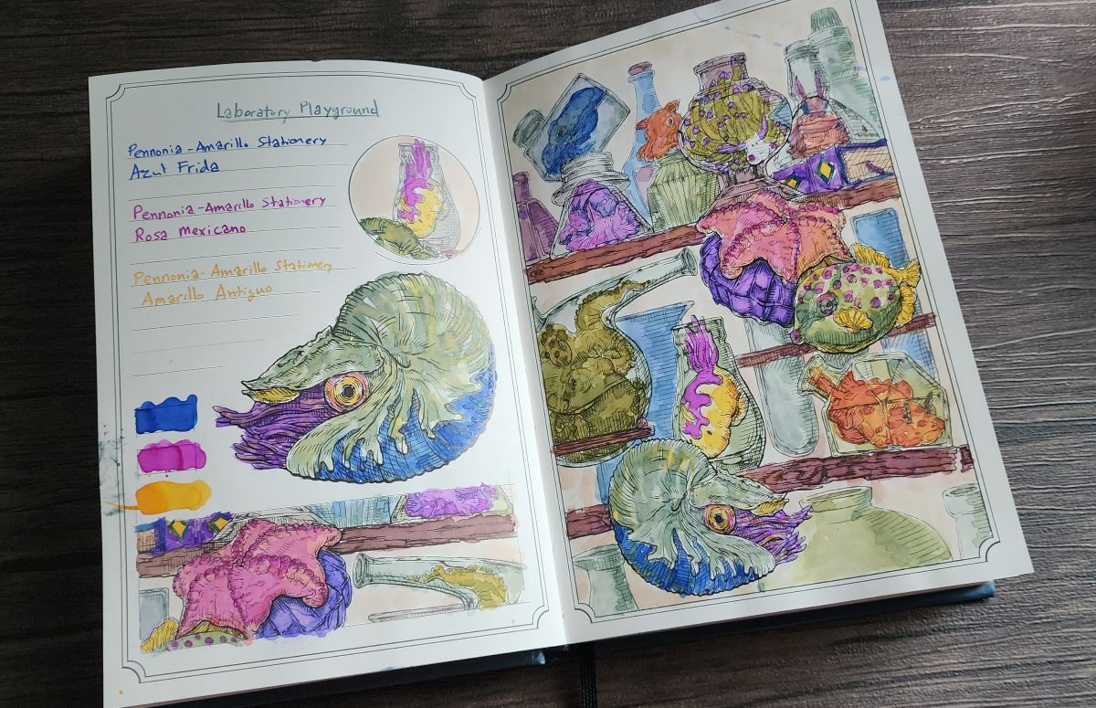
On another page I took these three Pennonia inks from Amarillo Stationery that are blue, bright pink, and yellow, but not quite the "CMY" shades, yet still produced an interesting range of vivid colors when mixed.

Painting Tips
It's much easier to paint a light background with very diluted ink first and let that dry a bit before painting the foreground objects with darker inks. Otherwise, painting light next to something dark can pull the dark ink (even if it's dried, unless it's very permanent) into the light area.

Use the shading marks on the drawings as a guide for where to add darker shading. Make those areas a little darker, and leave areas without many lines lighter for shading that will add depth.


It's ok to let ink dry out in the palette and resume painting later, just add drops of water or use a damp brush to start painting again. Maintaining the proper ratios and viscosity is crucial for using an ink in a pen, but that doesn't really matter when painting with a brush.

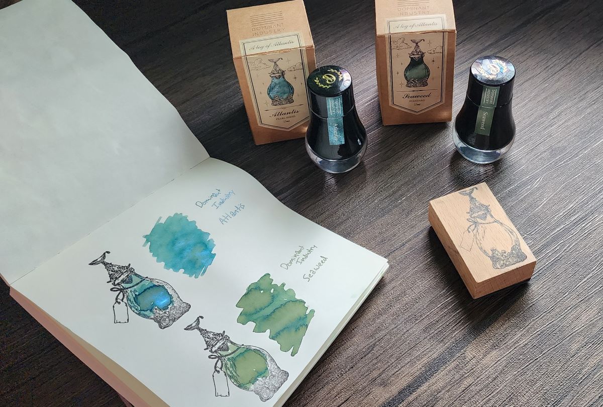
A Log of Atlantis Stamp and Inks
When this book was released, there was also a stamp and two new inks sharing the "Atlantis" theme. I really like both of the inks. Seaweed is a lovely chromashading green. Atlantis is a blue green with some of the shiniest blue shimmer I've ever seen in an ink, but has performed very well in a TWSBI Diamond 580 with a fine nib over the last several months.

Ink Archiving Vol. 2
I'm really enjoying the Atlantis theme and artwork in this book, but there's a new theme on the horizon! Dominant Industry has been sharing previews of the next book in this series called "A Log of Elixir" which has a black cover and is expected to be available in early 2025. There will also be a new stamp design and two inks released with the book. The new inks look really good, I can't wait to explore this new theme too.
Update: Dominant Industry Ink Archiving Book: A Log of Elixir
