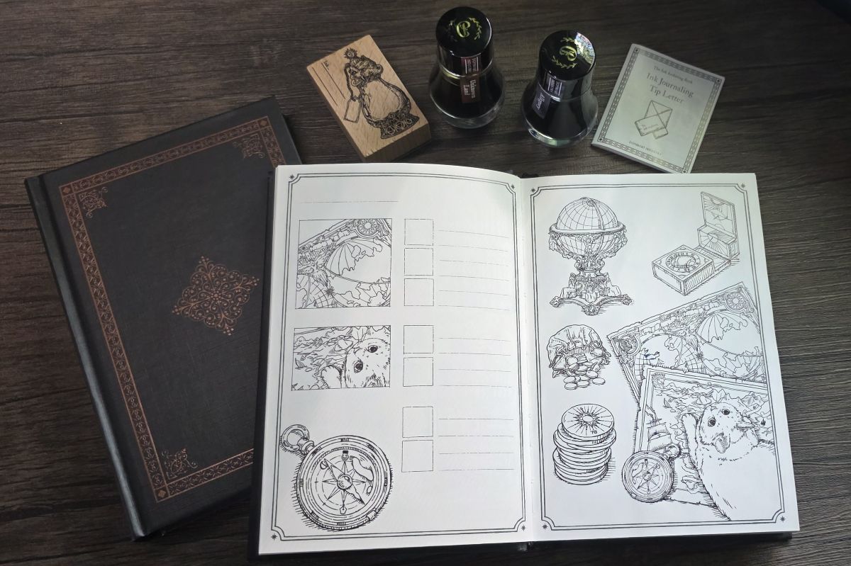
Earlier this year, the second edition of the Dominant Industry Ink Archiving book, A Log of Elixir, was released. The Ink Archiving books are B6 hardcover volumes filled with thick, 100g/m² fountain pen friendly paper and pre-printed designs for creatively swatching and exploring fountain pen ink.
I've been really enjoying exploring inks and color in the first book since last May, mostly during Sunday "art" streams on Twitch. I described the tools and techniques I'm using to paint pages with fountain pen inks in my earlier Ink Archiving Book post about the Log of Atlantis edition. With this release I'm continuing that approach while enjoying the new alchemy-inspired theme.
Similar Layout, New Theme
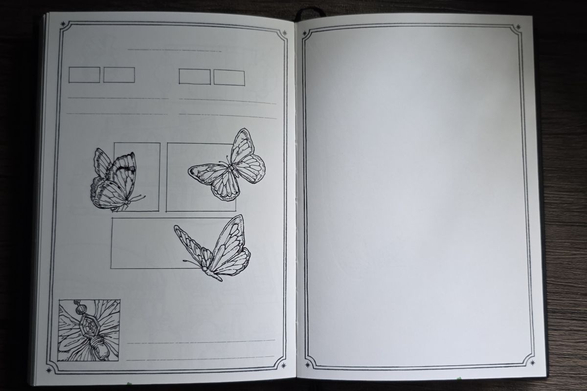
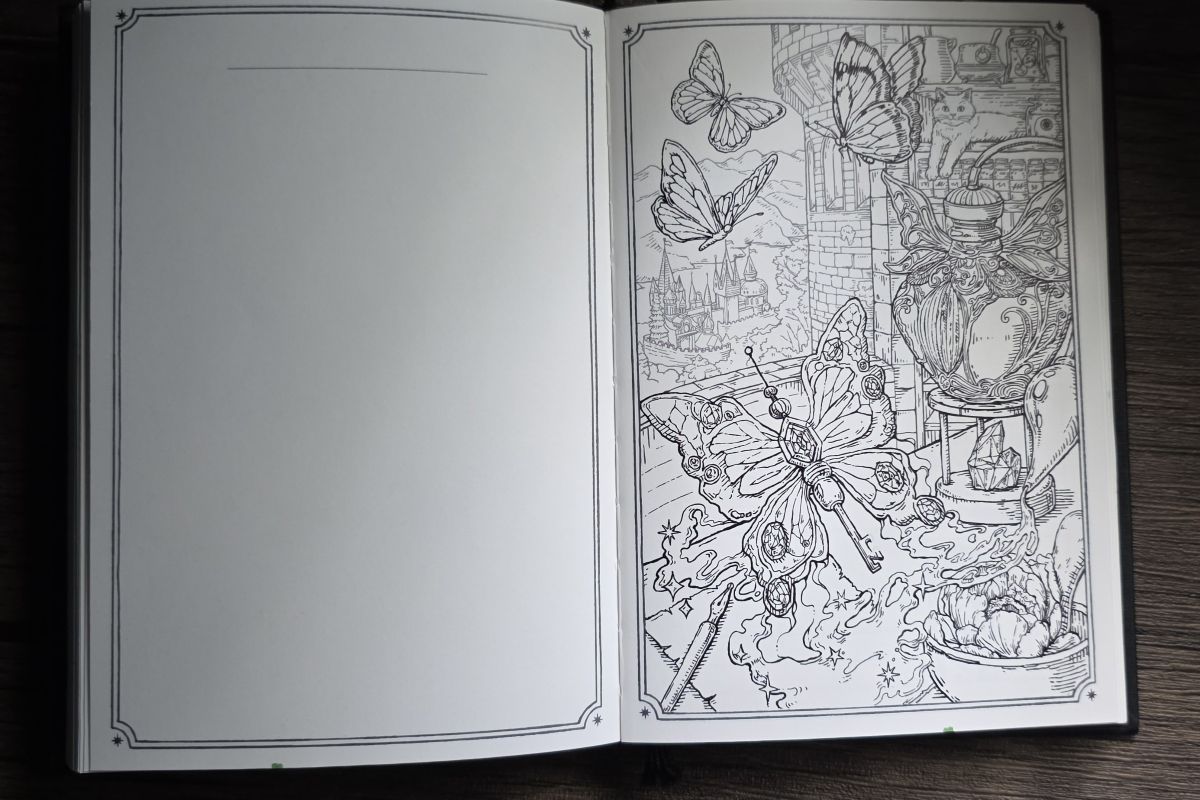
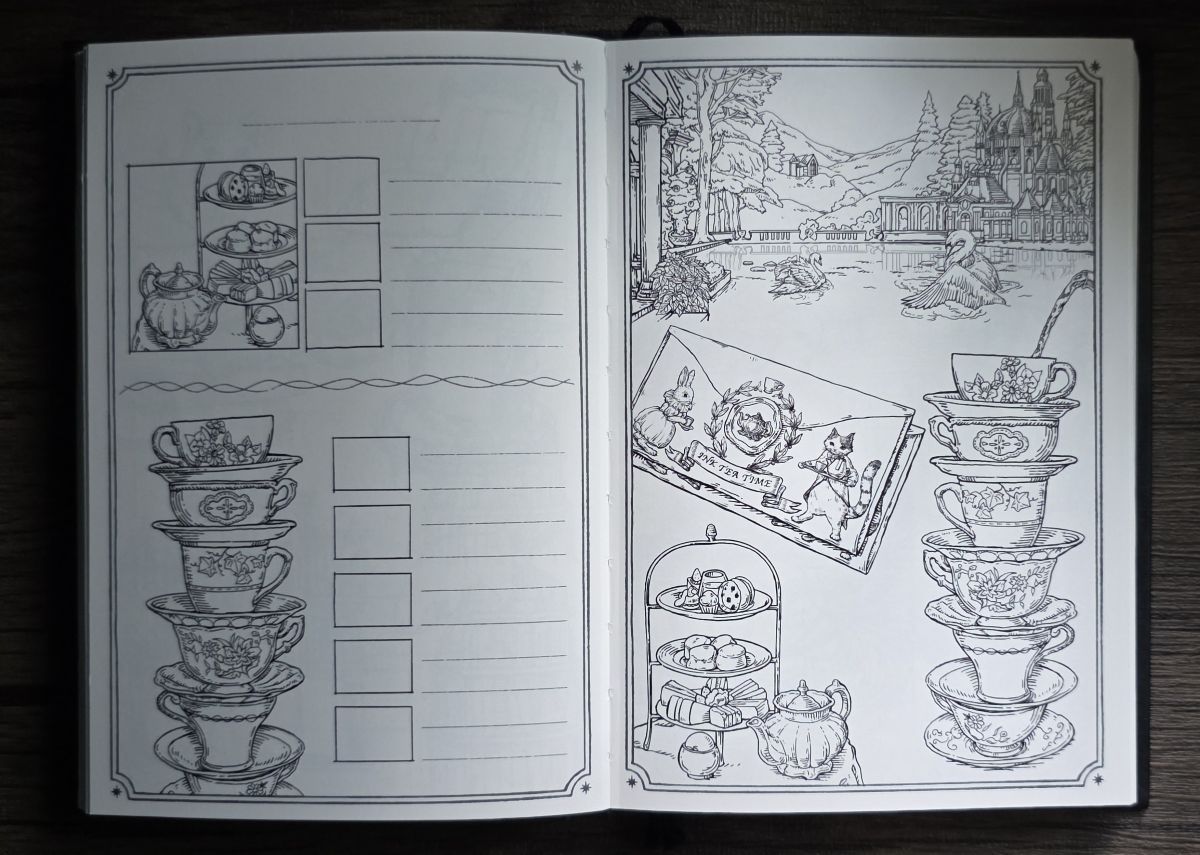
The book layout is nearly identical to A Log of Atlantis, but with a higher page count due to the addition of more blank pages at the end of the book. There are three copies of each of the 25 two-page spreads full of vintage vibes inspired by magical elixirs and alchemy, and cats!
The first section of 100 pages has two copies of each design. The page on the right is a full scene and/or collage of items, while the left page has places for swatches, documenting the inks used, additional writing, testing colors on smaller pieces of the full design, etc.
In the middle section of 100 pages the designs are repeated a third time but with an extra blank page in the middle of each spread for additional writing, drawing, journaling, handwriting practice, creating color palettes, documenting currently inked pens—there are so many creative ways you could use this book.
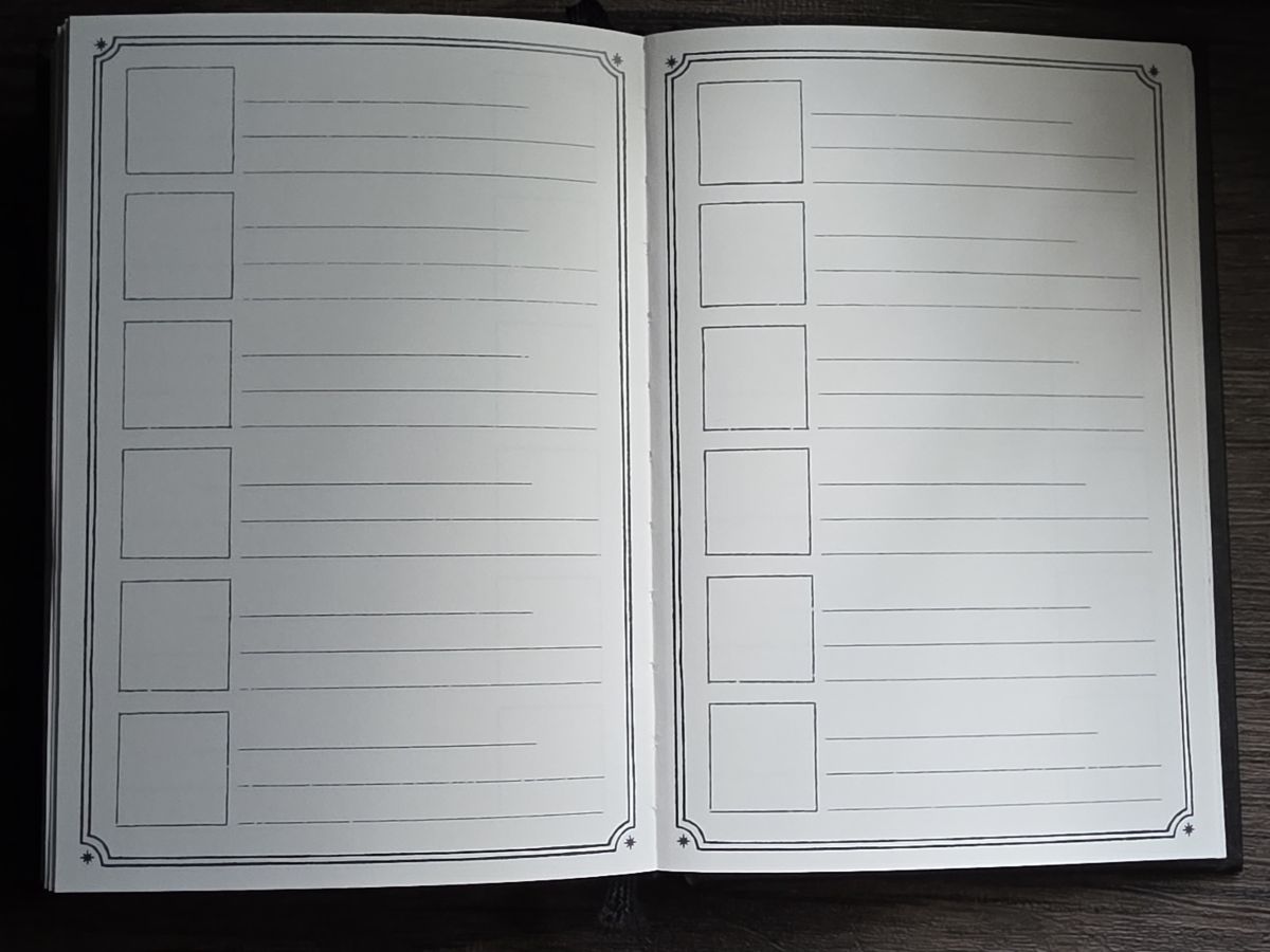
The last section has 50 pages for swatching six inks per page, and then 30 blank pages at the very back.
Ink Exploration
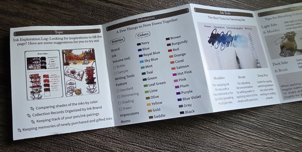
Since there are so many different ways these books can be used, it can be hard to decide where to start. This time Dominant Industry included a little pamphlet with ideas and tips such as:
- comparing shades of ink by color
- tracking pen/ink pairings
- keeping memories of newly purchased and gifted inks
- noting ink details like brand, color, volume, features, impressions
- using tools like a glass muddler, brush, dip pen
- etc.
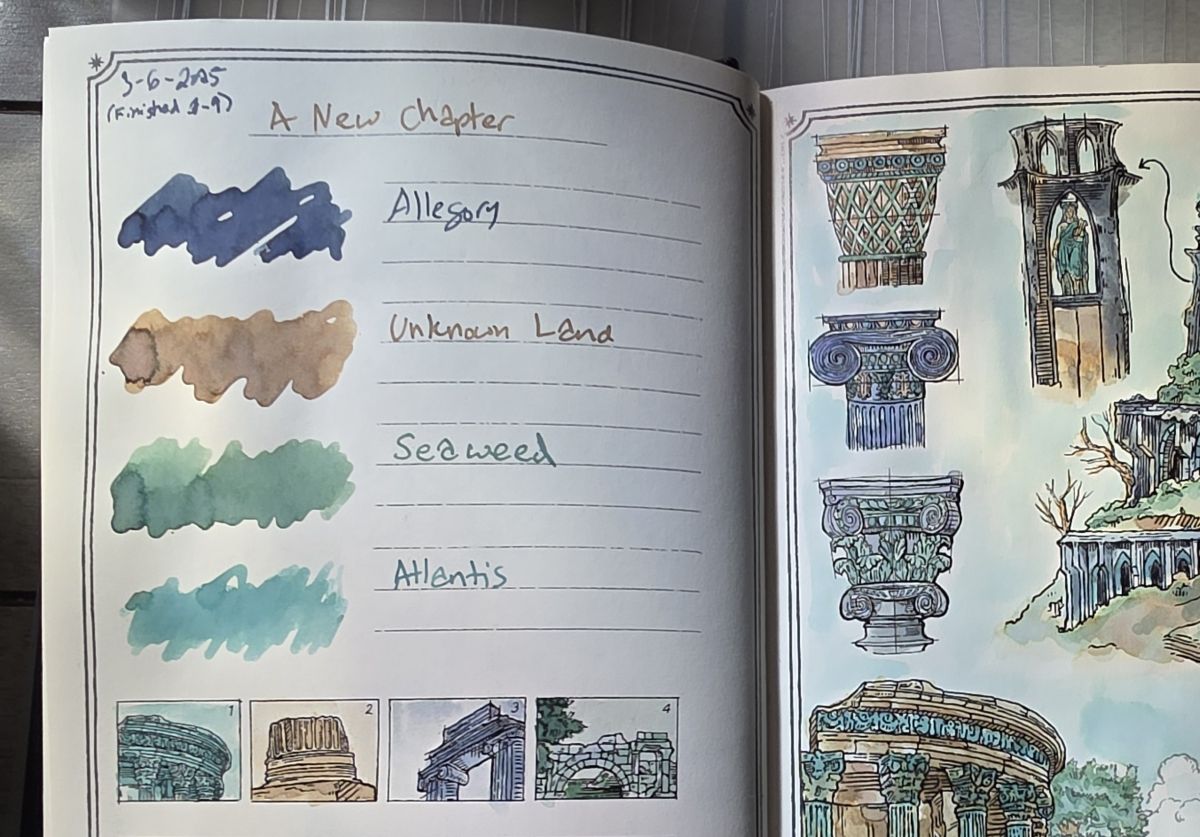
I continue to explore various groupings of fountain pen inks, starting a new page to swatch each group in the swatching section so they are all together on one page (or two if there's more than six inks).
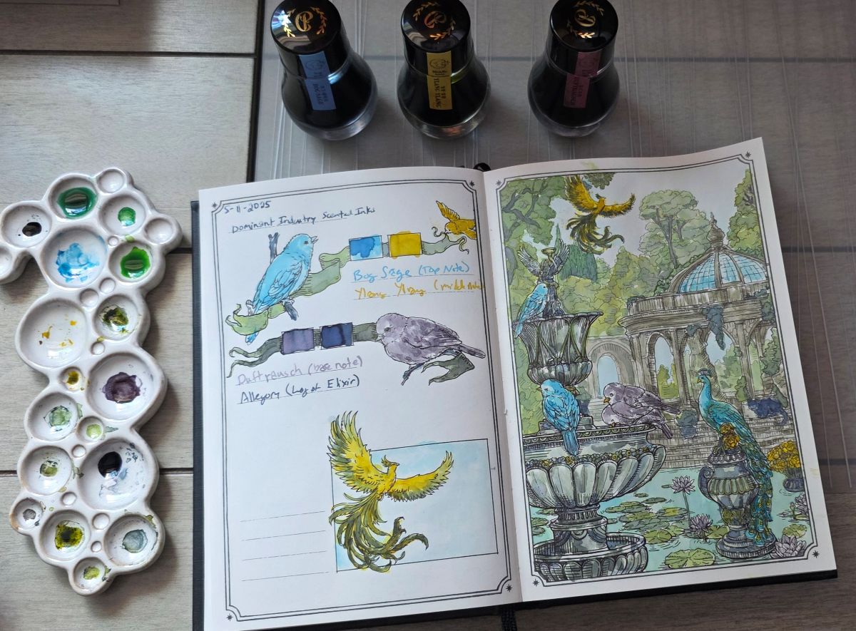
This group is a set of three scented inks from Dominant Industry, plus a darker shade to fill out the color palette. I used the original ink colors for several elements in the design, but also mixed the colors to get some nice neutral shades for the structures and a variety of greens for the foliage.
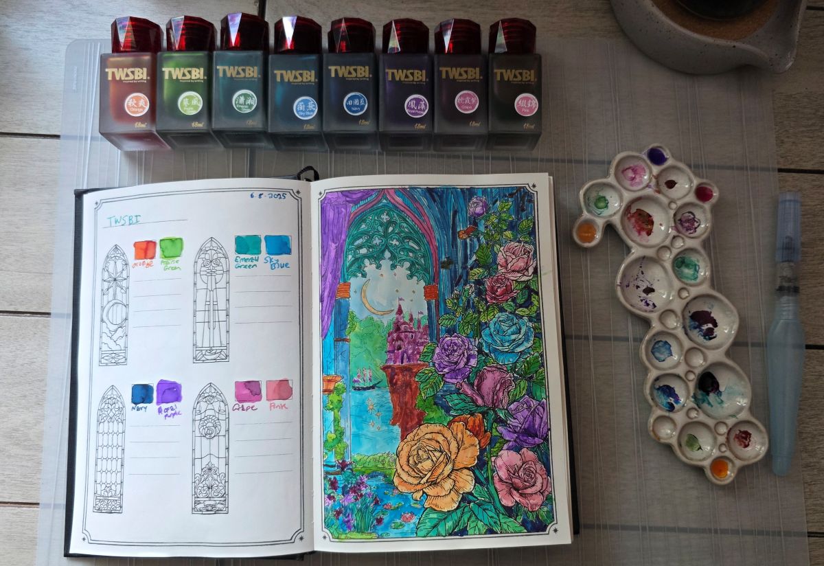
On this page I wanted to spend time getting to know the vibrant but often overlooked TWSBI inks that have some surprising character.
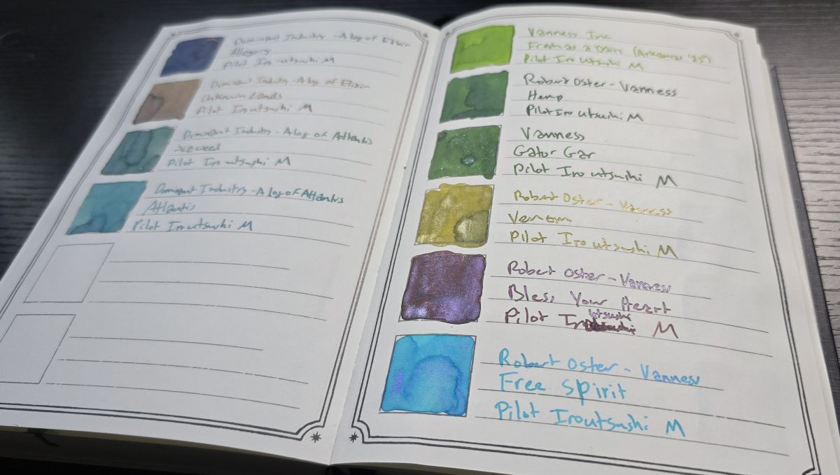
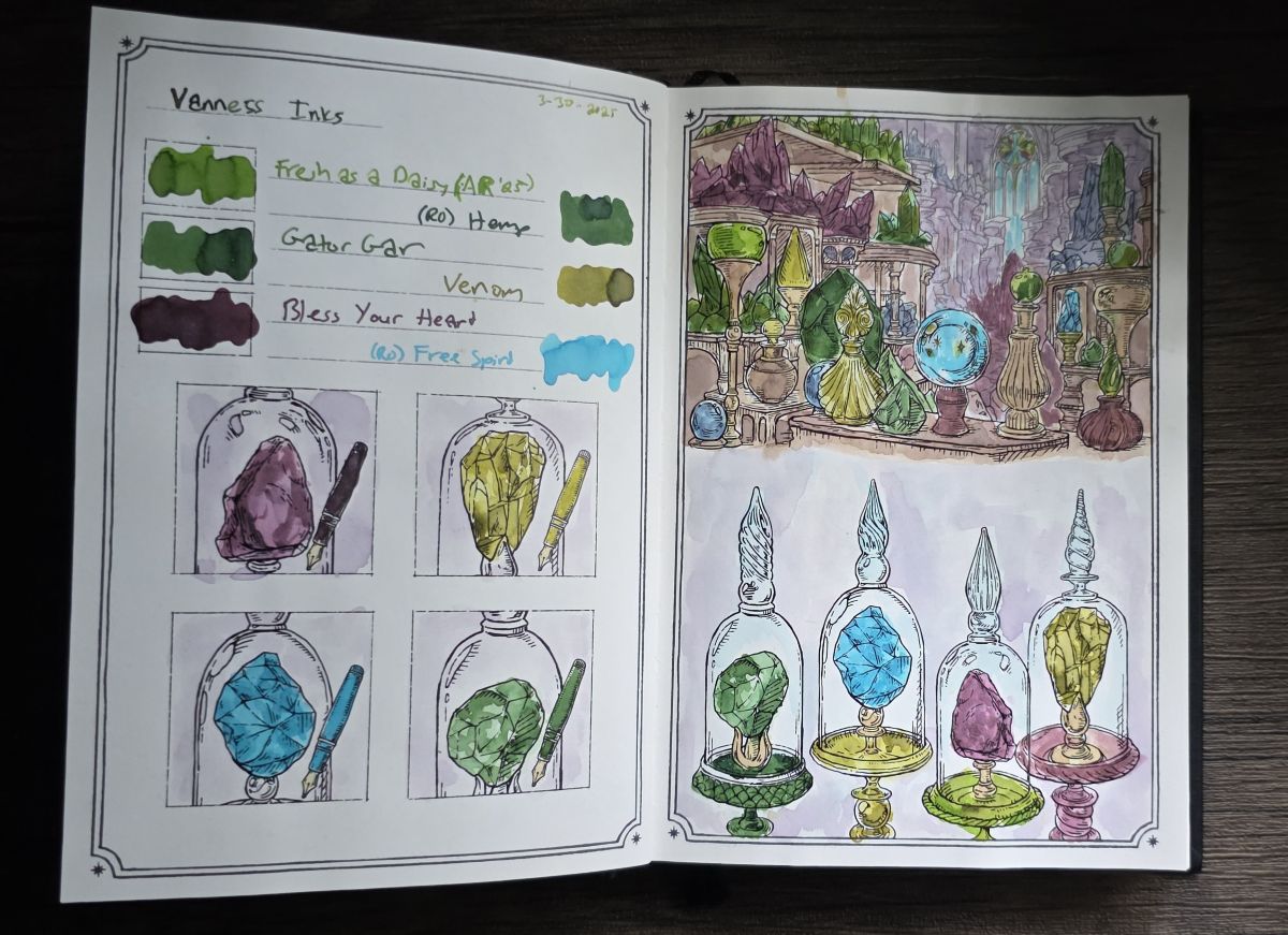
After getting to visit the Vanness Pen Shop for the first time while in Little Rock for the Arkansas Pen Show this spring, I painted this page featuring six Vanness-exclusive inks.
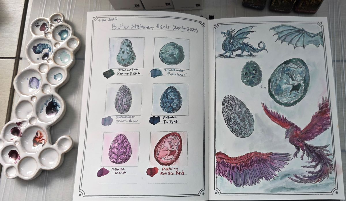
I also documented a couple more stationery shop visits by grouping inks I picked up at Butler Stationery in Columbia, TN.
Monochrome Layering
Another technique I've been using more consciously in this book is a monochrome layering of diluted shades of a single ink on the left page, when the design has enough featured close-ups to match up with each ink used.
I've done a lot of layering before—starting light and building up color is a good way to achieve highlight and shadow that give the designs depth and interest when painting in a watercolor style. What I'm doing a little differently now is going over the entire design in these featured rectangles with a more even, very pale wash as the first layer, then adding a slightly darker layer on certain elements of the design, then a third layer to darken a few areas even more, and so on, with much more of a focus on building highlight and shadow for the whole design at once rather than focusing on painting in the individual elements. This has been an interesting way to capture the shades of each ink individually in a bigger way than just with the smaller square/rectangle swatch boxes.
CMYK Painting
As much as I love swatching and learning about specific fountain pen inks, I also really enjoy just painting with ink as an alternative to watercolor. I prefer using a "CMYK" (cyan, magenta, yellow, and black) color palette to mix colors for general painting, so I've also been using the Ink Archiving book to test groups of roughly "CMYK" color inks from different brands, including both standard and pigmented (water resistant) inks.
In the Log of Atlantis book I used the pigmented Birmingham Pen Co CMYK inks on a couple pages, but as those inks have not been available for a while, I was looking to try out some other brands of pigmented ink. Thanks to Lisa Vanness, during a recent trip down to Vanness Pens I was able to get the Octopus Fluids Write & Draw inks in Pink Owl and Yellow Wolf to try out, combined with the Petrol Deer and Black Elephant colors I already had I assembled another pigmented ink CMYK palette.
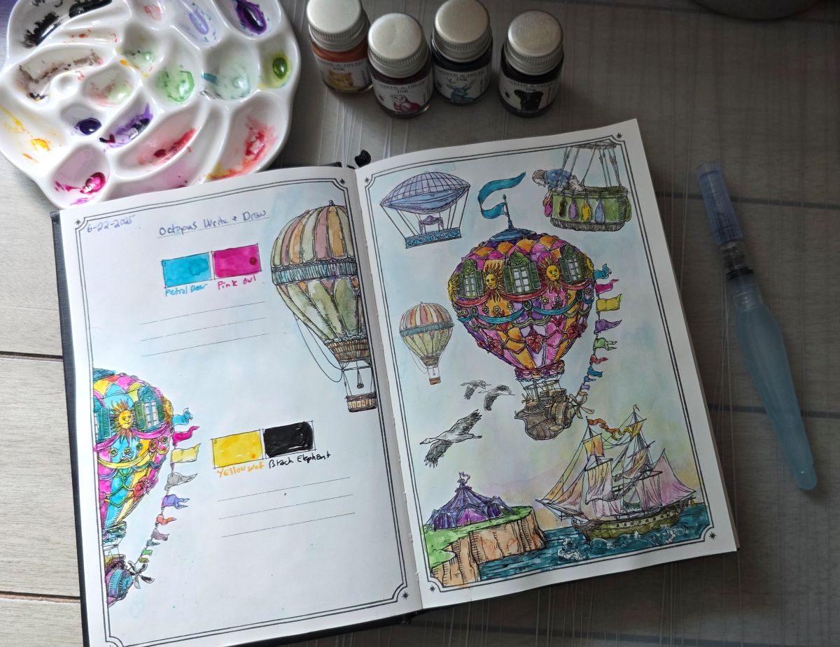
I really love how this page turned out—I was able to easily mix a good range of both vibrant and earth tone shades. Standard inks will usually be somewhat “reactivated” and will move around or mix when more ink and/or water is applied to an area that's already been painted, but pigmented inks fix into the page relatively quickly so colors will layer in a different way. In this design I was able to add yellow and pink shades over the sky near the water line without them overly mixing together to make orange or green shades. This difference can be used to create different effects, which is interesting to explore after using primarily non-pigmented inks thus far.
I've got at least three other CMYK(ish) palettes of inks to try out in future painting sessions in the Ink Archiving books, including samples of the Diamine Forever pigmented inks from a good friend, and sets of standard inks from both Anderillium and Diamine—so stay tuned on Twitch for further exploration of CMYK ink painting.
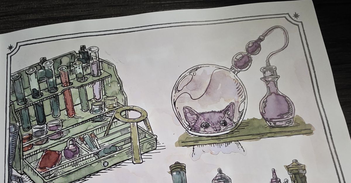
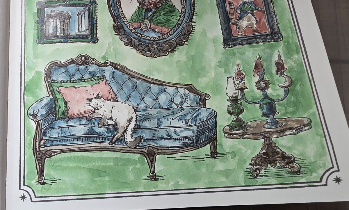
The Cats
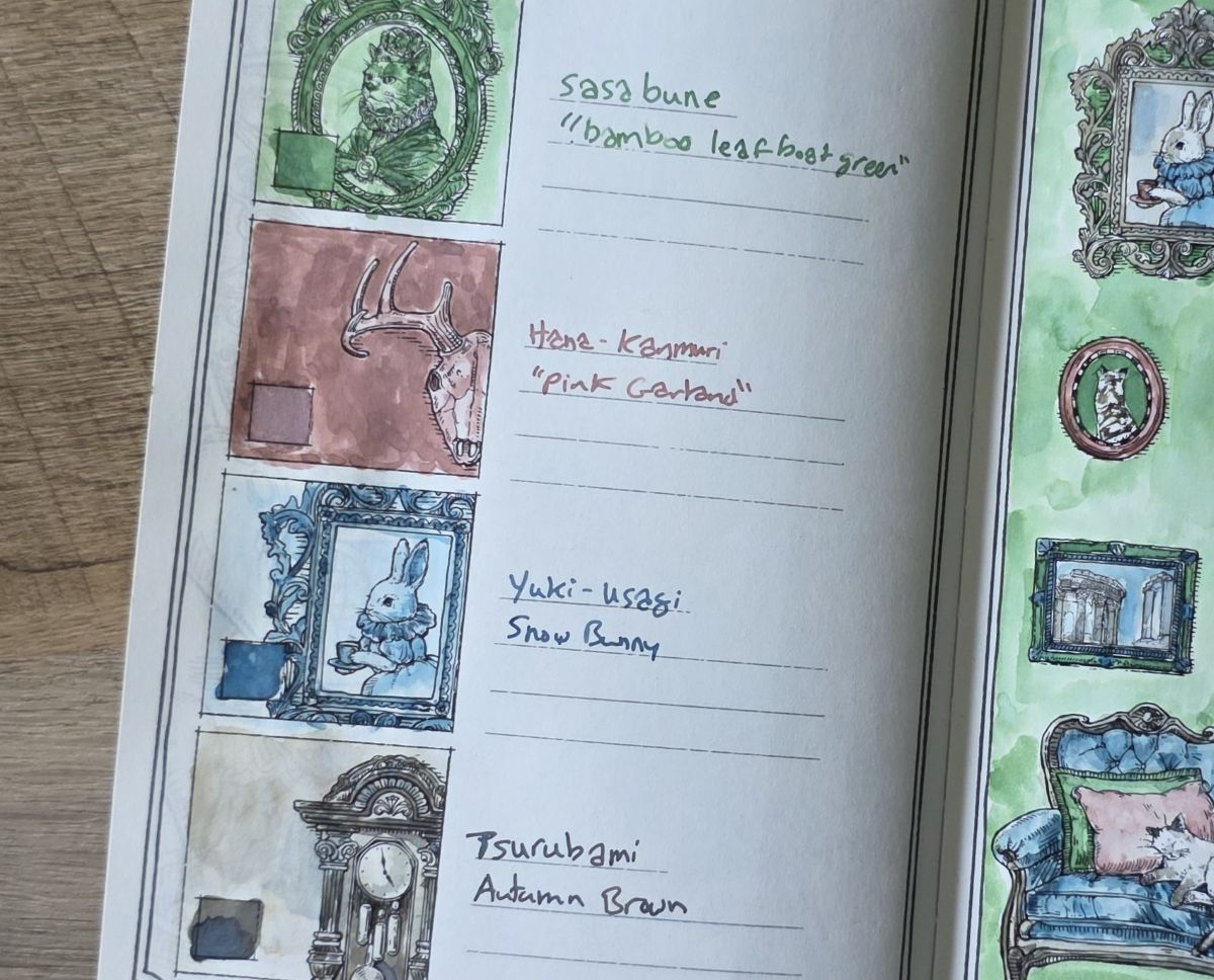
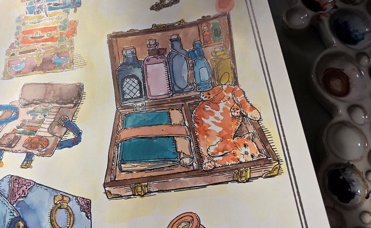
One detail that becomes increasingly more apparent while exploring the designs in this book is the prevalence of feline friends. Choosing colors and coat patterns for the cats has been a surprising challenge but they bring a lot of fun whimsy to the designs. I won't spoil them all, but here are a few favorites so far.
Orange cat energy.
Peek-a-boo.
Mood.
Log of Elixir Inks and Stamp
Like with A Log of Atlantis, there were two new inks and a wooden stamp released for the Log of Elixir theme. The stamp features a snake wrapped around the cap of an ornate glass bottle, and new this year are two vertical lines alongside the bottle to label the ink. No shimmer ink this time—two earthy shades that go with the vintage look.
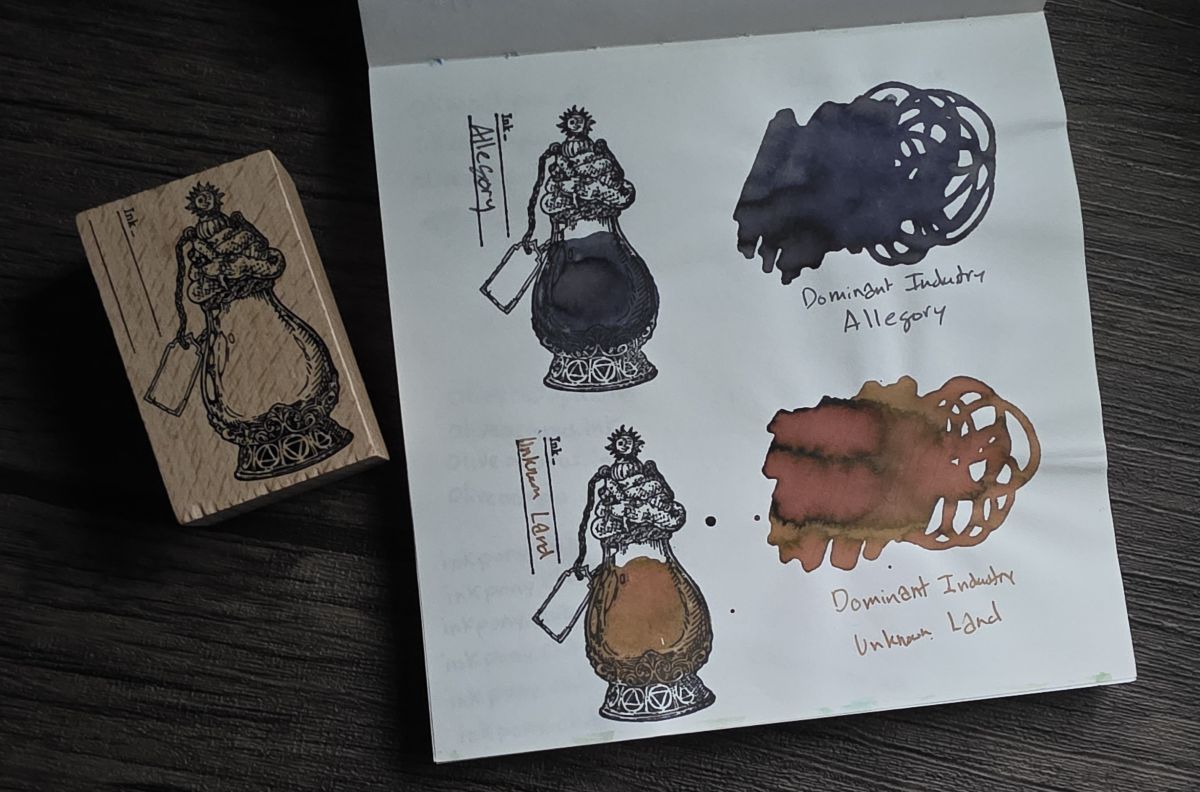
Allegory is a particularly interesting ink to feature for this book as it tends to be more of a cool gray on Col-o-ring and other papers like the Midiori Cotton page above, but turns quite indigo on the b7 paper in the Ink Archiving book. Unknown Land is a chromashading warm sepia that has a quite soft, vintage look on the b7 paper.
b7 Paper (Not the Size)
The first Ink Archiving book sent me down the rabbit hole of "b7" paper (not to be confused with the paper size B7) by Nippon Paper Industries Co., Ltd. On the Dominant Industry site the books are listed to have "Be Seven 100gsm" paper, which I see more commonly represented as "b7" as a tribute to the creator's favorite musical chord.
Beyond these books I've acquired loose leaf b7 Natural and b7 Bulky paper to try. I've found the b7 Natural and the thicker b7 paper in these books to be very similar in texture, color, and color representation to both Cosmo Air Light and Iroful. While ink properties like shading, sheen, and shimmer will be well-represented on these papers, there can be significant color differences compared to other common fountain pen papers. In particular some inks appear much bluer, and especially when swatching or painting there can be a "softening" or "muting" effect on the color, which happens to fit with the vintage theme of this edition.
Used Books
These books can be intimidating to get started in—the fear of "messing up" the fancy hardcover artsy book—but IMHO they can only get better as they are used. As the spines soften, the pages get slightly wrinkled from painting, the edges get marked with drips of ink—I make these books my own.
While I tend to get a little "artsy" and spend quite a bit of time per page, that's just one way of thousands to use these books—I want to see how you use yours!